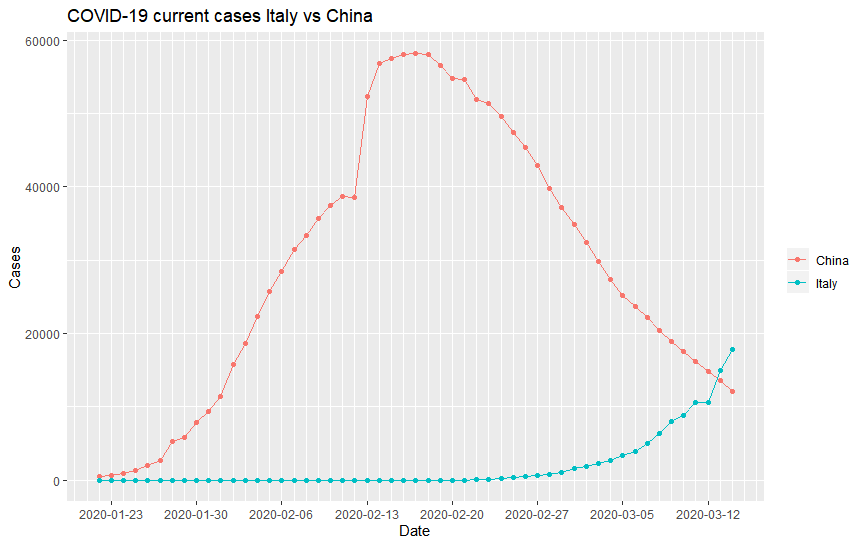
It’s been about a month since I last posted about the Coronavirus and boy, did the situation change for the worst! They have changed the name of the disease to COVID-19 (not the virus! The virus is called SARS-Cov-2), and the World Health Organisation (WHO) has just declared it a pandemic. As I have discussed in the last blog, China was at a turning point back then and the world has just started seeing cases. Indeed, the number of cases in China has been on a downturn since then, and the number of cases has increased exponentially around the world. For example, here is the number of cases in China compared to the number of cases in Italy as a function of time:
Anyways, for this blog, I am not going to do any analysis or predictions of the COVID-19 data. Rather, I would like to share with you how I made an online dashboard for the viewing of the data. Even during the time that I was writing the last blog, it has occurred to me that one of the most obvious downfall of my analysis and visualisation is that it will be outdated very quickly as new data is being compiled each day. In the ideal case, each of the visualisations should be updated automatically each day to show the newest data. This was clearly not possible if the visualisation is in a blog form. What is needed is a dashboard.
There are already many dashboards around that shows the COVID-19 data. The most notable one is the dashboard created by John Hopkins University. Here, I am going to create a simple dashboard using R. I want to display the data in real time, as well as be able to view this data on a map. A time series plot will be helpful too, to see the development over time for individual countries.
To achieve this, I have used shiny package. The shiny package is a easy to use package in R for creating Web Apps. In particular, it allows users to create a user interface (UI) with reactive components which will perform different tasks according to the server code. An additional bonus of the shiny package is that shiny apps can be hosted for free on RStudio’s shinyapp.io, which is very handy for someone like me who do not really want to pay for the hosting my dashboard.
It is very easy to create an App using shiny. Essentially, three pieces of codes are needed:
library(shiny)

#The following creates the UI for the app

ui <- fluidPage(

)

#The following tells the server what to do
server <- function(input, output){
}

#create the Shiny App
shinyApp(ui = ui, server = server)
where the UI function contains all the codes required to create the reactive UI, the server function contains all the codes required to perform the desired tasks, and a final line of code to link the two together into a shiny app.
In the UI code, the various components, which can be classified as inputs and outputs, are defined to allow them to be processed by the server. The shiny package provides a lot of UI components already, such as textboxes, dropdown selections, and plots. To add in more components that are more specific to dashboards, I also used the shinydashboard package, which provides additional components and functionalities targeted for making a nice and beautiful online dashboard.
The standard dashboard template provided by the shinydashboard package gives three essential components that most people would want in the dashboard, namely, a title bar, a side bar, and the main page. These are created in the UI using the dashboardPage() (instead of fluidpage() in standard shiny) function as so:
ui <- dashboardPage(
  #Create header
  dashboardHeader(

  ),
  #Create sidebar
  dashboardSidebar(

  ),
  #Create dashboard main panel
  dashboardBody(

  )
)
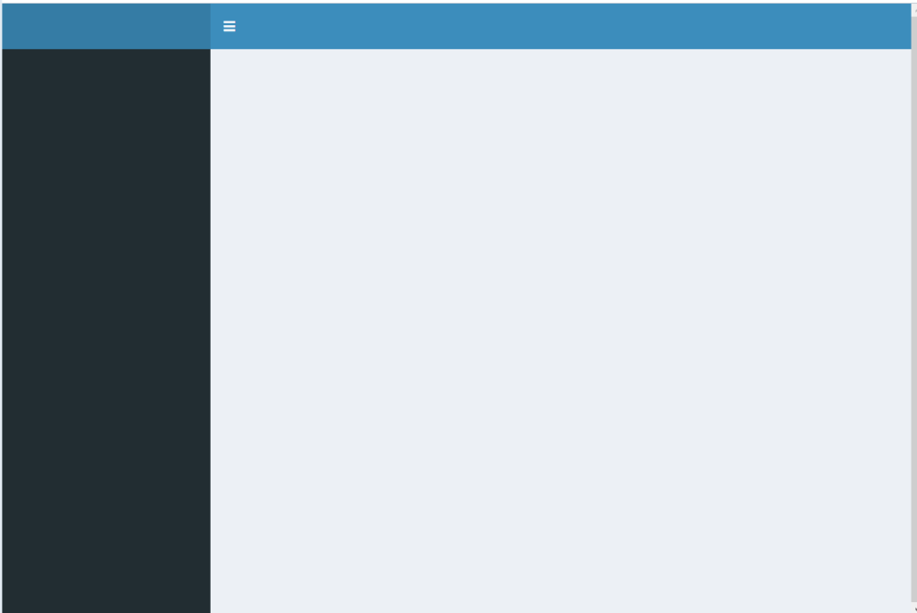
This code creates an empty dashboard Page like this:
Similar to all other Shiny Apps, all you need to do is to add components to each of these portions of the dashboard page to create the UI you want. In this dashboard, I would want to have a title, followed by big boxes at the top displaying the number of confirmed cases, deaths, recovery and cases still in care in real time. The valueBoxOutput() component from shinydashboard is perfect for this. I would also like to have two plots, one to plot the map, and one to put the time series data. Therefore I put in two plotOutputs(), from vanilla shiny:
ui <- dashboardPage(
#Create header. Title need extra space
dashboardHeader(title = "COVID-19 Data Visualisation Dashboard v1", titleWidth = 450),
#Create sidebar
dashboardSidebar(
),
#Create dashboard main panel
dashboardBody(
#Boxes to display total number of cases in each category
valueBoxOutput(outputId = "Total_Confirmed", width = 3),
valueBoxOutput(outputId = "Total_Deaths", width = 3),
valueBoxOutput(outputId = "Total_Recovered", width = 3),
valueBoxOutput(outputId = "Total_Current", width = 3),
#plots to display the data
plotOutput(outputId = "Map"),
plotOutput(outputId = "TimeSeries"),
)
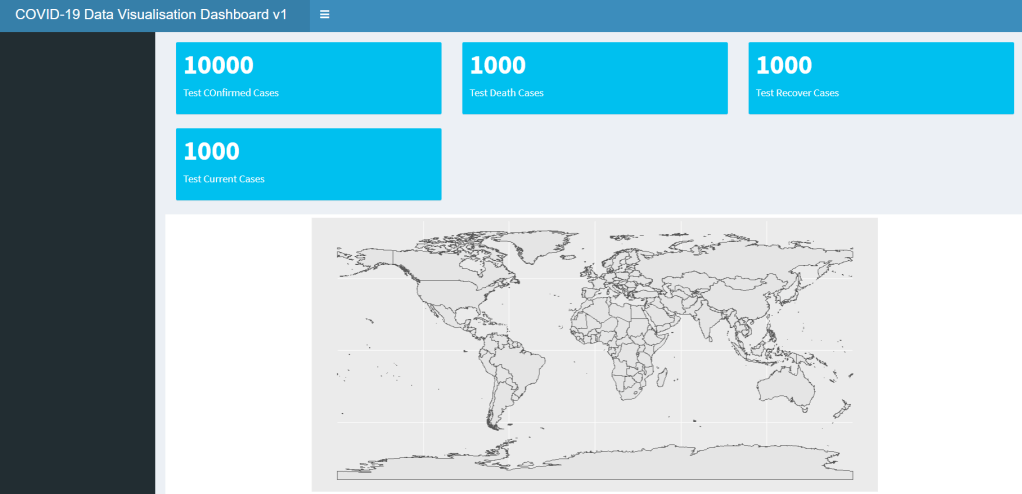
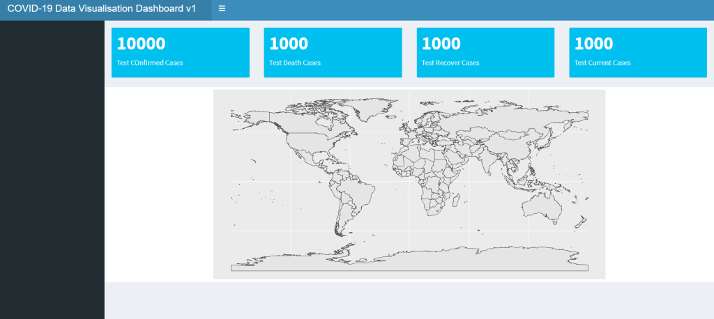
)Note that for each of these XXXOutput() functions which creates various components of the UI, it would always have an argument outputId = id_string. This argument is very important as it is the way in which the server code can call upon the output, so name them wisely. If you run the dashboard now (we will go into how to insert the data later), you will see that the boxes and plots would be like this:
But this is not what I want. I want to have the value boxes right on the top in a row. To format the dashboard page, two important functions in shiny can be used: fluidRow() and column(). As the names suggested, the fluidRow() let you arrange component in rows and column() arrange in component in columns. Here, we use fluidRow() to put these components in rows (we will be using column() later):
dashboardBody(

   #First row: Big boxes displaying the total number of cases for each category as of the latest data
   fluidRow(
     valueBoxOutput(outputId = "Total_Confirmed", width = 3),
     valueBoxOutput(outputId = "Total_Deaths", width = 3),
     valueBoxOutput(outputId = "Total_Recovered", width = 3),
     valueBoxOutput(outputId = "Total_Current", width = 3)
   ),

   #Second row: Plotting of the Map
   fluidRow(
     plotOutput(outputId = "Map")
   ),

   #Empty rows to seperate out the two graphs
   br(),
   br(),
   br(),

   #Third row: Plotting of time series plot
   fluidRow(
     plotOutput(outputId = "TimeSeries")
   )
)
Which gives the following:
This is much better. Now that we have the outputs, let’s think about the input components. The data is universal, and so I will not put any components relating to the loading of the data. However, I would like to be able to select to plot or display different data. In particular, what I want is the ability to choose the case category (confirmed, deaths, recovered or current) in the map and the time series plot. For the map, there should be an option to choose the date and region in which the plot is showing, and for the time series, the evolution of the cases for each individual countries reported. To do that, let’s make use of the selectInput() and dateInput() components:
#The following creates the UI for the dashboard
ui <- dashboardPage(
  #Create header. Title need extra space
  dashboardHeader(title = "COVID-19 Data Visualisation Dashboard v1", titleWidth = 450),

  #Create sidebar for selections that is universal for all graphs. Here, selecting the type of case to be viewed
  dashboardSidebar(
    mainPanel(
      selectInput(inputId = "Cases", label = "Select A Category to View", choices = c("Confirmed", "Deaths", "Recovered", "Current")),
    width = 12)
  ),

  #Create dashboard main panel
  dashboardBody(

    #First row: Big boxes displaying the total number of cases for each category as of the latest data
    fluidRow(
      valueBoxOutput(outputId = "Total_Confirmed", width = 3),
      valueBoxOutput(outputId = "Total_Deaths", width = 3),
      valueBoxOutput(outputId = "Total_Recovered", width = 3),
      valueBoxOutput(outputId = "Total_Current", width = 3)

    ),

    #Second row: Plotting of the Map, and inputs for map display. The Date and region can be selected for the map view
    fluidRow(
     column(10, plotOutput(outputId = "Map")),
     column(2,
            dateInput(inputId = "Date", label = "Select A Date to View", value = Sys.Date(), min =
                       "2020-01-22", max = Sys.Date()),
            selectInput(inputId = "Location", label = "Select A Region to View", choices = c("The
                         World", "East Asia", "North America", "South America", "Europe", "Middle East",
                         "Australisia", "Africa"))
           ),
    ),

    #Empty rows to seperate out the two graphs
    br(),
    br(),
    br(),

    #Third row: Plotting of time series plot, and inputs for the time series. Time series for each country can be selected and viewed
    fluidRow(
      column(10, plotOutput(outputId = "TimeSeries")),
      column(2, selectInput(inputId = "Countries", label = "Select A Country/Region", choices = c("All",
               as.character(df_confirm_world$Category)))
            )
    )
  )
)
Note that similar to the output components, XXXInput() all have the inputId = id_string argument to allow the server to identify the inputs. The inputs also have additional argument for specifying the text and initial values or selectable values associated with the inputs. In this case here, the date selectable would be from the 22/1/2020 (when the data was first recorded) to today, various geographical regions are selectable for the map view, and the list of countries in the data table, as well as an option to view the whole world (“All”) is selectable for the time series. I have also invoked the column() function here, to align the input components with the appropriate plots. Since the selection for the case to display is a universal input for both plots, it is instead placed on the sidebar to control the whole page.
Now that the UI is completed, let’s look at the server side. This is the backbone of the dashboard, where all the calculations take place. It is also where it reacts to the reactive components in the dashboards, i.e, the inputs, and display the outputs accordingly. Note that the loading of the data is placed outside of the server code, as the UI code also requires the data to get some of the selections. The data is loaded directly from JHU Github page, and then various operations are done on the data the organise and clean the data. Notably, the data needed to be aggregated to get a total of the data in each country (and the world), and some of the countries needed to be renamed to match the country names in the mapping package (more on this next). The full code can be found in my Github page here.
The most important part in the server code is the ability to react to changes in the inputs in the UI and change the output accordingly. This is done by renderXX() functions with XX corresponding to the specific components that were specified in the UI. For example, to display the total number of cases in the value boxes, renderValueBox() is used:
server <- function(input, output){

  #Display the total cases in the corresponding value boxes
  output$Total_Confirmed <- renderValueBox({valueBox(total_confirmed, "Confirmed Cases")})

  output$Total_Deaths <- renderValueBox({valueBox(total_deaths, "Deaths")})

  output$Total_Recovered <- renderValueBox({valueBox(total_recovered, "Recovered")})

  output$Total_Current <- renderValueBox({valueBox(total_current, "Still in Care")})

}
Noted here that the output of the renderXX() function is assigned to the desired output using output$outputId in order for the UI to know what the output should be. The resulting value boxes will look like this:

Note that in this case here, these outputs are not dependent on any input. For the plots though, the inputs affect how the plots are displayed. For example, for the time series plot, the plot should show either confirmed, deaths, recovered or current cases for the country selected. Similar to the output, we use input$inputId to access the corresponding inputs:
#Display time series plot
output$TimeSeries <- renderPlot({
#Again, select the appropriate dataframe, as well as giving it a color
if (input$Cases == "Confirmed"){
df_data2 <- df_confirm_world
display_case <- "Confirmed Cases"
color = "#0072B2"
}
if (input$Cases == "Recovered"){
df_data2 <- df_recover_world
display_case <- "Recovered Cases"
color = "#CC79A7"
}
if (input$Cases == "Deaths"){
df_data2 <- df_death_world
display_case <- "Casualties"
color = "#D55E00"
}
if (input$Cases == "Current"){
df_data2 <- df_current_world
display_case <- "Current Cases"
color = "#009E73"
}
#Depending on which country is selected to select only those rows of that country
#special case when all is selected - data on each date is summed to get the world total
#A dataframe is create to put the date and data into columns
if (input$Countries == "All"){
display_country <- "the World"
df_time<- data.frame("Date" = colnames(df_data2[,c(2:length(df_data2))]),
"Data" = colSums(df_data2[,c(2:length(df_data2))], na.rm = TRUE))
}
else{
display_country <- input$Countries
print(input$Countries)
df_time<- data.frame("Date" = colnames(df_data2[,c(2:length(df_data2))]),
"Data" = as.numeric(df_data2[as.character(df_data2$Category) ==
as.character(input$Countries), c(2:length(df_data2))]))
}
#turn Dates into actual dates
df_time$Date <- as.Date(sapply(as.character(df_time$Date), decode_date))
#generate plot
#Plot both line and points, appropiate title, and split the date scale appropiately. Also adjust plot margin for it to match the width of the map above better
ggplot(df_time, aes(x=Date, y=Data)) + geom_point(color = color, size = 3) + geom_line(color =
"black", size = 1) +
ggtitle(paste(display_case, " in ", display_country, " by Date", sep = "")) +
scale_x_date(date_breaks = "7 days", date_minor_breaks = "1 day") + labs(x = "Date", y= "Cases") +
theme(plot.background = element_blank(), plot.title = element_text(face = "bold"), plot.margin = margin(t=0, r=5.9, b=0, l=0.68, unit = "cm"))
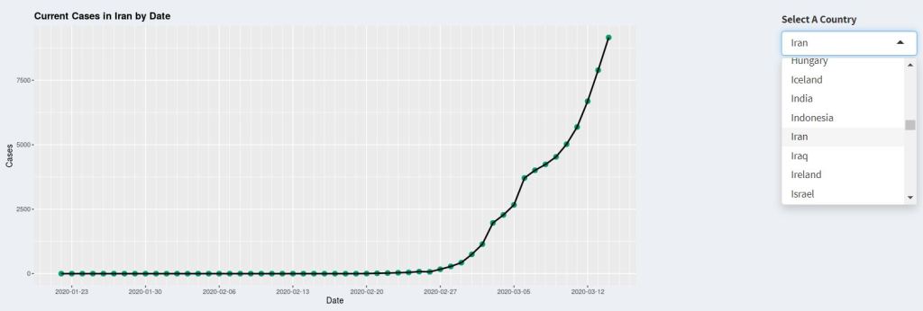
}, bg="transparent", execOnResize = FALSE)Note how the corresponding dataframe is selected depending on the Case input, and the corresponding rows (or the sum of all rows for displaying total for the world) is selected depending on the Country input. Finally, the plot is plotted using ggplot(). It is important to encase all the code for selection and plotting within the renderPlot() function. That is because the reactive component, i.e. input$input_Id, can only be referred to within a renderXX() function. The renderPlot() function would display the last thing that is plotted, just like a standard function return. Furthermore, whenever the input values changes, the renderPlot() function would update, generating the new plot. The time series plot on the dashboard would look something like this:
For the map, the geographical display of the data is achieved by using the sf and rnaturalearth packages. The sf package is R’s Simple Feature implementation. The Simple Feature is a formal ISO standard for representing real world data, with geospatial emphasis. In this standard, each data set (feature), which can be anything from numerical data to images, have a “geometry” which describes its position or location on earth. The sf package in R therefore allows geospatial data in Simple Feature format to be interpreted by common R packages such as ggplot2. For example, for the plotting and display of data on a map, the data needs to be mapped to an appropriate “polygons” to specifies the boundaries of the region to be plotted, for example, a country, a province, or a suburb. By providing the data and the associated polygon in the simple feature format using the sf package, the map can then be plotted by ggplot2 using geom_sf().
The actual polygons of different regions, countries and states in the world is provided by the rnaturalearth and the rnaturalearthdata package. Therefore, to plot the associated COVID-19 data on the map, the world map is first extracted from the rnaturalearth package, and then the corresponding COVID-19 data (e.g. the data for confirmed cases) is joined onto the world map data using left_join():
    #Load in world data which contains the polygons required for mapping
    world <- ne_countries(scale = "medium", returnclass = "sf")

    #Combine the COVID-19 data with the world map data based on the country name
    combined_data <- left_join(world, df_data, by = c('name' = 'Category'))
This is where the naming of the countries is important. The country names in the two table must be the same in order for left_join() (or any other joins for that matter) to work. To represent the data (number of cases) as a colour on the map, I created data bins to allow the number of cases to be plotted as different colours on the plot according to the data bins:
#Bin data into appropiate bins to allow colour scale display
combined_data$Column_Plot[is.na(combined_data$Column_Plot)] <- 0
breaks <- c(-Inf, 0, 50, 100, 500, 1000, 5000, 10000, 50000, +Inf)
names <- c("None Reported", "1 - 50", "50 - 100", "100 - 500", "500 - 1000", "1000 - 5000", "5000 -
10000", "10000 - 50000", "50000+")
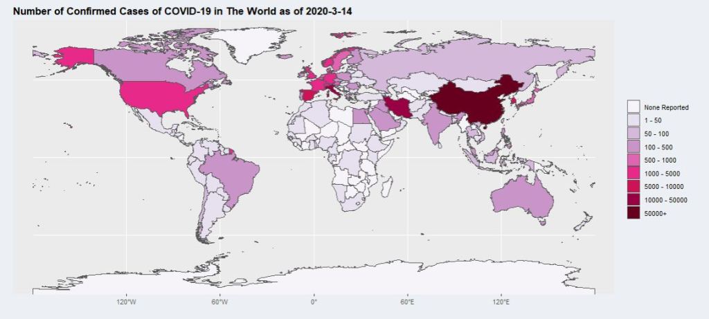
combined_data$data_bin <- cut(combined_data$Column_Plot, breaks = breaks, labels = names)This results in a map like this:
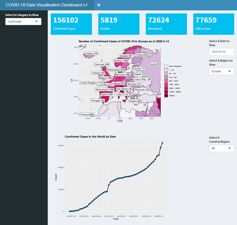
Which is good, but hard to see for smaller countries. This is where the viewing regions comes into play. For each viewing region selected, a coordinate limit is assigned, which is then added to the ggplot using coord_sf() to limit the extend in which the map is plotted. This allows the users to look at their region of interest in more details. Finally, using package ggrepel function geom_label_repel(), labels can be put on the map to display the number of cases for the countries exceeding a certain threshold:
#Limits the Long and Lat of the map displayed, and limit the labels being displayed to within the displayed region
    if (input$Location == "The World"){
      latitude = c(-80, 80)
      longitude = c(-175, 175)
      label_data <- subset(combined_data,
                             Column_Plot > threshold_world)
    }
    else if (input$Location == "East Asia"){
      latitude = c(-5, 45)
      longitude = c(90, 150)
      label_data <- subset(combined_data,
                             (as.character(continent) == "Asia" &
                                (as.character(region_wb) == "East Asia & Pacific")))

    }
    else if (input$Location == "Middle East"){
      latitude = c(0, 45)
      longitude = c(30, 90)
      label_data <- subset(combined_data,
                        (as.character(continent) == "Asia" &
                          (as.character(region_wb) == "Middle East & North Africa" |
                             as.character(region_wb) == "South Asia")))
    }
    else if (input$Location == "Europe"){
      latitude = c(30, 70)
      longitude = c(-25, 45)
      label_data <- subset(combined_data,
                             (as.character(continent) == "Europe"))
    }
    else if (input$Location == "North America"){
      latitude = c(15, 75)
      longitude = c(-170, -45)
      label_data <- subset(combined_data,
                             (as.character(continent) == "North America"))
    }
    else if (input$Location == "South America"){
      latitude = c(-60, 10)
      longitude = c(-105, -30)
      label_data <- subset(combined_data,
                             (as.character(continent) == "South America"))
    }
    else if (input$Location == "Australasia"){
      latitude = c(-50, -5)
      longitude = c(105, 180)
      label_data <- subset(combined_data,
                           (as.character(continent) == "Oceania"))
    }
    else if (input$Location == "Africa"){
        latitude = c(-35, 37.5)
        longitude = c(-25, 53)
        label_data <- subset(combined_data,
                             (as.character(continent) == "Africa"))
    }


 #Generate the plot.

    ggplot(data = world) + geom_sf() +
        #Color in countries according to the number of cases. A Purple to Red Palette is used.
        geom_sf(data = combined_data, aes(fill = data_bin)) +
        scale_fill_brewer(palette = "PuRd", drop = FALSE) +

        #Add labels for countries above threshold cases within the displayed map, use geom_label_repel to make sure they do not overlap
        geom_label_repel(data= label_data[((label_data$Column_Plot) > threshold_region),],aes(x=Long, y=Lat, label= paste(name, Column_Plot, sep = ":"))) +

        #Aesthetics - make background transparent, bold title, remove legend title, make it transparent
        theme(plot.background = element_blank(), plot.title = element_text(face = "bold"), legend.title = element_blank(), legend.background = element_blank()) +

        #Limit coordinates of the map according to region selected
        coord_sf(xlim = longitude, ylim = latitude, expand = TRUE) +

        #Add title according to case type, date, and location
        ggtitle(paste("Number of ", display_case, " of COVID-19 in ", input$Location,  " as of ", display_date, sep = ""))
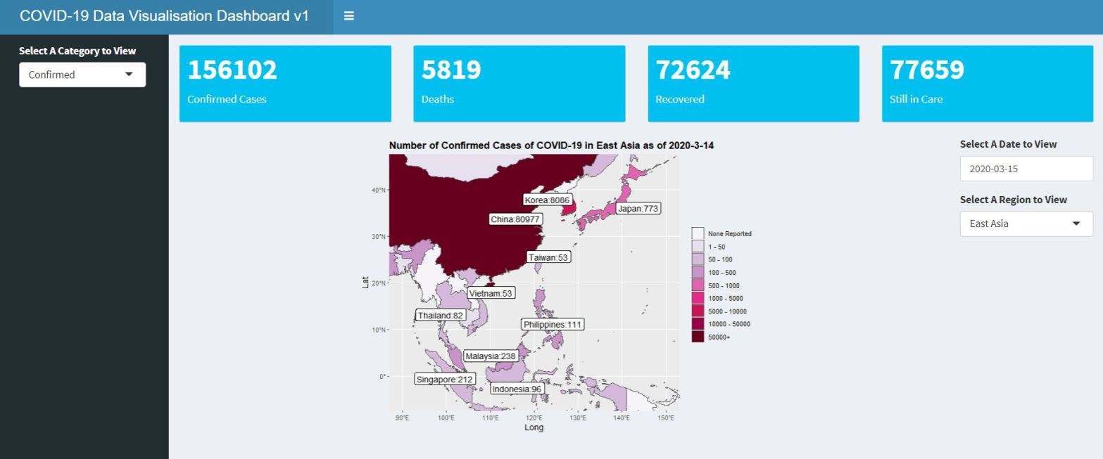
The final dashboard looks something like this (the full code for the dashboard can be found in my Github page, and the actual dashboard can be found here):
So this is how a simple dashboard can be created using R. This is, of course, a very simple dashboard, and with more work and packages one may create more sophisticated dashboard using Shiny. For example, using Leaflet with Shiny can allow more sophisticated interactive maps. But I hope that this article can give you some inspirations into making dashboards for sharing unique data visualisations.
