In the last blog I have shown how to create word vectors using Python gensim‘s Word2Vec implementation and a large number of text as inputs, as well as the powerful features of similarities and analogies in the word vector space. In this blog, I will show how these word vectors can be used to further classify documents, using an unsupervised clustering algorithm.
Word Vector Recap
In the last blog, I have introduced the concept of word vectors – vectors associated with each word that appears in a list of documents. These vectors are assigned in such a way that the context of the word, i.e. the words that surrounds each word of interest, is taken into account. The Word2Vec mode is one way to form these word vectors, and involves training the model via a neural network with each pair of focus and context words as input. Gensim provides an implementation for the Word2Vec algorithm that allows the creation of word vectors from a list of documents pretty easily.
As discussed also in the last blog, two of the most powerful features are the similarity and analogy properties of word vectors. Both of these sprung from the fact that the dimensions of word vectors are actually encoding information related to the meaning of a word (within the scope of the input documents), and therefore, the distance between each word vector and the position of each vector related to each other actually mean something. Hence once the words are encoded as word vectors, we can start to use standard machine learning techniques to classify and/or predict the meaning of words within the word vector space.
Representing a document
Of course, predicting or classifying the meaning of a single word is not very interesting nor very useful. But with these word vectors, it is easy to convert multiple words into a vector form, allowing predictions and classification of meanings of sentences, paragraphs, and documents. The simplest way to do this is to simply average the word vectors of all the words in a document to obtain a single vector for the document. This make sense as a document about finance for example would have more words related to finance and money, and so averaging of the word vectors in the document would obtain a vector that is in general in the “finance” direction, verses another document that is about animals for example. In practice, this simple averaging words reasonably well, and this is what we will be using here.
Again, we will be using the COVID-19 literature research Kaggle challenge as an example. To recall, we have selected about 10k articles from the previous topic modelling and now we will be looking at the abstracts of these articles. To form average word vectors for each documents, we do the following:
#Turn abstract into a single vector by averaging word vectors of all words in the abstract
def abstract2vec(abstract):
    vector_list = []
    for word in abstract:
        #seperate out cases where the word is in the word vector space, and words that are not
        if word in w2v_model.wv.vocab:
            vector_list.append(w2v_model[word])
        else:
            vector_list.append(np.zeros(300))
    #In case there are empty abstracts, to avoid error
    if (len(vector_list) == 0):
        return np.zeros(300)
    else:
        return sum(vector_list)/len(vector_list)

#Store tokens into dataframe and turn it into vectors
df_selected['sentences'] = tokenised_sentences
df_selected['avg_vector'] = df_selected['sentences'].apply(lambda x: abstract2vec(x))
Two things of note here. Firstly, refer to my previous blog on the format of tokenised_sentences. Essentially, this list of word tokens is the result of tokenisation of the abstract, after the application of text preprocessing steps including lower casing, punctuation removal, and lemmatization. The list tokenised_sentences is essentially the processed form of all the abstracts of the articles selected, that was used to train the Word2Vec model w2v_model. The other thing worth noting the addition of error catchers, just to make sure that if words that are not in the word vector space is passed into the function, it can return a zero vector rather then throwing an exception.
Clustering Analysis
Now that each abstract is presented by a single vector avg_vector, we can apply clustering analysis to group the abstracts into clusters. Clustering analysis is a unsupervised learning technique, and as the name suggests, attempts to put the unlabelled data into clusters. Each clusters would have data points (vectors) that are geometrically close to each other, and therefore data points within a cluster can be consider similar. In our case here, this would implying that the abstracts that lies in the same cluster talks about similar subjects. This is similar to topic modelling, but instead of using a bag-of-word and term frequency approach, the context and relationship between words are taken into account.
To perform unsupervised clustering analysis, we can use the k-means clustering algorithm. K-means works by first randomly assigning the centroid (mean vector) of each cluster, and assigns each vector to a cluster based on the centroid it is closest to. After assignment, the cluster centroid is updated to the mean of all vectors assigned to the cluster, and then each vector is assigned again based on the new centroids. This is continued until the centroids does not move, and the clusters are formed from the final assignment. In Python, K-means can be implemented using sci-kit learn‘s Kmeans() :
from sklearn.cluster import KMeans
from sklearn.preprocessing import StandardScaler

# Turn data in an array as input to sklearn packages
X = np.array(df_selected.avg_vector.to_list())

#Perform standard scaling and kmeans strongly affected by scales
sc = StandardScaler()
X_scaled = sc.fit_transform(X)

#Obtain cluster labels
km_model = KMeans(init='k-means++', n_clusters=20, n_init=10, random_state = 1075)
cluster = km_model.fit_predict(X_scaled)
Note that clustering algorithms, in particular K-means, is very sensitive to the scale of the dimensions, and therefore it is important to make sure the inputs are all normalised before putting through the model. The sci-kit learn implementation Kmeans() has a number of parameters as inputs. In particular, the init parameter allows the initialisation method to be specified. The default is k-mean++, an initialisation algorithm for k-means that is more efficient and guarantees a convergence. The n_init parameter specify how many times the K-means is ran with different initial centroids, and the best output is used as the final output.
One of the most important hyperparameter for a K-means algorithm is n_cluster, the number of clusters to form. There is no way to know (for most real data) how many cluster is sensible for a set of data a priori, and therefore, it needs to be tuned as a hyperparameter. The two metrics that are commonly used to assess the wellness of a K-means model are inertia and silhouette score.
Inertia measures how close each data point is to the centre of their cluster. It is defined as the sum of square distance between each data point and the centre of their cluster. For a good cluster model, we expect the samples that are classified as belonging to the same cluster should be close to their cluster centre. Therefore, we expect the inertia to be small. In relation to optimising the number of clusters using inertia, it should be noted that the inertia will always decrease with the number of clusters, as increasing the number of cluster will inevitably decrease the distance between data points and their cluster centre. Hence, a so call “elbow” method is often used to determine the number of cluster used: the optimal number of cluster is where the rate of decrease of inertia with increasing number of clusters starts to slow down significantly. This can be visually determined by plotting inertia score vs the number of clusters, and identifying where the curve bends flat – like the elbow of someone’s arm resting on a table.
The following code shows how the elbow method can be implemented for our example here:
#Form kmeans model with cluster size from 2 - 100, and record the inertia, which is a measure of the average distance of each point
#in the cluster to the cluster centroid
sum_square = []
for i in range(2,100,5):
    km_model = KMeans(init='k-means++', n_clusters=i, n_init=10)
    cluster = km_model.fit_predict(X_scaled)
    sum_square.append(km_model.inertia_)


x = range(2,100,5)
plt.figure(figsize=(20,10))
plt.plot(x,sum_square)
plt.scatter(x,sum_square)
plt.title('Sum of square as a function of cluster size')
plt.xlabel('Number of clusters')
plt.ylabel('Sum of square distance from centroid')
plt.show()
which produces the following graph:
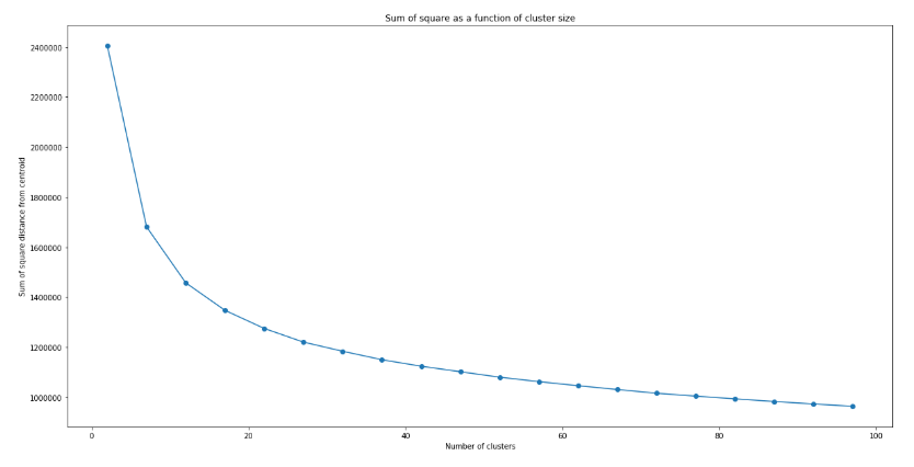
Unlike typical examples shown on the web (such as the iris dataset), there is not really a clear indication of where exactly the elbow is. This is typical of real data, where the data are not necessarily separated in a way that there is a “correct” number of cluster. However, it can be seen clearly that the decrease in inertia with increasing number of clusters n does slow down, with a slow “inflection” of the curve happening around n = 15 – 25. We can therefore use this to narrow down the optimal n to be within this range.
To further obtain the optimal value of n, we can further apply the silhouette analysis. The silhouette score measures the separation of clusters. In particular, the silhouette score measures the distance between a data point and data points in neighbouring clusters. If the silhouette score is close to +1, that means the data point are very far from neighbouring clusters. If the silhouette score is close to 0, that means the data point is close to the boundary of neighbouring clusters. If silhouette score is close to -1, that means that the data point is wrongly assigned. Therefore, by looking at the average value of silhouette score, we can tell how well the clusters are separated, and hence the wellness of the model. The silhouette score of a good cluster model should be close to 1.
Similar to the elbow method, we can form K-means model with different number of clusters and plot the silhouette score as a function of the number of clusters. And the optimal n would be where a global maximum of silhouette score is achieved. As an optimal range has already been identified using the elbow method above, the step size can be reduced:
from sklearn.metrics import silhouette_samples, silhouette_score

#Sweep from 10 to 30 (range around the elbow) and look for the record the silhouette score
silhouette = []
model_list = []
cluster_list = []
for i in range(10,30,1):
    km_model = KMeans(init='k-means++', n_clusters=i, n_init=10, random_state = 1075)
    cluster = km_model.fit_predict(X_scaled)
    model_list.append(km_model)
    cluster_list.append(cluster)
    silhouette.append(silhouette_score(X_scaled, cluster))


#Plot to observe the maximum silhouette score across this range
x = range(10,30,1)
plt.figure(figsize=(20,10))
plt.plot(x,silhouette)
plt.scatter(x,silhouette)
plt.title('Silhouette score as a function of number of clusters')
plt.xlabel('Number of clusters')
plt.ylabel('Silhouette Score')
plt.show()
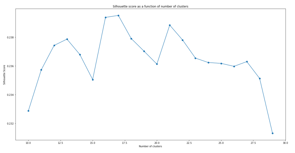
It can be seen that the models do not have a very impressive silhouette score. Even at the maximum, the silhouette score is only slightly below 0.24. Furthermore, there doesn’t seem to be a clear maxima. In fact, the maxima actually change with successive runs of the same script, although the silhouette score stays pretty similar with number of clusters within this range. While the low silhouette score shows that the clustering models do not separate the clusters all that well, let’s continue analysis with the best model we have – i.e. model with n = 17.
Before using these clusters, one might want to visualise them to see how well the clusters are separating the data points. One way to visualise these clusters using t-SNE (T-distributed Stochastic Neighbor Embedding). t-SNE is dimension reduction technique designed for visualisation in mind. Python sci-kit learn provides a t-SNE implementation in sklearn.manifold which can be used for visualising our cluster model. However, even with t-SNE, a dimension of 300 is too much to plot. PCA can be applied to bring the overall dimension to about 50 prior to t-SNE to allow a better visualisation:
from sklearn.decomposition import PCA
from sklearn.manifold import TSNE

#Create Principal components
pca = PCA(n_components=50)
X_reduced = pca.fit_transform(X)

#Create t-SNE components and stored in dataframe
X_embedded = TSNE(n_components=2, perplexity = 40).fit_transform(X_reduced)
df_selected['TSNE1'] = X_embedded[:,0]
df_selected['TSNE2'] = X_embedded[:,1]

#plot cluster label against TSNE1 and TSNE2 using different colour for each cluster
color = ['b','g','r','c','m','y','yellow','orange','pink','purple', 'deepskyblue', 'lime', 'aqua', 'grey', 'gold', 'yellowgreen', 'black']
plt.figure(figsize=(20,10))
plt.title("Clusters of abstract visualised with t-SNE")
plt.xlabel("PC1")
plt.ylabel("PC2")
for i in range(17):
    plt.scatter(df_selected[df_selected['cluster'] == i].TSNE1, df_selected[df_selected['cluster'] == i].TSNE2, color = color[i])
plt.show()
It is worth noting that TSNE() also takes in a parameter perplexity, which strongly affects how the visualisation look. The value perplexity = 40 was chosen to give in my eyes the best visualisation of the clusters. The resulting graph is shown below:
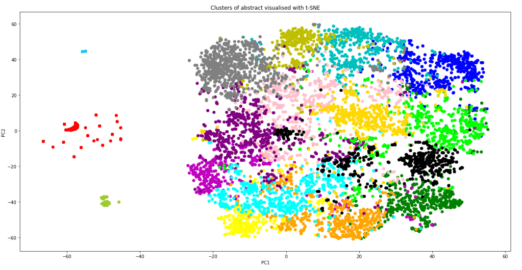
The graph shows that apart of some of the outlying data points (which correctly form their own cluster), most of the data point lies in one giant cluster at the centre, not very well separated from each other. This explains why even with the best model, the silhouette score is quite close to zero. However, it should also be kept in mind that the graph above is a projection of 300 dimensions into a 2D space, so in the actual 300 dimension space, the clusters are probably more separated than as indicated from this plot. From the graph, we can also see that the K-means model have done a relatively good job in separating the data point into clusters. Not only did the model correctly separate out the outlying data as individual clusters, it is also clear that most of the clusters are localised, and are rarely spreading out across the 2D-space or smearing and overlapping into each other. Inevitably there are overlaps between some clusters, but it is performing much better than I thought it would.
With the clusters in place, we can how select the cluster which most represent the questions that was specified in the task list. We can do that by simply using the K-means model to predict what cluster would our questions fall into:
#Take the questions from the question list and clean using the same function
q_cleaned = [abstract_cleaner(x) for x in question_list]
#Create tokens from the bigram phraser
q_words = [q.split() for q in q_cleaned]
q_tokens = bigram[q_words]
#Turn tokens into a single summary word vector
q_vectors = [abstract2vec(x) for x in q_tokens]
#Predict cluster based on the summary word_vector
question_cluster = model_list[7].predict(q_vectors)
print(question_cluster)
It is crucial that the questions needs to be formatted and cleaned the same way as the abstract, including application of the bigram model and averaging word vectors to form a single “sentence vector”, before passing into the K-means model for cluster prediction. This is the output printed out on the screen:

Incredibly, all of the 12 questions posed on the task page are predicted to fall into a single cluster #8. This means that we can narrow down to just one cluster of articles for review when considering literature search for finding answers for these questions. To confirm that this cluster makes sense, let’s visualise the top words of this cluster using a word cloud. This can be done by first extracting the top words using CountVectorizer():
from sklearn.feature_extraction.text import CountVectorizer

#Make tokens back into a string
df_selected['sentence_str'] = df_selected['sentences'].apply(lambda x: " ".join(x))
#Perform Count Vectorize to obtain words that appeared most frequently in these abstracts
main_cluster = mode(question_cluster)
cv = CountVectorizer()
text_cv = cv.fit_transform(df_selected[df_selected['cluster'] == main_cluster].sentence_str)
dtm = pd.DataFrame(text_cv.toarray(), columns = cv.get_feature_names())
top_words = dtm.sum(axis = 0).sort_values(ascending = False)
topword_string = ",".join([x for x in top_words[0:40].index])
Once the top words are available and put into a string, the wordcloud package can be used to put the words into a word cloud image very easily:
from wordcloud import WordCloud

#Create word cloud using the topwords
wordcloud1 = WordCloud(width = 800, height = 600,
                background_color ='white',
                min_font_size = 10).generate(topword_string)


# plot the WordCloud image

plt.figure(figsize=(10,6))
plt.imshow(wordcloud1)
plt.title("Word Cloud for Main Cluster")
plt.axis("off")
plt.tight_layout(pad = 0)
plt.show()
the above code produces the following:
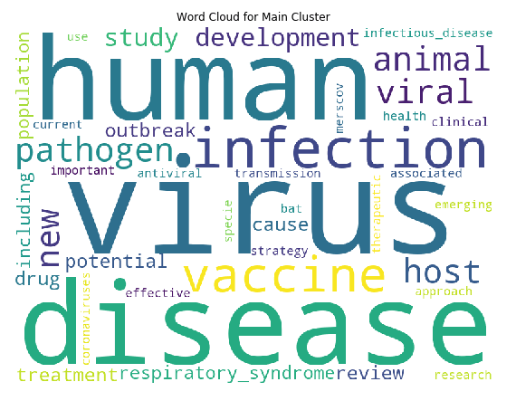
We can see that the top words are “virus”, “human” and “disease” by far, which makes sense as all articles are virus related (we can possibly remove these common words in hindsight, similar to what was done in topic modelling). But importantly, in this cluster, “vaccine” is also one of major keywords. The keywords “drugs”, “antiviral”, “treatment” and “therapeutic” are also in present in the top words of this clusters. Hence the clustering has worked quite well to identify the cluster of articles that we need according to our task, which is vaccines, treatments, and therapeutics for COVID-19. Finally, let’s look at how many articles are in this cluster:
df_cluster = df_selected[df_selected['cluster'] == main_cluster]
print("Number of articles in main cluster: ", df_cluster.shape[0])

We have successfully reduced the number of articles from 40k+ to around 600. This is a much more manageable number. We can now start to dive into the full text of these articles and try to automate summarising and extraction of information from these articles. This will be covered in the next blog.
Reference
Tutorial on determining number of clusters in K-means
Scikit-learn official tutorial on using the silhouette score
Tutorial on NLP including use of word cloud (as well as topic modelling)
The Full code on the material in this blog can be find in my Kaggle Notebook
