Finding the Most Desirable Data Science Skills – an Analysis of Data Scientist Job Postings

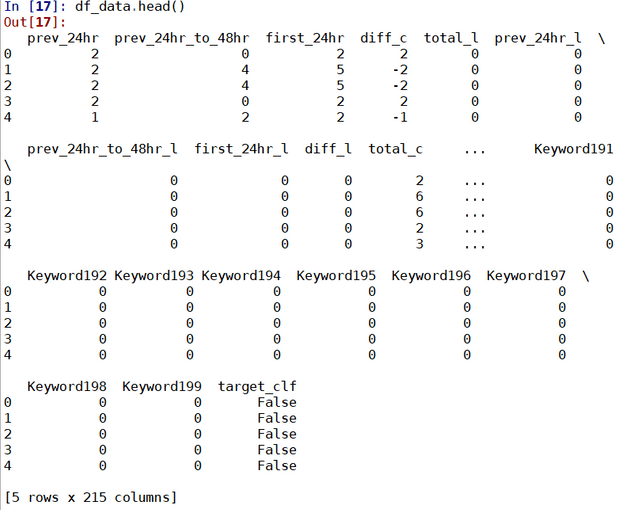
Data Scientist has commonly been referred to as the sexist job in the 21st Century over the last few years. Indeed, as a job which utilises state-of-the-art algorithms straight out of research papers, and often associated with futuristic inventions such as self-driving cars and human-like chatbots, what is not to like about being a data scientist!

But just as not every scientists are working on faster than light travel or time machines, not every data scientists are working on the frontier stuff that gets the most press and publicity. In fact, most data scientists are not working on self-driving cars or face recognition. For someone who wants to be a data scientist, this means the following – mastering deep learning, generative adversarial network or extreme gradient boosting may not actually increase your chance to become a data scientist, as only a very few jobs actually uses these tools. A better way to increase your chance in becoming a data scientist is to master tools or skill sets that are needed for most data scientist positions.

To understand what are the most desirable (hard) skills employers seek for in data science roles, we can look into data science job advertisements. After all, job posting directly reflect what employers are looking for in filling their data science roles. In particular, we could analyse recent online job posting to find out what skills appears the most in data scientist job ads. In Australia, the largest job posting sites are Seek, Indeed and Jora. Let’s focus on the postings on these three websites.

To analyse the job posting, we would need to scrap the information for each posting. This can be broken down into a two parts: extracting the links for each posting that comes up from a search of “data scientist” in each of the site, and extracting the actual text relating to the job posting from each extracted link. In both cases, the key comes down to decoding the html of the webpages of interest.

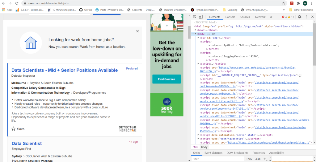
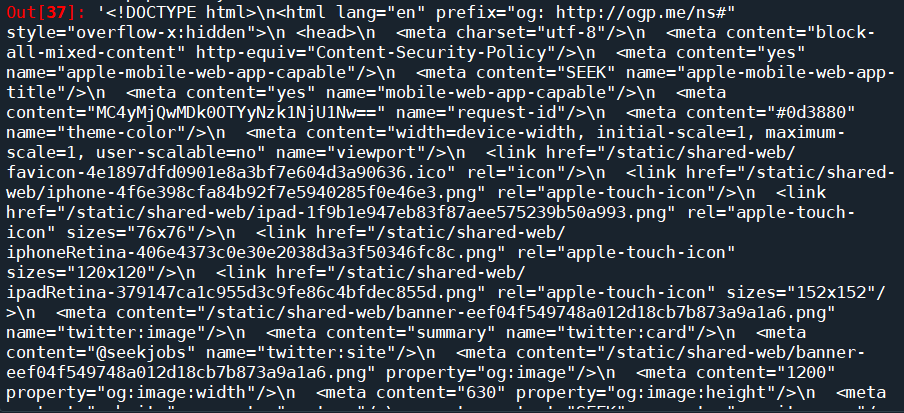
The html code of a webpage can be easily view using a browser. In Chrome, to view the html code, one can use the Developer Tool Option, which can be accessed either by the menus icon (three dots) on the top right of the browser, or by the short cut Ctrl+Shift+I. The following figure shows a typical view of the html code of a search page from Seek:

In Python, there are two key packages for web scraping: request and BeautifulSoup. The package request is used to send requests to web servers for getting the webpage content of a specified URL, while BeautifulSoup is used to parse the html code of the webpage. For example, to obtain the content of the first search page from Seek, we do the following:

    import request
    from bs4 import BeautifulSoup
    
    URL_base = 'https://www.seek.com.au/data-scientist-jobs'
    URL = URL_base + '?page=1' 
    page = requests.get(URL)
    soup = BeautifulSoup(page.content, 'html.parser')

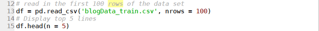
where the URL “http://www.seek.com.au/data-scientist-jobs?page=1” is the exact URL for the first page returned by typing data scientist in the search box. One can print the page content soup by using the print function, or better yet, use the build-in function prettify():

soup.prettify()

which will return the following:

We can see that this is exactly the html code we saw on the browser. We have successfully downloaded the html code of the requested page onto our script. The next step, is to parse the html to find the information that we want. BeautifulSoup provides the function soup.find() which searches through the html soup it just parsed from the webpage for tags and attributes that is passed into the function. There are general tags keywords such as class or id that BeautifulSoup recognises and can be passed relatively easily using the syntax soup.find(tag=tag attribute). It can also take in user-defined tags using the syntax soup.find(tag, attrs = {attribute:value}). So the find() function is pretty flexible and all we need to do is to find out the tags and attributes that corresponds to the part of the page that is of interest to us.

This is actually easier said then done. Firstly, you need to find a tag that has an attribute that is unique to the part of the page of interest, in order for it to be extracted. If an attribute is not unique, other parts of the page would also be extracted and it would be hard to isolate what you really need. Furthermore, if you dig around a complex search page, you will find that a lot of the attributes are random numbers and letters, probably related to how these pages are generated. These attributes are unique, but there is no way to specify it in the code to ensure that it will work every time. Most of the effort therefore comes down to slowly going through the html code on the browser, identifying the exact bits of code that corresponds to the text or the links required, and looking around the code to find a unique tag and/or attribute that can get you to this part of the code in one go.

What are we really looking for? We are looking for two things – a way to access the job pages returned by the search, and the actual content of those pages. Let’s take Seek website for example. If we clicked on one of the job postings returned by a “data scientist” search, it can be seen that the webpage of the search has the following URL:

https://www.seek.com.au/job/50127135?type=promoted#searchRequestToken=dd9e0bdc-de64-4f84-8e05-41fe883e4858

The URL starts with “https://www.seek.com.au/job”, followed by a number “50127135”, followed by a long string starting with a “?”. The part starting with the “?” actually relates to how we arrived to the page, i.e. from the search itself. The actual page can be accessed by simply using the first part of the URL, i.e., “https://www.seek.com.au/job/50127135”. If we then look at a few more jobs, it will be clear that all page URL follows the same format: a base URL “https://www.seek.com.au/job”, followed by an id that is unique to each job posting. It is likely that these job-ids can be found somewhere in the html of the search page. Following the code and keeping an eye on what bit of code corresponds to the search results (putting mouse cursor on a line of code in the chrome developer tool would show which part of the webpage is generated by that code), we find the following code snippet:

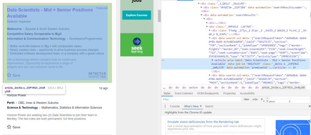
It can be seen that the job-id 50127135 is present in an attribute called “data-job-id” under the article tag. It is clear that each each result is defined by its own article tag, all of which comes under the universal tag <div data-automation = “searchResults> that encloses all search results. Since all these different tags are custom, we need to use the universal tag to extract all instances of articles within the search result, from which the data-job-id can then extracted and stored as job post URLs. This is done (for the first 8 pages of the search) using the following code:

job_link = []
job_title = []
site = []

seek_link = 'https://www.seek.com.au/job/'
URL_base = 'https://www.seek.com.au/data-scientist-jobs'
for i in range(8):
    URL = URL_base + '?page=' + str(i+1)
    page = requests.get(URL)
    soup = BeautifulSoup(page.content, 'html.parser')
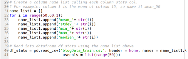
    results = soup.find("div", attrs = {'data-automation':'searchResults'})
    job_list = results.find_all('article')

    for job in job_list:
        job_link.append(seek_link + str(job.attrs['data-job-id']))
        job_title.append(job.attrs['aria-label'])
        site.append('Seek')

So the list of articles are extracted by first isolating the search results using the higher level tag <div ‘data-automation’ = “searchResults”>, followed by finding all article instances under this tag using the find_all() function. The attributes of the article instances can then be simply extracted using the attrs keyword.

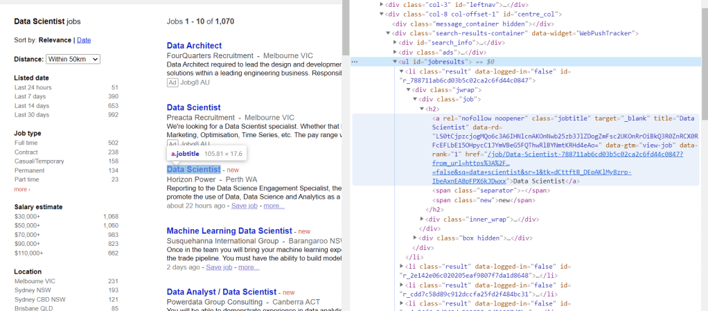
Doing similar detective work on Indeed, the following can be found:

which yields the following code for extracting the URLs:

URL_base = 'https://au.indeed.com/jobs?q=data+scientist'
indeed_link = 'https://au.indeed.com/viewjob?jk='
for i in range(0,80,10):
    URL = URL_base + '&start='+str(i)
    page = requests.get(URL)
    soup = BeautifulSoup(page.content, 'html.parser')
    results = soup.find("td", attrs = {'id':"resultsCol"})
    job_list = results.find_all("div", attrs = {'class':"jobsearch-SerpJobCard unifiedRow row result"})
    title_list = results.find_all("h2", attrs = {'class':"title"})
    for job in job_list:
        job_link.append(indeed_link + str(job.attrs['data-jk']))
        site.append('Indeed')
    for title in title_list:
        job_title.append(re.sub('\n','',title.get_text()))

Similarly for Jora:

URL_base = 'https://au.jora.com/j?l=&p='
jora_link = 'https://au.jora.com'


for i in range(5):
    URL = URL_base + str(i+1) + '&q=data+scientist'
    page = requests.get(URL)
    soup = BeautifulSoup(page.content, 'html.parser')
    results = soup.find("ul", attrs = {'id':'jobresults'})
    job_list = results.find_all('a', attrs={'class':'jobtitle'})
    for job in job_list:
        job_link.append(jora_link + job.attrs['href'])
        site.append('Jora')
        job_title.append(job.get_text())

The only difference here is that for Jora, the sub-link is provided directly rather than deduced from a job id.

The next step is to do exactly the same thing, but looking at individual job posts, to see which part of the code corresponds to the actual text in the job ad, and extract it. Taking again the Seek job post page as an example:

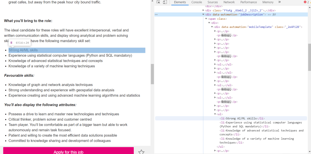
It can be seen that within the text, there are two different types of tags: <p> which corresponds to paragraphs, and <li> which corresponds to lists. Both are part of the text and therefore both needs to be extracted. This is universal for all three websites. The only difference is therefore the actual tag under which these paragraphs and lists are stored. Using this information, a function can be written to extract the text of job posts according to the URL provided and the site that it belongs:

def decode_webpage(company, URL):
    page = requests.get(URL)
    soup = BeautifulSoup(page.content, 'html.parser')
    if company == "Seek":
        results = soup.find("div", attrs={'data-automation':'jobDescription'})
    elif company == "Indeed":
        results = soup.find(id='jobDescriptionText')
    elif company == "Jora":
        results = soup.find("div", attrs = {'class':'summary'})
    
    try:
        job_lists = results.find_all('li')
        job_para = results.find_all('p')
    
        corpus = []
        for l in job_lists:
            corpus.append(l.get_text())
        for p in job_para:
            corpus.append(p.get_text())
    
        return ' '.join(corpus)
    except:
        return " "

The following code then extract and stores the text from each of the extracted links into a dataframe:

import pandas as pd

df = pd.DataFrame(columns = ['job', 'link', 'site', 'content'])
df.job = job_title
df.link = job_link
df.site = site
df.content = df.apply(lambda x: decode_webpage(x.site, x.link), axis = 1)
df.head()

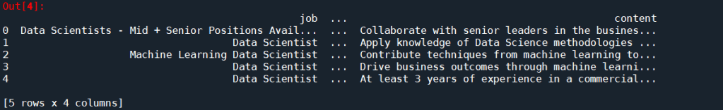
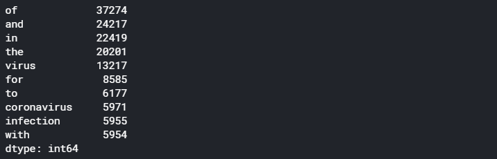
Looks like it worked pretty well. It is time to analyse the text. A simple way to extract keywords is to use the CountVectorizer() to find out what words appear the most. A simple cleaning is also performed on the text prior to the CountVectorizer().

from gensim.parsing.preprocessing import remove_stopwords
import re

def text_cleaner(text):
    
    text = str(text).lower()
    text = re.sub('[%s]' % re.escape(string.punctuation), " ", text)
    text = re.sub('–', "", text)
    text = remove_stopwords(text)
     
    return text


from sklearn.feature_extraction.text import CountVectorizer

df['cleaned_content'] = df.content.apply(lambda x: text_cleaner(x))
cv = CountVectorizer(stop_words = "english")
text_cv = cv.fit_transform(df.cleaned_content)
dtm = pd.DataFrame(text_cv.toarray(), columns = cv.get_feature_names())
top_words = dtm.sum(axis = 0).sort_values(ascending = False)
print(top_words[0:20])

which gives the following results as the top 20 most frequent occurring terms:

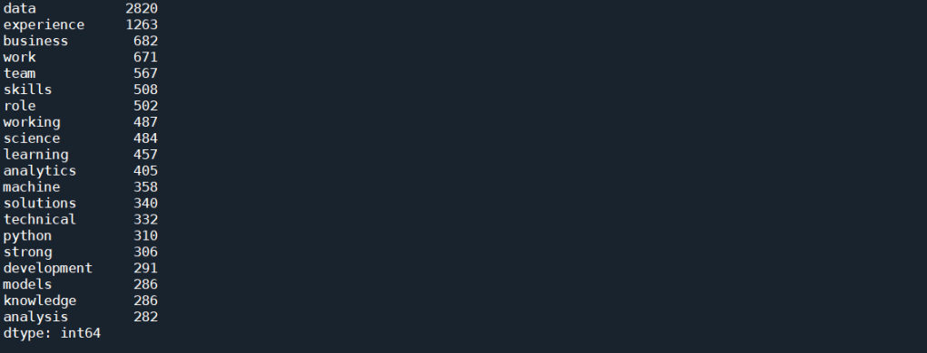
As expected, simply using CountVectorizer() does not yield good results. That’s because we know that each job posts would contain description about the job, description about the company, and other information about the job that is not relevant to this task. These general job related terms will undoubtedly occur more often then the technical skills. We would also expect words such as data and scientists occurs much more often than any other words for a search for “Data Scientist”. All these floods the term-document matrix and stops us from extracting useful information.

A way to combat this is to use Part of Speech (POS) Tag. Each word in a sentence has a role to play in that sentence – a noun, an adjective, an adverb etc. This is known as the Part of Speech. One thing that we notice with all the hard skills for Data Scientist, such as Python, AWS or NLP, are all Proper Nouns, as they are special names for a technique, method, or a software. It may therefore be a good way to isolate the skills present in the text. The nltk package provides a way to tokenise a text, with each token tagged to indicate what POS is each word in a particular sentence. We can therefore write a function to extract all words that are proper nouns in a given piece of text:

def pos_tokenise(text, pos = ['NNP']):
    
    tokens = word_tokenize(text)
    pos_tokens = pos_tag(tokens)
    interested = [x[0] for x in pos_tokens if x[1] in pos]
    
    return list(dict.fromkeys(interested))

where ‘NNP’ is the tag for proper nouns. This tag can be changed to extract out other words such as nouns or adjectives. The occurrence of any words that are repeated many times within a post is also reduced to 1 (using list(dict.fromkeys())). This is because we are only interested in what words appears in most job posts, and not how many times a word appears within one job post. We can then apply this function to the text that extracted from the job ads as follows:

df['nouns'] = df.content.apply(lambda x: pos_tokenise(str(x)))
df['cleaned_nouns'] = df.nouns.apply(lambda x: text_cleaner(" ".join(x)))
df.drop_duplicates(subset = 'cleaned_nouns', keep = 'first', inplace = True)

Note that the cleaning is performed after the nouns were extracted, to avoid turning proper nouns to lower cases which would mean they can’t be detected. Note that here, we are also removing duplicates, as it is very likely that some jobs are posted on multiple sites. Next, we apply the CountVectorizer() again on these proper nouns:

cv = CountVectorizer(token_pattern = r"(?u)\b\w+\b", ngram_range = (1,2))
text_cv = cv.fit_transform(df.cleaned_nouns) 
dtm = pd.DataFrame(text_cv.toarray(), columns = cv.get_feature_names())
top_words = dtm.sum(axis = 0).sort_values(ascending = False)
print(top_words[0:25])

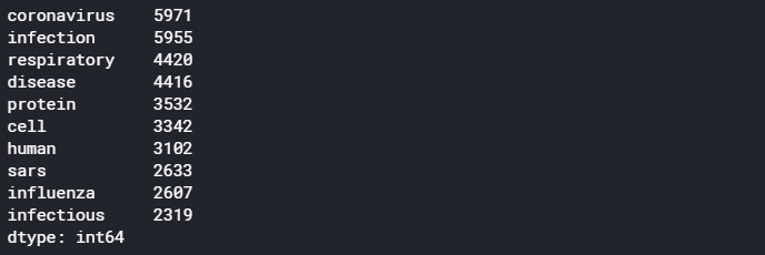
Two things to note here. Firstly, a token pattern “r”(?u)\b\w+\b”” is passed into the CountVectorizer() to take care of tokens that are only 1 letter long, as by default, CountVectorizer() disregard tokens that are less than 2 letter long. This is important as one of the important skills, R, is obviously a single letter token. Another thing to note is that a ngram_range = (1,2) means that n-grams of up to 2 words (i.e. bi-grams) will be considered as a candidate for the vocabulary. The code above produces the following results:

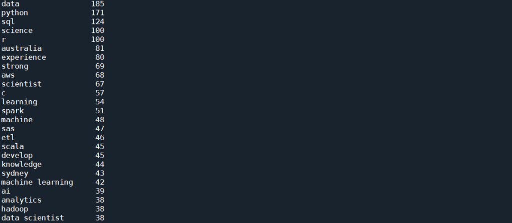
This is much better. We start to see a lot of skills showing up in this top list, which includes Python, SQL, R, AWS, C and Spark. There is still a lot of other words, such as “data” and “science”, and some of them are not even nouns, for example, “develop” or “strong”. This artefact in the result is due to the fact that in most job ads, the required skills are emphasis in lists, which most often then not have every single word’s first letter capitalised. The fact that NLTK simply rely on the capital letter to identify a proper noun result in these words being selected along with what we actually want.

We can look into more sophisticated approach to remove the unwanted words. But from the list above, it can be seen that we are almost there – more than half of those words are actual skills. If the objective is to find the most common skills advertised, the quickest way forward is in fact manually remove the words that we don’t want, since the word list is already down to a manually manageable size. We can therefore look through the list, and manually put the words that we don’t want as stop words, and run the CountVectorizer() again:

stop_word_list = ['data', 'science', 'experience', 'australia', 'scientist', 'strong', 'develop', 'sydney', 'ai', 'analytics', 'engineer', 'phd', 'apply', 'work', 'design', 'knowledge', 'role', 'big', 'proven', 'engineering', 'skills', 'cv', 'research', 'build', 'excellent', 'business', 'ability', 'platform']
cv = CountVectorizer(stop_words = stop_word_list, token_pattern = r"(?u)\b\w+\b", ngram_range = (1,2))
text_cv = cv.fit_transform(df.cleaned_nouns) 
dtm = pd.DataFrame(text_cv.toarray(), columns = cv.get_feature_names())
top_words = dtm.sum(axis = 0).sort_values(ascending = False)
print(top_words[0:25])

which gives the following:

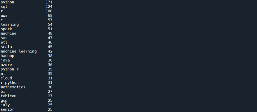
This is already giving us very interesting results. As can be seen from the list, as expected, the top skill that has been most mentioned, listed in 171 posts, is Python. This is followed by SQL and R, both of which are also expected. It is, however, interesting to see that next up is AWS and C (with C representing both C and C++ and C# etc as all punctuation has been removed), followed by Spark, SAS, and perhaps quite unexpectedly, ETL (Extract, Transform, Load) – i.e. database operations. Machine Learning is interesting, in that there are 54 and 48 mentions of Learning and Machine respectively, but only 42 of those actually comes from the bi-gram “machine learning”. However, there is also “ml” which in these job posts are most definitely short hand for machine learning, and therefore should actually be counted towards the total mention.

To visualise these results, we take this list of 25 top terms and further clean it:

important_skills = top_words[0:25]
important_skills.pop('july')
important_skills.pop('senior')
important_skills.pop('learning')
important_skills.pop('machine')
important_skills['machine learning'] = important_skills['machine learning'] + important_skills['ml']
important_skills.pop('ml')
important_skills.pop('python r')
important_skills.pop('r python')
sorted_skills = sorted(important_skills.items(), key=lambda x: x[1], reverse=True)
skills = [x[0] for x in sorted_skills]
occurrence = [x[1] for x  in sorted_skills]

Here, we have combined the counts of machine learning and “ml” to get a true count of “machine learning” in the posts. “python r” and “r python” are also removed, as the count of these will already be included in “python” and “r” individually.

We can now visualise these skills. First, let’s form a word cloud:

from wordcloud import WordCloud

topword_string = ",".join(skills)
topword_string = re.sub("machine learning", "machine_learning", topword_string)
wordcloud1 = WordCloud(width = 800, height = 600, 
                background_color ='white', 
                min_font_size = 10, regexp = r"(?u)\b\w+\b", normalize_plurals = False, 
                relative_scaling = 0, stopwords = set()).generate(topword_string)

plt.figure(figsize=(5,3))
plt.imshow(wordcloud1) 
plt.title("Top skills advertised in Data Scientist Job Ads")
plt.axis("off") 
plt.tight_layout(pad = 0) 
plt.show() 

Note the need to remove all stopwords and specify regexp to include “C” and “R” in the wordcloud. The relative_scaling = 0 means that font size is determined by rank only. The following wordcloud is generated:

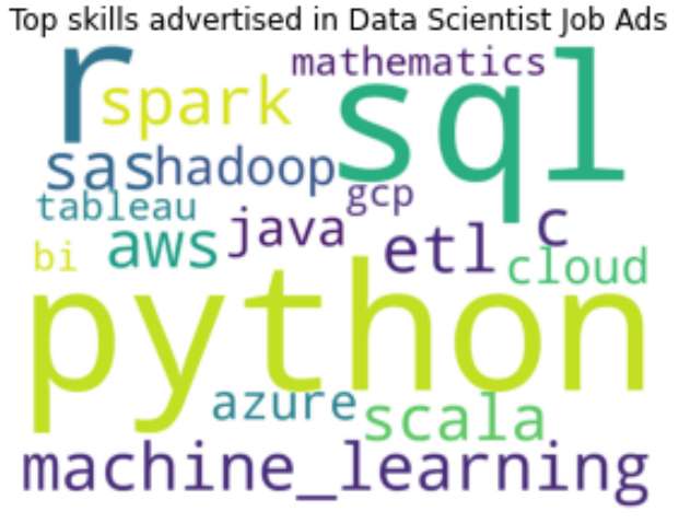
It can be clearly seen here that Python, SQL and R are the top three skills mentioned in data scientist job advertisements. This is followed by Machine Learning and AWS. SAS, Spark, Scala and ETL also have similar font sizes, and therefore are also mentioned quite often. For a more quantitative visualisation, we can look at the total number and proportion of job ads that each skill is mentioned in:

y_pos = np.arange(len(skills))
plt.barh(y_pos, occurence, align = 'center', alpha = 0.5)
plt.yticks(y_pos, skills)
plt.xlabel('No of Job Ads (Out of ' + str(len(df)) + ' job posts)')
plt.xlim(0,220)
plt.title('Most Common Skills in Data Science Job Ads')
for i in range(len(occurence)):
    label = str(occurence[i]) + " (" + "{:.1f}".format(occurence[i]/len(df)*100) + "%)"
    plt.annotate(label, xy=(occurence[i] + 1 ,y_pos[i] - 0.22))

plt.show()

which gives the following:

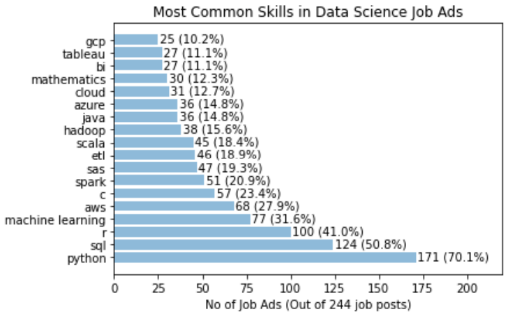
It is clear that Python definitely takes the crown, with 70% of the job posts mentioned Python. SQL is also popular, with over 50% of job posts requiring SQL. This is followed by 41% for R. Interestingly, only 32% of jobs specifically mention the need of machine learning. A similar proportion of jobs have AWS mentioned. C, Spark, SAS, ETL and Scala all have a similar proportion siting at around 20%.

Another way to visualise the data is to look at for each skill in the list, what other skills is mentioned together the most often. To simplify, we will only consider the top eight skills for this analysis, but for each of these we will look at all the skills extracted above to see which one is the most frequent co-skill:

top_8 = skills[0:8]
df_2 = pd.DataFrame()
for s in top_8:
    df_2[s] = df.cleaned_nouns.apply(lambda x: " ".join(skill_relations(skills, s, x.split())))
    cv = CountVectorizer(token_pattern = r"(?u)\b\w+\b", ngram_range = (1,1))
    text_cv = cv.fit_transform(df_2[s]) 
    dtm = pd.DataFrame(text_cv.toarray(), columns = cv.get_feature_names())
    top_words = dtm.sum(axis = 0).sort_values(ascending = False)
    co_skills = top_words[0:8]
    sorted_top_skills = sorted(co_skills.items(), key=lambda x: x[1], reverse=True)
    top_skills = [x[0] for x in sorted_top_skills]
    top_occurrence = [x[1] for x  in sorted_top_skills]/important_skills[s]*100
    y_pos = np.arange(len(top_skills))
    plt.barh(y_pos, top_occurance, align = 'center', alpha = 0.5)
    plt.yticks(y_pos, top_skills)
    plt.xlabel('% of Job Posts')
    plt.xlim(0,120)
    plt.title('Skills that appear most often with: ' + s.upper())
    for i in range(len(top_occurrence)):
        label = "{:.1f}".format(top_occurrence[i])+ "%"
        plt.annotate(label, xy=(top_occurrence[i] + 1 ,y_pos[i] - 0.22))
    plt.show()

For example, when a job post mentions Python, the following graph shows which other skills is most often mentioned together:

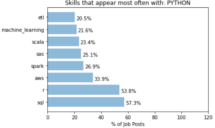
It can be seen that over 50% of job posts with Python also mentioned SQL and R, and over 30% mentions AWS. On the other hand, we have the following for R:

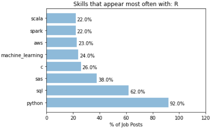
A whooping 92% of job posts that mentioned R also mentioned Python. This indicates most job posts that asks for R also accepts Python users, but not vice versa. In that sense, learn Python probably open up more opportunities than learning R. For R, SQL is also another common co-skill that employers mention in their job ads.

A different behaviour is observed for the keyword “machine learning”:

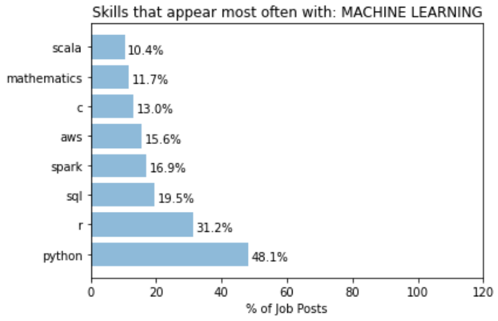
Posts that mentions machine learning has a lower proportion that mentions Python. This suggests that a more machine learning focus role is probably less focused on what language you use. A even lower proportion mentions SQL, significantly lower than expected from a random set of posts. This could simply mean that most role that focuses on machine learning probably require less direct data extraction and manipulation in databases. Or, it could be from the fact that what is done here does not take into account the fact that not all search results returned are data scientist roles. May be a significant portion that mentions SQL are actually Data Analyst roles, as oppose to those that mentions “machine learning” are proper data scientists roles. This is one of the key things in the current approach that needs to be improved on.

While most of the top skills seems to have top co-skills that is within the 8 top skills list, there are certainly cases where skills that appears more often with a particular key skill than it otherwise would. For example, let’s take the analysis for “C”:

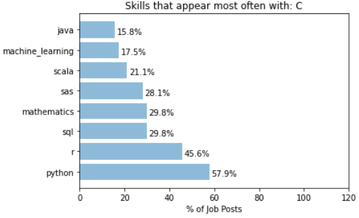
It can be seen that the word “mathematics” is almost 3 times more likely to appear with “C” than it normally would. This can be interpreted as C (or C++) is a much more commonly used language for jobs that involves really digging into the mathematical models of data science, such as research or postdoctoral positions.

Another example of specific co-skills is with the word “Spark”:

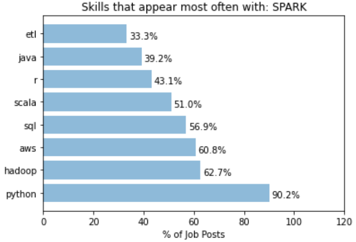
While python still takes out the dominant spot in this case, we can see that the “Hadoop” is 4 times more likely to be mentioned in job posts with “Spark” mentioned. This is expected as Hadoop and Spark are from the same eco-system, but highlights the fact that someone having Hadoop in addition to Spark in their knowledge base would fair better in these jobs than someone who just know one but not the other.

To conclude, we have successfully extracted information from data scientist job posting using BeautifulSoup and POS analysis, and obtained a list of top data science skills that are most mentioned in the job postings. The approach here was semi-manual: Manual filtering of words that are not relevant was required to clean the keyword list to a desirable form. Obviously, more work can be done on perfecting the keyword extraction process, by making it more automated and generic. For example, comparison with a set of reference pages may potentially allow irrelevant terms to be removed. There is a whole set of literature looking at different ways to do domain specific term extraction in an unsupervised way. There is also improvements in terms of how the problem is framed and approached. For example, we may want to narrow down the difference between data scientist vs machine learning engineers vs data analysts, to give a more meaningful breakdown. POS analysis with adjectives or adverbs may also prove helpful in extracting the soft skills required, such as being inquisitive or a quick learner.

But the initial goal of this exercise, which is to find out what specific skills is needed to have a better chance at becoming one, has been achieved. As someone who do want to become a data scientist, it is clear that my immediate attention should be given to improving my skills in SQL and AWS (given that I have pretty good skills in Python, R and machine learning), rather than perfecting this project. So expect stuff about my learning in SQL and AWS in my next blog!

COVID-19 Literature Review using NLP – Part #4 Summarising Articles

In the last few blogs I have shown how the NLP techniques or Topic Modelling and Word2Vec can be used in literature review by grouping relevant articles together and narrow down the number of articles that are relevant and needs to be analysed. In this final blog of the series, I will show how to use extractive summarisation and regular expression to extract useful information from the text of an article.

Recap

In the last three blogs, the focus was on the analysis of a large number of documents. By using two different approaches – the bags-of-words approach and Word2Vec approach, I have shown how a large number of documents can be turned into a bunch of vectors, from which machine learning algorithms can be applied to analyse these documents as a whole, similar to what one may do with conventional data. In particular, two unsupervised approaches – Topic Modelling based of Latent Dirichlet Allocation and K-means Clustering based on word vectors – were used to demonstrate the classification of documents into similar topics, and the COVID-19 Literature research database CORD19 was used as an example to show how the two techniques can be applied to narrow down the number of relevant articles from 40k+ to just under 600 articles. We now shift focus to how can we extract useful information from these ~600 selected articles. We will start by looking at just one document.

Summarization

One method to extract information out of a document is by writing a summary. A summary of an article should contain the main ideas presented by the article. It should only contain a small portion of the specific details from an article, and that someone should have a pretty good idea of what the article is about after he or she reads the summary.

Writing a summary for an article is not easy even manually. How can we perform this task automatically? There are actually two ways to automatically generate summaries for a document. The first is extractive summarization, where the key sentences that gives the most information in a document are extracted and compiled to become the summary of the document. The second technique is abstractive summarization, where the whole text is analysed, and by using a generative model, a summary which rephrases what is present in the document is generated. While abstractive summarization is closer to how a summary is done manually, it involves complex sequential modelling and the training of a deep neural network from scratch. Here, I will only consider the simpler approach of extractive summarization.

Extractive Summarization

In extractive summarization, the summary of the document is formed by selecting sentences that are considered the most important. There are different ways of considering what makes a sentence important in a document. One of the most common algorithm is the TextRank algorithm, which is what Python gensim uses. In the TextRank algorithm, the sentences in a document is put into a graph representation, where each vertex or node is a sentence in the document, and the edge between the vertices is labelled with the similarity between the sentences. The similarity between the sentences can be measured by any one of the many similarity metrics, such a cosine similarity, onto vector versions of the sentences. Note that the vectors can be formed using either bag-of-word (i.e. one-hot encoding) or word embeddings (i.e. word vectors). The sentences are then ranked by its similarity to all of the sentences, with the sentences that has the highest overall similarity score to all sentences in the document ranked the highest. Finally, the summary is created by selecting the top ranking sentences, with the number of sentences selected via a word count or a proportion of the total number of sentence.

A visualisation of a graph representation of a document, with each node (blue circle) being a sentence in the document, and each node is connected to sentences that it is similar to (non-zero similarity score). Each connection or edge have an associated similarity score. Node with highest total similarity score would be the top ranked sentence.

Gensim provides an implementation of TextRank extractive summarisation that is very easy to use. Again, I will be using the CORD19 Data as an example. In this example, the effect of number of word counts in the summary will be investigated:

0from gensim.summarization.summarizer import summarize

#Perform extractive summarization with a range of word counts
for word_count in range(50,350,50):
    summary = summarize(clean_text, word_count = word_count)
    print("No of words: ", word_count)
    print("Summary: ", summary)
    print("\n")

As can be seen, the usage of gensim summarizer is extremely simple. There is not even a need to preprocess the text: clean_text is simply the extracted full text from one of the articles, with undesired labels (that appears on every page of an article and copied as part of the full text) removed. All other preprocessing such as stopwords and stemming are handled by the summarize() function. The code above gives the following result (on one particular article):

It is clear that there is a sweet spot for summarising an article in terms of the number of words used. With word count less than 100, a summary would only contain 1 or 2 sentences, and therefore is not doing a very good job in summarising an article. On the other hand, if word count is more than 200, the summary becomes too cumbersome to read. Therefore, the optimal number of words seems to be 150 – 200.

Extracting Specific Data

The summary of an article gives an overview of what the article is about, and is therefore very useful for a researcher for screening relevant articles. However, summaries by default would only show general information – information that describes the article in general. Rarely would a summary contain specific results. However, sometimes it may be specific results that a researcher may be after. Additional analysis on top of summarisation would be needed to extract specific results.

Rather then using complicated algorithms, specific data extraction can be done simply with regular expressions. Regular expressions are expressions that defines a string search pattern that is universal in the field of computer science and linguistics. It uses specific characters to represent certain string patterns. The syntax of regular expressions can be found here. An example of a regular expression is shown below. Python has a regular expression toolbox re, which allows search and substitution of strings that matches the pattern represented by regular expressions. We can therefore make use of regular expression to search out important information in a document.

When thinking about using regular expressions to extract information, one would need to answer the question: what sentence pattern would key results usually appear in. It is noted that in most articles, key results are usually displayed in a table or a figure. Hence looking for sentences that refers to these tables and figures may yield specific results. It is also noted that most scientific results are conveyed by numbers. In particular, numbers followed by units, numbers within a equality or inequality, and non-integer numbers (e.g. decimal places or exponential representations) almost always represent meaningful results. That is because scientific measurements is most likely to be non-integer, and presented with a unit or in a equality or inequality for statistical analysis. We can therefore make use of the two rules above to extract information from the full text of the article, using regular expressions:

import string
from nltk.tokenize import word_tokenize

#This code check if a token is a number, and seperate between integer and float
def check_token(token):
    try:
        num = int(str(token))
        return "integer"
    except (ValueError, TypeError):
        try:
            num = float(str(token))
            return "float"
        except (ValueError, TypeError):
            return "string"


def extract_key_sentences(clean_text):
    #Break the text up into sentences
    sentences = re.split(r"(?<=\.) {1,}(?=[A-Z])", clean_text)


    #Empty list to store key sentences and words
    key_sentences = []
    fig_sentences = []
    special_words = []

    #Specify special tokens to look for: common units, comparasion operators, and tokens related 
    to figures and tables
    units = ["kcal", "K", "ml", "mL", "L", "J", "kJ", "mol", "eV"]
    ops = [">", "<", "=", ">=", "<=", "≤"]
    fig_list = ["Figure", "FIGURE", "Fig", "figure", "fig", "figures", "Table", "table", "TABLE", "Graph", "graph"]

    #For each sentence in the full text, check for tokens, and either score according to the number detected in the sentence, select the sentence if it is referring to figure/table/graph, 
    #or flag as a special term if it contains both letter and numbers

    for s in sentences:
        #First tokenise to seperate into individual tokens
        tokens = word_tokenize(s)
        score = 0
        selected = 0
        for i in range(len(tokens)):
            #check token - int, float or string
            word_type = check_token(tokens[i])
        
            #for integers, only consider numbers that are not years
            #And for other integers, only contribute to score if it is followed by a percent, a unit, or followed or precede by one of the comparison operators
            if word_type == "integer":
                if (int(str(tokens[i])) < 1800) or (int(str(tokens[i])) > 2030):
                    if (i > 0) and (i < len(tokens) - 1):
                        if ((str(tokens[i+1])) == "%") or (str(tokens[i+1]) in units) or (str(tokens[i-1]) in ops) or (str(tokens[i+1]) in ops):
                            score = score + 1
            #All floats are consider important and are scored higher
            if word_type == "float":
                score = score + 3
            #for strings,check if it is a "figure sentence"
            if word_type == "string":
                if (str(tokens[i]) in fig_list):
                    selected = 1

        #Save sentence if they fit criteria
        if score > 0:
            key_sentences.append((s, score))
        if selected > 0:
            fig_sentences.append(s)
    
    #Store empty string if no key sentences are detected
    if len(key_sentences) == 0:
        key_sentences.append(("",0))
    
    #Sort by score before returning it
    key_sentences.sort(key=lambda x:x[1], reverse = True)
        
    return key_sentences, fig_sentences

key_sentences, fig_sentences = extract_key_sentences(clean_text)
      

#Print the top five key sentences
print("Key results extracted:\n")
for i in range(5):
    print(key_sentences[i][0]+"\n")

This piece of code probably warrant some explanation. The function extract_key_sentences() aims to extract out sentences that contains the words “figure” or “table” (or their abbreviations), as well as sentences that contains key results. This is done by first tokenising each sentences (using nltk), and classifying each token as a int, float or a string. Each float detected in the sentence gives a score of 3 to the sentence, since floats are considered to contain the most specific information. Each int detected that is not a year, and that it is followed by a unit, a percentage sign, or have a equal sign or inequality sign before or after it, are considered to be useful as well, and assigned a score of 1. Any sentence with a score greater than zero is selected as a key result sentence. For each string detected, we look at whether the string is “figure” or “table” or a variation on either. If it is, the sentence is automatically selected as a figure sentence.

Running the code yields the following key sentences (on an arbitrary article):

It can be seen that this technique works very well. We are able to extract from the article specific results about the binding energy of different proteins, which are results that a researcher would look for when reading this paper. The result above indicates that regular expression extracting sentences with specific numerical results does yield useful information.

The following shows some of the figure sentences:

Sentences referring to figures seems to provide less information. This is probably due to the fact that when taking about a figure, the first sentence that mentions the figure may not be the sentence that actually describe the specifics in a figure. Nevertheless, these sentences reveal what figures are present in the article, another piece of information that is useful to have.

Putting all these together, a search function can be made to search for particular keywords in the full text, summary, or within the key results or figure sentences (after the summary, key sentences and figure sentences are extracted and stored in the dataframe) :

def find_information(keyword_list, options = "Summary", num_sentences = 5):
    df_temp = []
    if options == "Summary":
        df_temp =  df_cluster[df_cluster['summary'].apply(lambda x: all(substring in x for substring in keyword_list)) == True]
    elif options == "Full text":
        df_temp =  df_cluster[df_cluster['text'].apply(lambda x: all(substring in x for substring in keyword_list)) == True]
    elif options == "Figures":
        df_temp =  df_cluster[df_cluster['figures'].apply(lambda x: all(substring in x for substring in keyword_list)) == True]
    elif options == "Results":
        df_temp =  df_cluster[df_cluster['results'].apply(lambda x: all(substring in x for substring in keyword_list)) == True]

    if (len(df_temp) == 0):
        print("The Search Cannot find any relevant articles")
    else:
        print("Number of Articles Found: " + str(len(df_temp)) + "\n")
    
        for i in range(len(df_temp)):
            print("Title: ", df_temp['title'].iloc[i], '\n')
            print("Authors: ", ",".join(df_temp['authors'].iloc[i]), '\n')
            print("Summary: ", df_temp['summary'].iloc[i], '\n')
            print("Key Results: \n")
            for j in range(len(df_temp['results'].iloc[i])):
                if j < num_sentences:
                    print(df_temp['results'].iloc[i][j]+"\n")
            print("Sentences that refer to figures/tables:\n")
            for j in range(len(df_temp['figures'].iloc[i])):
                if j < num_sentences:
                    print(df_temp['figures'].iloc[i][j]+"\n")
    
     
    return df_temp

which yields the following for a search for article with summaries that contain keywords “vaccine” and “SARS” (Only the first article is displayed here):

df_answer = find_information(["vaccine", "SARS"])

As can be seen, the search function displays the title, author, summary, key results and figure sentences extracted for all the articles that fits the search, allowing researchers to quickly glance for results that are truly useful, and determine which article warrants an in-depth read.

Summary

In summary, over the last 4 blogs, I have demonstrated how NLP can be used as a tool to speed up literature review, using the CORD19 challenge as an example. By applying topic modelling and word vector clustering, relevant articles can be selected. Selected articles can then further analysed using extractive summarisation and regular expressions. Obviously there are a lot of other techniques that can be applied to further improve the analyses these articles to yield even better results. But hopefully these blog at least illustrates the basics and shows how powerful NLP can be for analysing a database of unknown articles.

References

Tutorial and explanation on TextRank Algorithm

Official Gensim tutorial on Summarization

Wikipedia Page on Regular Expression

Regular Expression Syntax guide

The Full code on the material in this blog can be find in my Kaggle Notebook

COVID-19 Literature Review using NLP – Part #3 K-mean clustering of word vectors

In the last blog I have shown how to create word vectors using Python gensim‘s Word2Vec implementation and a large number of text as inputs, as well as the powerful features of similarities and analogies in the word vector space. In this blog, I will show how these word vectors can be used to further classify documents, using an unsupervised clustering algorithm.

Word Vector Recap

In the last blog, I have introduced the concept of word vectors – vectors associated with each word that appears in a list of documents. These vectors are assigned in such a way that the context of the word, i.e. the words that surrounds each word of interest, is taken into account. The Word2Vec mode is one way to form these word vectors, and involves training the model via a neural network with each pair of focus and context words as input. Gensim provides an implementation for the Word2Vec algorithm that allows the creation of word vectors from a list of documents pretty easily.

As discussed also in the last blog, two of the most powerful features are the similarity and analogy properties of word vectors. Both of these sprung from the fact that the dimensions of word vectors are actually encoding information related to the meaning of a word (within the scope of the input documents), and therefore, the distance between each word vector and the position of each vector related to each other actually mean something. Hence once the words are encoded as word vectors, we can start to use standard machine learning techniques to classify and/or predict the meaning of words within the word vector space.

Representing a document

Of course, predicting or classifying the meaning of a single word is not very interesting nor very useful. But with these word vectors, it is easy to convert multiple words into a vector form, allowing predictions and classification of meanings of sentences, paragraphs, and documents. The simplest way to do this is to simply average the word vectors of all the words in a document to obtain a single vector for the document. This make sense as a document about finance for example would have more words related to finance and money, and so averaging of the word vectors in the document would obtain a vector that is in general in the “finance” direction, verses another document that is about animals for example. In practice, this simple averaging words reasonably well, and this is what we will be using here.

Again, we will be using the COVID-19 literature research Kaggle challenge as an example. To recall, we have selected about 10k articles from the previous topic modelling and now we will be looking at the abstracts of these articles. To form average word vectors for each documents, we do the following:

#Turn abstract into a single vector by averaging word vectors of all words in the abstract
def abstract2vec(abstract):
    vector_list = []
    for word in abstract:
        #seperate out cases where the word is in the word vector space, and words that are not
        if word in w2v_model.wv.vocab:
            vector_list.append(w2v_model[word])
        else:
            vector_list.append(np.zeros(300))
    #In case there are empty abstracts, to avoid error
    if (len(vector_list) == 0):
        return np.zeros(300)
    else:
        return sum(vector_list)/len(vector_list)

#Store tokens into dataframe and turn it into vectors
df_selected['sentences'] = tokenised_sentences
df_selected['avg_vector'] = df_selected['sentences'].apply(lambda x: abstract2vec(x))

Two things of note here. Firstly, refer to my previous blog on the format of tokenised_sentences. Essentially, this list of word tokens is the result of tokenisation of the abstract, after the application of text preprocessing steps including lower casing, punctuation removal, and lemmatization. The list tokenised_sentences is essentially the processed form of all the abstracts of the articles selected, that was used to train the Word2Vec model w2v_model. The other thing worth noting the addition of error catchers, just to make sure that if words that are not in the word vector space is passed into the function, it can return a zero vector rather then throwing an exception.

Clustering Analysis

Now that each abstract is presented by a single vector avg_vector, we can apply clustering analysis to group the abstracts into clusters. Clustering analysis is a unsupervised learning technique, and as the name suggests, attempts to put the unlabelled data into clusters. Each clusters would have data points (vectors) that are geometrically close to each other, and therefore data points within a cluster can be consider similar. In our case here, this would implying that the abstracts that lies in the same cluster talks about similar subjects. This is similar to topic modelling, but instead of using a bag-of-word and term frequency approach, the context and relationship between words are taken into account.

To perform unsupervised clustering analysis, we can use the k-means clustering algorithm. K-means works by first randomly assigning the centroid (mean vector) of each cluster, and assigns each vector to a cluster based on the centroid it is closest to. After assignment, the cluster centroid is updated to the mean of all vectors assigned to the cluster, and then each vector is assigned again based on the new centroids. This is continued until the centroids does not move, and the clusters are formed from the final assignment. In Python, K-means can be implemented using sci-kit learn‘s Kmeans() :

from sklearn.cluster import KMeans
from sklearn.preprocessing import StandardScaler

# Turn data in an array as input to sklearn packages
X = np.array(df_selected.avg_vector.to_list())

#Perform standard scaling and kmeans strongly affected by scales
sc = StandardScaler()
X_scaled = sc.fit_transform(X)

#Obtain cluster labels
km_model = KMeans(init='k-means++', n_clusters=20, n_init=10, random_state = 1075)
cluster = km_model.fit_predict(X_scaled)

Note that clustering algorithms, in particular K-means, is very sensitive to the scale of the dimensions, and therefore it is important to make sure the inputs are all normalised before putting through the model. The sci-kit learn implementation Kmeans() has a number of parameters as inputs. In particular, the init parameter allows the initialisation method to be specified. The default is k-mean++, an initialisation algorithm for k-means that is more efficient and guarantees a convergence. The n_init parameter specify how many times the K-means is ran with different initial centroids, and the best output is used as the final output.

One of the most important hyperparameter for a K-means algorithm is n_cluster, the number of clusters to form. There is no way to know (for most real data) how many cluster is sensible for a set of data a priori, and therefore, it needs to be tuned as a hyperparameter. The two metrics that are commonly used to assess the wellness of a K-means model are inertia and silhouette score.

Inertia measures how close each data point is to the centre of their cluster. It is defined as the sum of square distance between each data point and the centre of their cluster. For a good cluster model, we expect the samples that are classified as belonging to the same cluster should be close to their cluster centre. Therefore, we expect the inertia to be small. In relation to optimising the number of clusters using inertia, it should be noted that the inertia will always decrease with the number of clusters, as increasing the number of cluster will inevitably decrease the distance between data points and their cluster centre. Hence, a so call “elbow” method is often used to determine the number of cluster used: the optimal number of cluster is where the rate of decrease of inertia with increasing number of clusters starts to slow down significantly. This can be visually determined by plotting inertia score vs the number of clusters, and identifying where the curve bends flat – like the elbow of someone’s arm resting on a table.

The following code shows how the elbow method can be implemented for our example here:

#Form kmeans model with cluster size from 2 - 100, and record the inertia, which is a measure of the average distance of each point 
#in the cluster to the cluster centroid 
sum_square = []
for i in range(2,100,5):
    km_model = KMeans(init='k-means++', n_clusters=i, n_init=10)
    cluster = km_model.fit_predict(X_scaled)
    sum_square.append(km_model.inertia_)


x = range(2,100,5)
plt.figure(figsize=(20,10))
plt.plot(x,sum_square)
plt.scatter(x,sum_square)
plt.title('Sum of square as a function of cluster size')
plt.xlabel('Number of clusters')
plt.ylabel('Sum of square distance from centroid')
plt.show()

which produces the following graph:

Unlike typical examples shown on the web (such as the iris dataset), there is not really a clear indication of where exactly the elbow is. This is typical of real data, where the data are not necessarily separated in a way that there is a “correct” number of cluster. However, it can be seen clearly that the decrease in inertia with increasing number of clusters n does slow down, with a slow “inflection” of the curve happening around n = 15 – 25. We can therefore use this to narrow down the optimal n to be within this range.

To further obtain the optimal value of n, we can further apply the silhouette analysis. The silhouette score measures the separation of clusters. In particular, the silhouette score measures the distance between a data point and data points in neighbouring clusters. If the silhouette score is close to +1, that means the data point are very far from neighbouring clusters. If the silhouette score is close to 0, that means the data point is close to the boundary of neighbouring clusters. If silhouette score is close to -1, that means that the data point is wrongly assigned. Therefore, by looking at the average value of silhouette score, we can tell how well the clusters are separated, and hence the wellness of the model. The silhouette score of a good cluster model should be close to 1.

Similar to the elbow method, we can form K-means model with different number of clusters and plot the silhouette score as a function of the number of clusters. And the optimal n would be where a global maximum of silhouette score is achieved. As an optimal range has already been identified using the elbow method above, the step size can be reduced:

from sklearn.metrics import silhouette_samples, silhouette_score

#Sweep from 10 to 30 (range around the elbow) and look for the record the silhouette score
silhouette = []
model_list = []
cluster_list = []
for i in range(10,30,1):
    km_model = KMeans(init='k-means++', n_clusters=i, n_init=10, random_state = 1075)
    cluster = km_model.fit_predict(X_scaled)
    model_list.append(km_model)
    cluster_list.append(cluster)
    silhouette.append(silhouette_score(X_scaled, cluster))


#Plot to observe the maximum silhouette score across this range
x = range(10,30,1)
plt.figure(figsize=(20,10))
plt.plot(x,silhouette)
plt.scatter(x,silhouette)
plt.title('Silhouette score as a function of number of clusters')
plt.xlabel('Number of clusters')
plt.ylabel('Silhouette Score')
plt.show()

It can be seen that the models do not have a very impressive silhouette score. Even at the maximum, the silhouette score is only slightly below 0.24. Furthermore, there doesn’t seem to be a clear maxima. In fact, the maxima actually change with successive runs of the same script, although the silhouette score stays pretty similar with number of clusters within this range. While the low silhouette score shows that the clustering models do not separate the clusters all that well, let’s continue analysis with the best model we have – i.e. model with n = 17.

Before using these clusters, one might want to visualise them to see how well the clusters are separating the data points. One way to visualise these clusters using t-SNE (T-distributed Stochastic Neighbor Embedding). t-SNE is dimension reduction technique designed for visualisation in mind. Python sci-kit learn provides a t-SNE implementation in sklearn.manifold which can be used for visualising our cluster model. However, even with t-SNE, a dimension of 300 is too much to plot. PCA can be applied to bring the overall dimension to about 50 prior to t-SNE to allow a better visualisation:

from sklearn.decomposition import PCA
from sklearn.manifold import TSNE

#Create Principal components
pca = PCA(n_components=50)
X_reduced = pca.fit_transform(X)

#Create t-SNE components and stored in dataframe
X_embedded = TSNE(n_components=2, perplexity = 40).fit_transform(X_reduced)
df_selected['TSNE1'] = X_embedded[:,0]
df_selected['TSNE2'] = X_embedded[:,1]

#plot cluster label against TSNE1 and TSNE2 using different colour for each cluster
color = ['b','g','r','c','m','y','yellow','orange','pink','purple', 'deepskyblue', 'lime', 'aqua', 'grey', 'gold', 'yellowgreen', 'black']
plt.figure(figsize=(20,10))
plt.title("Clusters of abstract visualised with t-SNE")
plt.xlabel("PC1")
plt.ylabel("PC2")
for i in range(17):
    plt.scatter(df_selected[df_selected['cluster'] == i].TSNE1, df_selected[df_selected['cluster'] == i].TSNE2, color = color[i])
plt.show()

It is worth noting that TSNE() also takes in a parameter perplexity, which strongly affects how the visualisation look. The value perplexity = 40 was chosen to give in my eyes the best visualisation of the clusters. The resulting graph is shown below:

The graph shows that apart of some of the outlying data points (which correctly form their own cluster), most of the data point lies in one giant cluster at the centre, not very well separated from each other. This explains why even with the best model, the silhouette score is quite close to zero. However, it should also be kept in mind that the graph above is a projection of 300 dimensions into a 2D space, so in the actual 300 dimension space, the clusters are probably more separated than as indicated from this plot. From the graph, we can also see that the K-means model have done a relatively good job in separating the data point into clusters. Not only did the model correctly separate out the outlying data as individual clusters, it is also clear that most of the clusters are localised, and are rarely spreading out across the 2D-space or smearing and overlapping into each other. Inevitably there are overlaps between some clusters, but it is performing much better than I thought it would.

With the clusters in place, we can how select the cluster which most represent the questions that was specified in the task list. We can do that by simply using the K-means model to predict what cluster would our questions fall into:

#Take the questions from the question list and clean using the same function
q_cleaned = [abstract_cleaner(x) for x in question_list]
#Create tokens from the bigram phraser
q_words = [q.split() for q in q_cleaned]
q_tokens = bigram[q_words]
#Turn tokens into a single summary word vector
q_vectors = [abstract2vec(x) for x in q_tokens]
#Predict cluster based on the summary word_vector
question_cluster = model_list[7].predict(q_vectors)
print(question_cluster)

It is crucial that the questions needs to be formatted and cleaned the same way as the abstract, including application of the bigram model and averaging word vectors to form a single “sentence vector”, before passing into the K-means model for cluster prediction. This is the output printed out on the screen:

Incredibly, all of the 12 questions posed on the task page are predicted to fall into a single cluster #8. This means that we can narrow down to just one cluster of articles for review when considering literature search for finding answers for these questions. To confirm that this cluster makes sense, let’s visualise the top words of this cluster using a word cloud. This can be done by first extracting the top words using CountVectorizer():

from sklearn.feature_extraction.text import CountVectorizer

#Make tokens back into a string
df_selected['sentence_str'] = df_selected['sentences'].apply(lambda x: " ".join(x))
#Perform Count Vectorize to obtain words that appeared most frequently in these abstracts
main_cluster = mode(question_cluster)
cv = CountVectorizer()
text_cv = cv.fit_transform(df_selected[df_selected['cluster'] == main_cluster].sentence_str)
dtm = pd.DataFrame(text_cv.toarray(), columns = cv.get_feature_names())
top_words = dtm.sum(axis = 0).sort_values(ascending = False)
topword_string = ",".join([x for x in top_words[0:40].index])


Once the top words are available and put into a string, the wordcloud package can be used to put the words into a word cloud image very easily:

from wordcloud import WordCloud

#Create word cloud using the topwords
wordcloud1 = WordCloud(width = 800, height = 600, 
                background_color ='white', 
                min_font_size = 10).generate(topword_string)

  
# plot the WordCloud image        

plt.figure(figsize=(10,6))
plt.imshow(wordcloud1) 
plt.title("Word Cloud for Main Cluster")
plt.axis("off") 
plt.tight_layout(pad = 0) 
plt.show() 

the above code produces the following:

We can see that the top words are “virus”, “human” and “disease” by far, which makes sense as all articles are virus related (we can possibly remove these common words in hindsight, similar to what was done in topic modelling). But importantly, in this cluster, “vaccine” is also one of major keywords. The keywords “drugs”, “antiviral”, “treatment” and “therapeutic” are also in present in the top words of this clusters. Hence the clustering has worked quite well to identify the cluster of articles that we need according to our task, which is vaccines, treatments, and therapeutics for COVID-19. Finally, let’s look at how many articles are in this cluster:

df_cluster = df_selected[df_selected['cluster'] == main_cluster]
print("Number of articles in main cluster: ", df_cluster.shape[0])

We have successfully reduced the number of articles from 40k+ to around 600. This is a much more manageable number. We can now start to dive into the full text of these articles and try to automate summarising and extraction of information from these articles. This will be covered in the next blog.

Reference

Tutorial on determining number of clusters in K-means

Scikit-learn official tutorial on using the silhouette score

Tutorial on NLP including use of word cloud (as well as topic modelling)

The Full code on the material in this blog can be find in my Kaggle Notebook

COVID-19 Literature Review using NLP – Part #2 TF-IDF and Word Vectors

In the last blog I have showed how to use topic modelling to seperate a large number of articles into different topics. In this blog, I am going to talk about how to take one step further, and use word vectors and clustering to track down the articles that you really need.

Recall from the last blog that each articles have been assigned three top topics using topic modelling. We will now use this to narrow down the articles that we need. Then, we need to first look at what we are looking for in these articles. The Kaggle Open Challenge specified a range of tasks for the participants to work on. Here, I will be focusing on the task related to Vaccines and Therapeutics for COVID-19, as specified in this page. The task is essentially answer the questions posed on the page:

To select the topics that are relevant to these questions, we can extract out the keywords from these questions using a technique known as term frequency–inverse document frequency, or TF-IDF, and then select the topics which contain these keywords.

TF-IDF

Recall from the last blog, topic modelling is a bag-of-words method – a technique that considers words as individual tokens and uses its frequency of appearance as a key indicator of what a document of text, which is called a corpus, means. TF-IDF also make use of bag-of-words. As the name suggests, it too looks at the frequency of appearance of words in a document (the Term Freqency TF). However, it also looks at the frequency of appearance of the word across all documents, and reduce its weight if appears too often (the Inverse Document Frequency IDF). By applying this counter-weight, TF-IDF is able to filter out common words that appears everywhere and offers no extra information for distinguishing different documents. In its simplest form, the TF of a word is simply the number of times it occurred in one document, scaled by the number of words in the document. For example, in “How much wood could a woodchuck chuck if a woodchuck could chuck wood”, all three words “wood”, “woodchuck” and “chuck” has a TF of 2/13. The IDF on the other hand, is given by log(total number of documents/ number of documents containing the word). For example, if we now have 3 other sentences, all of which contain “wood”, 1 contain “chuck” and none contain “woodchuck”, then the IDF of “wood”, “chuck” and “woodchuck” would be 0, log(4/2) and log(4/1) respectively. The TF-IDF is then simply the product of TF and IDF, which gives 0, 0.046 and 0.093 for “wood”, “chuck” and “woodchuck” respectively (for the first sentence only). The word “woodchuck” can be consider as a word that can better distinguish this sentence from the other sentences, comparing to “wood” and “chuck”.

Python Sci-kit Learn provides a quick implementation of TF-IDF. We will use this to extract out the keywords from our list of sentences (Note that question_list is formed by simply putting the questions above into a list):

from sklearn.feature_extraction.text import TfidfVectorizer
import re
import string
from nltk.tokenize import word_tokenize
from nltk.stem import WordNetLemmatizer

#Put list into a dataframe for easier viewing and manipulation
df_task = pd.DataFrame(question_list, columns = ['tasks'])
df_task.head()

#Define function to clean text
def text_cleaner2(text):
    #Convert to lower case
    text = str(text).lower()
    #Remove punctuations
    text = re.sub('[%s]' % re.escape(string.punctuation), " ", text)
    return text
df_task['tasks'] = df_task.tasks.apply(lambda x:text_cleaner2(x))
df_task.head() 

#Create TFIDF model note that min_df was tuned to give optimal output
vectorizer = TfidfVectorizer(min_df=0.08, tokenizer = lambda x: x.split(), sublinear_tf=False, stop_words = "english")
tasks_keywords = vectorizer.fit_transform(df_task.tasks)

#Grab all keywords in the TF-IDF vectorizer
new_dict = vectorizer.vocabulary_
#manually remove useless words and put into a new keyword_list
stop_words = ["use", "tried", "studies", "know", "need", "concerning", "alongside"]
for word in stop_words:
    new_dict.pop(word, None)
keyword_list = list(new_dict.keys())

#Do the same processing as in the previous workbook that was used to form the topic topic titles
#This include the replacement of various keywords, removal of numbers and lemmatization
keyword_list = [x.replace("severe acute respiratory syndrome", "sars") for x in keyword_list]
keyword_list = [re.sub('viral|viruses', 'virus', x) for x in keyword_list]
keyword_list = [re.sub('[0-9]', '', x) for x in keyword_list]
wordnet_lemmatizer = WordNetLemmatizer()
lemma = WordNetLemmatizer()
keyword_list = [lemma.lemmatize(x) for x in keyword_list] 

print(keyword_list)

Some important things to note here. Firstly, since we are trying to couple the keywords to the topic model that we have, all of the pre-processing that was used during topic modelling must also be used here. This includes lemmatization and the special cases for “SARS” and “Virus”. However, the order of which these are performed can be tuned. In this case here, lemmatization and number removal are done after the TF-IDF to gain a better set keywords. Printing the keywords, we have the following:

['vaccine', 'therapeutic', 'published', 'research', 'development', 'evaluation', 'effort', 'effectiveness', 'drug', 'developed', 'treat', 'covid', 'patient', 'clinical', 'bench', 'trial', 'investigate', 'common', 'virus', 'inhibitor', 'naproxen', 'clarithromycin', 'minocycline', 'exert', 'effect', 'replication', 'method', 'evaluating', 'potential', 'complication', 'antibody', 'dependent', 'enhancement', 'ade', 'vaccine', 'recipient', 'exploration', 'best', 'animal', 'model', 'predictive', 'value', 'human', 'capability', 'discover', 'therapeutic', 'disease', 'include', 'antivirus', 'agent', 'alternative', 'aid', 'decision', 'maker', 'determining', 'prioritize', 'distribute', 'scarce', 'newly', 'proven', 'production', 'ramp', 'identifying', 'approach', 'expanding', 'capacity', 'ensure', 'equitable', 'timely', 'distribution', 'population', 'targeted', 'universal', 'coronavirus', 'develop', 'standardize', 'challenge', 'prophylaxis', 'healthcare', 'worker', 'evaluate', 'risk', 'enhanced', 'vaccination', 'assay', 'immune', 'response', 'process', 'suitable', 'conjunction']

Using these keywords, we can go through and select topics which contains these keywords, and then articles that belong to these topics. Note that if a keyword is not seen in any topics in the topic model, it would throw an error, and so one need to catch such exceptions. Finally, it turns out that name of drugs such as ‘naproxen’, ‘clarithromycin’ and ‘minocycline’ are not present in any topics, so I have manually added ‘antiinflammatory’ and ‘antibiotics’ which is the family of drugs that these drugs belongs to:

from gensim.corpora.dictionary import Dictionary

word2id = word_key.token2id 
new_topic_list = []
#Initial test shows that two important keywords, naproxen and minocycline are not in the topic keywords
#Since these are antiinflammatory and antibiotics respectively, I have decided to manually add these keywords into the keyword_list
keyword_list.append('antiinflammatory')
keyword_list.append('antibiotic')
for word in keyword_list:
    try: 
        word_id = word2id[word]
        topics = topic_model.get_term_topics(word_id, minimum_probability=None)
        for topic in topics:
            new_topic_list.append(topic[0])
    except:
        print(word + " not in topic words")

new_topic_list = list(set(new_topic_list))

Extracting articles that have all three top topics belonging to this new topic list, we find that the number of articles is reduced from 50k to about 10k, i.e 1/5. This is a good reduction and so we are now ready to look at the abstract of these selected articles in depth.

Problems with Bag-of-Words

The bag-of-words method, while quick, simple and useful, ignores the context of a word, which often provides additional information about the document. Consider the following example. Suppose we have the following sentences: “I am going to three banks today to try to get a loan.”; “Usually there are plenty of vegetation along river banks”; “The plane banks towards the airport.” In all three cases, the word “banks” appeared, yet all three have different meanings. Simply looking at the appearance of the word “banks” as a bag-of-word method would is not going to yield a correct topic or meaning for these sentences. What is needed is a technique that takes the context of a word into account. One popular method to do this is the concept of word vectors.

What are Word Vectors?

As the name suggests, word vectors attempts to encode words into multidimensional vectors. The key though is that we want to have these vectors in a way that the distance between words with similar meanings are closer than words with different meanings. For example, we want the word vector for “finance”, “money” and “loan” to be close to each other and to the word “bank” when it is in the first sentence. At the same time, we would want the words “river”, “beach” and the word “bank” in the second sentence to be close to each other but far away from the first set of words. To encode word meaning similarities, one would inevitably have to make use of the position of a word within a sentence. Just like you can infer the meaning of a word that you don’t know by looking at how it is used in a sentence, a computer can potentially identify the similarity of words by looking at words either side of the word of interest.

Word2Vec and Skip-gram

An algorithm that is commonly used for creating word vectors that is implemented by the python gensim package is the Word2Vec algorithm. In the Word2Vec algorithm, each word in a document (the focus word) is considered to be surrounded by a window of n context words. Base on optimising the cosine similarities between the vector representation of the focus word and vector representation of its context words over the whole document, the word vectors for each word are obtained. The relationship of focus words and its context words is visualised below (for a window size of 2):

There are two different ways to optimise a Word2Vec model. In the more intuitive continuous bags of word (CBOW) algorithm, the model optimises the prediction of a focus word given context words. This is similar to the fill in the blank type questions that school kids need to do for their English classes – given a set of context words on either side of the blank, fill in the blank with an appropriate word. For example, “I was at Bondi ____ building sand castles.” The CBOW seeks to predict the focus word given the context words. On the other hand, the Skip-gram algorithm do this in the opposite direction: given a focus word, make a prediction of the context words. This is equivalent to a fill in the blanks question with the following sentence: “____ ____ ____ ____ beach ____ ____ ____”. While this is less intuitive, it turns out that the Skip-gram model actually performs better and hence it is the more popular model to be implemented.

Getting slightly mathematical here, in the skip-gram model, each word has a corresponding focus vector f and a corresponding context vector c, representing when the word is considered as a focus word or context word respectively. The vectors are trained in such a way for two words a and b, the softmax of the dot product afT.bc gives the probability that b is a context word for focus word a, i.e.

P(b|a) = Softmax(afT.bc)

Since we have the ground truth represented by the one hot encoded context words for each focus word, a neural network can be used to trained the word vectors to minimise the overall log-loss of Softmax(afT.bc) for all focus-context word pairs a,b.

Fortunately, we do not have to build this model from scratch. Gensim provides a Word2Vec wrapper to allow a Word2Vec model to be trained and word vectors generated for a document input. I will show you how this is done using the COVID-19 literature dataset.

First, similar to before, we need to clean the abstract first. In particular, almost all abstract entries contacts the word “Abstract” which need to be removed:

from gensim.parsing.preprocessing import remove_stopwords
from nltk.tokenize import word_tokenize
from nltk.stem import WordNetLemmatizer
import re
import string

#Function to clean up abstract
def abstract_cleaner(text):
    #standard preprocessing - lower case and remove punctuation
    text = str(text).lower()
    text = re.sub('[%s]' % re.escape(string.punctuation), "", text)
    #remove other punctuation formats that appears in the abstract
    text = re.sub("’", "", text)
    text = re.sub('“', "", text)
    text = re.sub('”', "", text)
    #remove the word abstract and other stopwords
    text = re.sub("abstract", "", text)
    text = remove_stopwords(text)
    #lemmatize and join back into a sentence
    text = " ".join([lemma.lemmatize(x) for x in word_tokenize(text)])
    
    return text

#Clean abstract
df_selected['abstract'] = df_selected['abstract'].apply(lambda x: abstract_cleaner(x))
df_selected.head()

Note that there are additional cleaning that was required, namely, there were punctuation symbols that are not in standard format, and therefore cannot be removed with string.punctuation. Stopwords are also removed at this stage.

With the abstracts, because the number of words are much greater compared to titles, we can improve the subsequent word vector model by utilising bigrams. Bigrams are phrases with two words. Phrases such as “Machine Learning” or “Natural Language” are examples bigrams where the two constituent words appearing next to each other in this specific order, offers additional information or even completely new meaning. Therefore, by detecting these as phrases rather than individual words will help reveal more information to the documents we want to analysis. Bigrams can be used via the Phrases and Phraser models within the gensim package.

from gensim.models.phrases import Phrases, Phraser

#Check for bi-grams - first split sentence into tokens
words = [abstract.split() for abstract in df_selected['abstract']]
#Check for phrases, with a phrase needing to appear over 30 times to be counted as a phrase
phrases = Phrases(words, min_count=30, progress_per=10000)
#Form the bigram model
bigram = Phraser(phrases)
#Tokenise the sentences, using both words and bigrams. Tokenised_sentence is the word tokens that we will use to form word vectors
tokenised_sentences = bigram[words]
print(list(tokenised_sentences[0:5]))

Note that the Phraser would turn the sentences into tokens for both single words and bigrams. One can use the Phraser to further look for tri-grams (i.e. 3 worded terms) as well. But we will just stop at bigrams here. One of the tokenised abstract is shown below:

['understanding', 'pathogenesis', 'infectious', 'especially', 'bacterial', 'diarrhea', 'increased', 'dramatically', 'new', 'etiologic_agent', 'mechanism', 'disease', 'known', 'example', 'escherichia_coli', 'serogroup', '0157', 'known', 'cause', 'acute', 'hemorrhagic', 'colitis', 'e_coli', 'serogroups', 'produce', 'shiga', 'toxin', 'recognized', 'etiologic_agent', 'hemolyticuremic', 'syndrome', 'production', 'bacterial', 'diarrhea', 'major', 'facet', 'bacterialmucosal', 'interaction', 'induction', 'intestinal', 'fluid', 'loss', 'enterotoxin', 'bacterialmucosal', 'interaction', 'described', 'stage', '1', 'adherence', 'epithelial_cell', 'microvilli', 'promoted', 'associated', 'pill', '2', 'close', 'adherence', 'enteroadherence', 'usually', 'classic', 'enteropathogenic', 'e_coli', 'mucosal', 'epithelial_cell', 'lacking', 'microvilli', '3', 'mucosal', 'invasion', 'shigella', 'salmonella', 'infection', 'large', 'stride', 'understanding', 'infectious', 'diarrhea', 'likely', 'cloning', 'virulence', 'gene', 'additional', 'hostspecific', 'animal', 'pathogen', 'available', 'study']

We can see there are a few bigrams identified, such as “e_coli”, “etiologic_agent”, “epithelial_cell”. As specified when training the model, these bigrams would have occurred more than 30 times throughout all the documents to be counted. With the abstracts tokenised, now we can input this into the Word2Vec model to be trained. There are two important parameters that needs to be specified in gensim’s implementation of Word2Vec(). The first is the window, which specifies how many context words are considered for each focus word. A window size of 2, for example, means that 2 context words before and after the focus word will be considered. The other parameter is the size, which specifies the number of dimension the word vectors will have. Usually a size of a few hundreds will be sufficient. A size of 300 is chosen in our example here. There other other parameters which are learning parameters for the model, such as sample, alpha, min_alpha and negative which can be left as default if wished. One can also specify the number of cores used for training the model to speed up the process.

from gensim.models import Word2Vec
import multiprocessing

#Make use of multiprocessing
cores = multiprocessing.cpu_count() # Count the number of cores in a computer
#Create a word vector model. The number of dimensions chosen for word vector is 300
w2v_model = Word2Vec(window=2,
                     size=300,
                     sample=6e-5, 
                     alpha=0.03, 
                     min_alpha=0.0007, 
                     negative=20,
                     workers=cores-1)

#Build vocab for the model
w2v_model.build_vocab(tokenised_sentences)
#Train model using the tokenised sentences
w2v_model.train(tokenised_sentences, total_examples=w2v_model.corpus_count, epochs=30, report_delay=1)

After the model is trained, each word would now have a word vector associated with it. How can we use or assess whether the model is good or not? We can use two of the most interesting and very powerful features of word vectors – similarity and analogy. The concept of similarity is quite obvious. As one may be able to imagine, words that are similar in meaning would have word vectors close to each other, and therefore the concept of similarity can be applied by looking at the distance between the word vectors, and one would be able to judge whether a model is good by looking at whether a particular word and its synonyms are close to each other.

The concept of analogy is less obvious, and relies on the fact that the dimensions in the vector space actually encodes some meaning in terms of relationship between words. We will use a famous word vector example to illustrate this. Suppose we have the word vectors for “man” and “king”, which are certain distance from each other. Now consider the word “queen”. A Queen is essentially a king but a woman. So one could say that the word vector for “queen” must be the same distance from the word “woman” as the distance between “king” and “man”. Or, to rephrase, we can say that the word vector “queen” is essentially the word vector “king”, taking away the “man” component, but adding the “woman” component. i.e. Vector(Queen) = Vector(King) – Vector(Man) + Vector(Woman). In turns out that this is indeed the case in word vectors, and by using this type of analogy relationships, one can both assess the goodness of the model, as well as potentially use it to obtain information required.

Gensim has the two concept above wrapped into wv.most_similar(), with an identifier positive for getting similarities, and negative for analogy. We can have a look at how well our word vector model for the abstracts is by looking at for example, what terms are the most similar to Covid-19, or look at the analogy of “what word is to Covid-19 as Tamiflu is to influenza”:

print("Top words that are most similar to COVID19:", "\n", w2v_model.wv.most_similar(positive = ["covid19"]))
print("\n")
print("Oseltamivir (Tamiflu) to influenza as what to COVID19:\n", 
      w2v_model.wv.most_similar(positive=["oseltamivir", "influenza"], negative=["covid19"], topn=20))

which gives the following results (note: result depends slightly on randomness of model):

From these results, it can be seen that the word vector model has been trained pretty well, yielding terms that are quite sensible and relevant. For example, the top words that are most similar to Covid-19 includes “novel coronavirus”, “Wuhan China”, and “2019-ncov”, which are all very relevant, especially 2019-nCov which is the name of the disease before it was renamed Covid-19. The analogy case also yield interesting results, with the top ranking word “blg” stands for Chinese medicine Ban-Lan-Gan which was a popular herbal treatment for SARS. Chloroquine, a malaria treatment, as well as the drug Remdesivir, both of which been quoted to potentially effectively treat Covid-19, also appears on the list (unfortunately recent news suggests these are in fact ineffective). A bunch of antibiotics also appeared, probably referring the need to antibiotics for treating secondary infections.

So with TF-IDF and Word2Vec, we have successfully narrowed down the number of articles of interest and turn the abstracts of these articles of interest into a vector form that would allow us to perform further analysis. I have shown here that simple similarity and analogy analysis on word vectors can also yield relevant information for us to learn more about these articles. In the next blog, I will describe how cluster analysis on these word vectors can help further understand these abstracts.

References:

Stanford CS224N Lecture 2: Word2Vec Representations

Word2Vec Lecture by Jordon Boyd-Graber

Gensim Official Word2Vec Tutorial

TD-IDF Wikipedia Page

The full notebook for the work shown here is available on Kaggle

COVID-19 Literature Review using Natural Language Process – Part #1 Topic Modelling

Ask any PhD students and they will tell you that literature review is a daunting task. Sifting through mountains of papers to find the specific information that you need is no easy feat, especially there are often conflicting information, and worse, abstracts that looks promising but nothing of interest actually offer in the full-text. There is good reason why literature survey forms a significant part of the PhD thesis – you literally spend at least a month on it! Is there a better way?

With the increasing capability of natural language processing, there is scope to automate some part of the literature review. Wouldn’t it be nice if a computer can do the sifting work and identify the articles that are actually important? In this and the next two blogs, I will be going through how one can utilise natural language processing to extract important papers for review.

The example presented here is part of a Kaggle’s Open Challenge – the CORD-19 Open Research Dataset challenge. The idea of the challenge is that with the rapid increase of the number of articles published about COVID-19, medical experts and researchers is finding it hard to find relevant information in a timely manner, especially when they have to race against the clock to find treatment for a dying patient or to find a cure as soon as possible to reduce casualties. So the Allen Institute asked the Kaggle community in this open challenge for possible solutions to this problem. As a part of the challenge, they provided the full text of a large number of articles in json format, as well as the metadata for these articles, including the DOI, titles, abstract, and authors in a csv format. Loading this csv into python using pandas yield the following:

The most obvious way to work on this data is to first only consider the metadata and try to narrow down to the relevant articles using just the title and abstract. Since in most cases, the title contains the most summarised information compared to an abstract, I am going to take a three tier approach. First, I will separate the articles into topics by preforming topic modelling on the titles. This is followed by a clustering analysis on the abstract of articles that falls into the relevant topics to select the most relevant abstract cluster. Finally, the full text of this abstract cluster can be pulled out and summarized using text summarization. This first blog will consider the first step – topic modelling.

Text Preprocessing

Similar to normal data, most text needs to be cleaned before applying natural language processing techniques. To make a data analogy, a block of text in a large text document or a sentence in a paragraph is like a row in a dataframe, and each word is the data entry of that row. We need to make sure that these words are all in the same form and is understandable to a machine in order to perform NLP. For example, a key operation in text preprocessing is turning all letters into lower case. That’s because the computer will consider two words, such as “Hello” and “hello” as different as they are represented differently in the computer. In order for the computer to recognise that they are the same, the best way is to turn everything into lower case. Some other important and common operations include removing punctuation and removing numbers. These can be done easily using regular expressions:

import re
import string

def text_cleaner(text):
    text = str(text).lower()
    text = re.sub('[%s]' % re.escape(string.punctuation), '', text)
    text = re.sub('[0-9]', '', text)

    return text

text_df.title = text_df.title.apply(lambda x: text_cleaner(x))

Another common operation that may or may not be helpful is stemming or lemmatizing. Consider words such as “eat” and “eating”. In most cases, they have very similar meaning. How can we let the computer know to consider them as the same words? One way is to use stemming, which essentially stem the words into a shorter form by removing common suffixes such as “ing”, “tion” or “s”. In the above cases, stemming would reduce “eating” to “eat”. How about “eat” and “ate”? Stemming would not be able to do anything in this case. What we need is lemmatizing, which reduces a word to its lemma, or dictionary form. Lemmatizing “ate” would yield eat, and lemmatizing “is”, “was”, “are” and “were” would all yield “be”. Stemming and Lemmatizing can be done using Python’s NLTK package. Here, we will use lemmatization on the title data:

from nltk.tokenize import word_tokenize
from nltk.stem import WordNetLemmatizer

#combine the different "virus" forms and combine the term "severe acute respiratory syndrome" into sars"

text_df.title = text_df.title.apply(lambda x:x.replace("severe acute respiratory syndrome", "sars"))
text_df.title = text_df.title.apply(lambda x:re.sub('viral|viruses', 'virus', x))


wordnet_lemmatizer = WordNetLemmatizer()
lemma = WordNetLemmatizer()
text_df['Tokens'] = text_df.title.apply(lambda x: word_tokenize(x))
text_df.Tokens = text_df.Tokens.apply(lambda x: " ".join([lemma.lemmatize(item) for item in x]))

Note additional processing was performed on some keywords that lemmatizer was not able to pick up, such as “virus” vs “viruses”, and “severe acute respiratory syndrome” vs its acronym.

Word Tokenization and Bag of Words

It can been seen in the script above that a word tokenizer was applied. Tokenizing is a fancy word for breaking up a sentence into individual words. This simple action may seem intuitive to us, but is important for the computer to recognise that each word or token has a meaning, and not trying to break it down further. Again, one can use NLTK to break a piece of text into tokens, as above, before further processing.

We can now take a look a random title before and after processing to see the difference they have:

The visible difference is the removal of punctuation and numbers, as well as everything being in lower case. It is also now in a tokenised form, ready for NLP techniques to be applied.

The basis of NLP is trying to use computer to extract meaning from text. One of the simplest ways is to simply look at what words are in the text and to see which words appears the most frequently to tell what the text is above. This is called the bag-of-words, i.e you are treating the text or paragraph as a mixed-bag of vocabularies. The advantage of this technique is that it is simple and easy to produce. The disadvantage of this technique is the loss of information in the arrangement of words or context, which often determines the meaning of a particular word. Nevertheless, the bag-of-words technique works quite well, and this is what we will be doing here.

To create the bag-of-words, we form a matrix where the columns corresponds to each word and the rows corresponds to each document of interest, e.g a sentence, or in this particular case, the title of each article. The element of the matrix then corresponds to the frequency of each word in that particular document of interest. This matrix is called the document-term matrix (DTM). The DTM can be obtained using CountVectorizer() in the scikit-learn package:

from sklearn.feature_extraction.text import CountVectorizer

cv2 = CountVectorizer()
text_cv_stemed = cv2.fit_transform(text_df.Tokens)
dtm = pd.DataFrame(text_cv_stemed.toarray(), columns = cv2.get_feature_names())
top_words = dtm.sum(axis = 0).sort_values(ascending = False)
print(top_words[0:10])

Here, we can see the major problem of a naive word frequency approach – it is dominated by common words such as “of”, “and”, “the”, which offers no information on what the document is about. We need to remove these common terms, via what is known as the stop-words. Stop-words is a list of words which we want to remove in a bag-of-words, and most tokenization methods provides a native list of stop-words that would include most common words in the English language, such as “is”, “are”, “and”, “the”, etc. Many methods also provide ways to add in additional words in the stop-words list so that user can exclude words that are common to most of the documents of interest, and therefore offers no additional information. In our case here, we are also going to remove “virus”, “study” and “chapter” which seems to be appearing a lot but offer no extra information on what the document is above (virus is removed as by default, a lot of the articles will have virus as a keyword since this is a database relating to a virus):

from sklearn.feature_extraction import text
from nltk.corpus import stopwords

stop_words = text.ENGLISH_STOP_WORDS.union(["chapter","study","virus"])
cv2 = CountVectorizer(stop_words = stop_words)
text_cv_stemed = cv2.fit_transform(text_df.Tokens)
dtm = pd.DataFrame(text_cv_stemed.toarray(), columns = cv2.get_feature_names())
top_words = dtm.sum(axis = 0).sort_values(ascending = False)
print(top_words[0:10])

We can see that out of the 40k+ titles, some of the most common terms include “Coronavirus”, “respiratory”, and “disease”. The bag-of-word technique has done a reasonable job in extracting the keywords of the titles for the articles of interest and gives us a general idea of what all these articles are about.

Next, we want to look at how the titles can be separated into different topics using this bag-of-words or DTM that we have just generated. To do this, we use Topic Modelling.

What is Topic Modelling?

Topic Modelling is an unsupervised clustering technique that assign different topics to the documents in the training set. It uses the bag-of-words approach and assumes that each document is described by a statistical distribution of topics, and each topic is defined as a statistical distribution of words. Essentially, topic modelling looks at the word frequency of different words in each document, and assumes that documents with a similar word frequency of the same words are of the same topic.

As a simple example, let’s say we have five sentences:

  1. “I have a cat and I love cats”
  2. “Cats are carnivorous mammals. Lions and Tigers are also of the cat family”;
  3. “Both Dogs and Wolfs are Carnivorous. Wolves like to hunt in packs “
  4. “Banana and Apples are great for making desserts. I love them”
  5. “Hunter likes to use hunting dogs to help them hunt because of their great sense of smell”

It can be seen quite easily that one may be able to group these sentences into different topics by simply looking at the words used and how frequent they were used. For example, the first and second sentence are about cats – they both have cats occurring twice in the sentences. The third and last sentence have hunt and dog appearing, and therefore can be grouped into a topic, and there is a very weak link between the first and the fourth sentence through the words “I love” and so there could be a topic that would be assigned to both.

Topic modelling seek to do the above automatically. In real situations, with significantly longer documents and larger word base, it would be much harder to assign topics by simply matching exact words and frequencies. This calls for a more statistical approach – something known as Latent Dirichlet Allocation (LDA)

Latent Dirichlet Allocation(LDA)

In LDA, the topics are assume to be “hidden”, i.e. there is assumed a hidden set of topics that generates all of the documents (hence the term latent). It assumes that the probability of the nth document containing words in the mth topic follows the Dirichlet distribution (As this article is more practically focused, I won’t go into details of the Dirichlet distribution here). The LDA algorithm works by first randomly assigning each word in each document into one of the topics, and then for each word in each document, look at the current proportion of all words in the document that are assigned to the topic that the word belongs to, and the current proportion of all documents that are assigned to this topic because of this word. The word’s topic assignment is then updated according to the Dirichlet distribution. This is repeated for all words and all documents for a large number of times until it reaches a steady state.

Despite the complex mathematics and algorithms involved in the LDA, thankfully the python package gensim provides a simple way to do this:

from gensim import matutils, models

#First, the dtm needs to be transposed into a term document matrix, and then into a spare matrix

tdm = dtm.transpose()
sparse_counts = scipy.sparse.csr_matrix(tdm)

#Gensim provide tools to turn the spare matrix into the corpus input needed for the LDA modelling. 
corpus = matutils.Sparse2Corpus(sparse_counts)

#One also require a look up table that allow us to refer back to the word from its word-id in the dtm
id2word = dict((v,k) for k, v in cv2.vocabulary_.items())

#Fitting a LDA model simply requires the corpus input, the id2word look up, and specify the number of topics required

lda = models.LdaModel(corpus = corpus, id2word = id2word, num_topics=20, 
                                           passes=10,
                                           alpha='auto')

lda.print_topics()

A few things of note. Firstly, the gensim LDA routine takes in a term-document matrix (TDM) instead of the document-term matrix. We therefore need to transpose the DTM output from CountVectorizer. Also, as the TDM is a sparse matrix, we can store it as a scipy sparse matrix object for more efficient calculations. Finally, we require a look up table between the word ID and the actual word which we can obtain from the CountVectorizer.vocabulary_ attribute. All these are then simply put into the LDA model for training.

If we now print the topics obtained by using print_topics(), the following will be displayed:

It can be seen that each topics is expressed as the sum of a list of words, weighted by their relative importance in the topic, which is a number from 0 to 1. We can see from the list of topics that in all topics, there is not really a overly dominant word, with the highest importance for each topic falling in the range of around 0.1. This is in fact what usually happen in real life scenario, as it is unlikely that the underlying topics in a complex mix of documents can be described by one or two words alone. Nonetheless, we have successfully performed topic modelling using LDA and have seperated the 40k+ articles into manageable topics.

Optimising the Model

One thing that can be tuned in a topic model is the number of topics. With known documents, we might have some ideas of how many topics there are. However, in most real life scenario such as this one, it would be impossible to know the number of topics to use a priori. We would therefore need to tune the number of topic as a hyperparameter of the LDA model.

In order for tune the number of topics, we need a metric to measure how good a model is. The metric that is commonly used for evaluating topic models is the coherence score. The discussion of what the coherence score actually means is beyond the scope of this blog. However, one could roughly interpret the coherence of a topic model as how semantically similar articles in a topic are to each other. The higher the coherence is, the better the model. Therefore, we can tune the LDA by evaluating the coherence score of models with different number of topics. This is done by invoking the CoherenceModel() in gensim, using the C_v coherence measure.

from gensim.models import CoherenceModel
from gensim import corpora
from matplotlib import pyplot as plt

#The Coherence model uses a corpora.Dictionary object that have both a word2id and id2word lookup table. 

d = corpora.Dictionary()
word2id = dict((k, v) for k, v in cv2.vocabulary_.items())
d.id2token = id2word
d.token2id = word2id

#Function to create LDA model and evalute the coherence score for a range of values for the number of #Note that the coherence model needs the original text to calculate the coherence

def calculate_coherence(start, stop, step, corpus, text, id2word, dictionary):
    model_list = []
    coherence = []
    for num_topics in range(start, stop, step):
        lda = models.LdaModel(corpus = corpus, id2word = id2word, num_topics=num_topics, passes=10,alpha='auto')
        model_list.append(lda)
        coherence_model_lda = CoherenceModel(model=lda, texts=text, dictionary=dictionary, coherence='c_v')
        coherence_lda = coherence_model_lda.get_coherence()
        print("Coherence score for ", num_topics, " topics: ", coherence_lda)
        coherence.append(coherence_lda)
    
    return model_list, coherence

#Create and evaluate models with 10 - 80 topics in steps of 10
model_list, coherence_list = calculate_coherence(10, 90, 10, corpus, text_df.Tokens.apply(lambda x: word_tokenize(x)), id2word, d)


# Plot graph of coherence score as a function of number of topics to look at optimal number of topics. 
x = range(10, 90, 10)
plt.plot(x, coherence_list)

plt.title("Coherence Score vs Number of Topics")
plt.xlabel("Number of Topics")
plt.ylabel("Coherence score")
plt.show()

which yields the following:

The optimal number of topics is where any further increase in the number of topics does not improve the coherence score. In the graph above, we can see that 60 is a good choice for the number of topics.

Visualising the model

Since the LDA model is a high-dimensional model, it is difficult to visualise the topics and their relation to each other. Fortunately, there is a python package pyLDAvis, which makes use of dimensional reduction for visualising how close each topic is to each other in a LDA model. Let’s try to visualise our model as follows:

# Visualize the topics
pyLDAvis.enable_notebook()
#Taking the 6th model representing 60 topics
vis = pyLDAvis.gensim.prepare(model_list[5], corpus, d)
vis

It may take a while to run, but it produces an interactive graph that let you view the intertopic distance, as well as the word distribution of each topic:

A good topic model would have well spread out models in the 2D principal component space, and that there will be minimal overlap between topics. Of course, that is only in ideal situation. We can see here that there are substantial overlap between the models. with models congregating as a streak across a small part of the 2D space. This indicates that the LDA model didn’t perform particularly well. However, overlap is pretty much expected when we try to reduce 40,000 articles into 60 topics, so the fact that there are quite a few non-overlapping models shows that LDA is at least a promising approach. A possibility of the poor performance is that short sentences such as that occurs in a title is known to perform poorly with LDA (see this paper here for example). Nonetheless, we have successfully applied topic modelling to this large set of articles and this will allows us to narrow our literature search.

Assigning Topics

The final task in topic modelling for our problem at hand is to assign a topic to each of the article using the topic model. One can obtain the topics predicted particular document via the code below:

#Format the title in a form acceptable by the gensim lda model
corpus_dict = Dictionary([text_df.title[0])
corpus = [corpus_dict.doc2bow(words) for words in [text_df.title[0]]
#predict the topic probabilities using the model
vector = model_list[5][corpus]
topic_list = []
for topic in vector:
      print(topic)

Note that the input into the lda model must be in a bag-of-word form, converted using a gensim Dictionary created from the text. If we print the result, we will get something like this:

We see the model prediction results in a list of tuples, with the first element the topic number, and the second number a probability or weight of that particular topic. Again, this is the direct visualisation of how a LDA model assumes each document has a distribution of topics and predicts such models and their distribution when a document is passed into the model. Similar to the words in the topic, we see that for most document, there is not one topic that significantly dominate the document, but rather a few equally likely topics with similar probability. For the purpose of separating the articles, let’s take the top three topics to represent each article, and store them into the initial dataframe:

#Store tht top 3 topics, the contribution of the most dominant topic, and the total contribution of the top three topics
topic_list = []
top_score = []
sum_score = []
#lda_mode[corpus] gives the list of topics for each sentence (list of tokens) in the corpus as a list of tuples. We can then decipher that 
#and extract out the top three topics and their scores
for i, row in enumerate(model_list[5][corpus]):
    top_topics = sorted(row, key=lambda tup: tup[1], reverse = True)[0:3]
    topic_list.append([tup[0] for tup in top_topics])
    top_score.append(top_topics[0][1])
    sum_score.append(sum([tup[1] for tup in top_topics]))

text_df['topics'] = topic_list
text_df['top_score'] = top_score
text_df['sum_scores'] = sum_score
text_df.head()

With a trained topic model and the predicted topic for each article, we are now ready to go into the next part: a more in-depth clustering study using word vectors. This will be covered in the next blog.

The full version of the code and results presented here can be found here

References:

https://towardsdatascience.com/latent-dirichlet-allocation-lda-9d1cd064ffa2

http://blog.echen.me/2011/08/22/introduction-to-latent-dirichlet-allocation/

https://towardsdatascience.com/light-on-math-machine-learning-intuitive-guide-to-latent-dirichlet-allocation-437c81220158

COVID-19 Data – Making a Dashboard for visualisation

It’s been about a month since I last posted about the Coronavirus and boy, did the situation change for the worst! They have changed the name of the disease to COVID-19 (not the virus! The virus is called SARS-Cov-2), and the World Health Organisation (WHO) has just declared it a pandemic. As I have discussed in the last blog, China was at a turning point back then and the world has just started seeing cases. Indeed, the number of cases in China has been on a downturn since then, and the number of cases has increased exponentially around the world. For example, here is the number of cases in China compared to the number of cases in Italy as a function of time:

Number of Cases still in care in China vs Italy

Anyways, for this blog, I am not going to do any analysis or predictions of the COVID-19 data. Rather, I would like to share with you how I made an online dashboard for the viewing of the data. Even during the time that I was writing the last blog, it has occurred to me that one of the most obvious downfall of my analysis and visualisation is that it will be outdated very quickly as new data is being compiled each day. In the ideal case, each of the visualisations should be updated automatically each day to show the newest data. This was clearly not possible if the visualisation is in a blog form. What is needed is a dashboard.

There are already many dashboards around that shows the COVID-19 data. The most notable one is the dashboard created by John Hopkins University. Here, I am going to create a simple dashboard using R. I want to display the data in real time, as well as be able to view this data on a map. A time series plot will be helpful too, to see the development over time for individual countries.

To achieve this, I have used shiny package. The shiny package is a easy to use package in R for creating Web Apps. In particular, it allows users to create a user interface (UI) with reactive components which will perform different tasks according to the server code. An additional bonus of the shiny package is that shiny apps can be hosted for free on RStudio’s shinyapp.io, which is very handy for someone like me who do not really want to pay for the hosting my dashboard.

It is very easy to create an App using shiny. Essentially, three pieces of codes are needed:

library(shiny)

#The following creates the UI for the app

ui <- fluidPage(
  
)

#The following tells the server what to do
server <- function(input, output){
}

#create the Shiny App
shinyApp(ui = ui, server = server)

where the UI function contains all the codes required to create the reactive UI, the server function contains all the codes required to perform the desired tasks, and a final line of code to link the two together into a shiny app.

In the UI code, the various components, which can be classified as inputs and outputs, are defined to allow them to be processed by the server. The shiny package provides a lot of UI components already, such as textboxes, dropdown selections, and plots. To add in more components that are more specific to dashboards, I also used the shinydashboard package, which provides additional components and functionalities targeted for making a nice and beautiful online dashboard.

The standard dashboard template provided by the shinydashboard package gives three essential components that most people would want in the dashboard, namely, a title bar, a side bar, and the main page. These are created in the UI using the dashboardPage() (instead of fluidpage() in standard shiny) function as so:

ui <- dashboardPage(
  #Create header 
  dashboardHeader(

  ),
  #Create sidebar 
  dashboardSidebar(

  ),
  #Create dashboard main panel
  dashboardBody(
  
  )
)
    

This code creates an empty dashboard Page like this:

Similar to all other Shiny Apps, all you need to do is to add components to each of these portions of the dashboard page to create the UI you want. In this dashboard, I would want to have a title, followed by big boxes at the top displaying the number of confirmed cases, deaths, recovery and cases still in care in real time. The valueBoxOutput() component from shinydashboard is perfect for this. I would also like to have two plots, one to plot the map, and one to put the time series data. Therefore I put in two plotOutputs(), from vanilla shiny:

ui <- dashboardPage(
  #Create header. Title need extra space
  dashboardHeader(title = "COVID-19 Data Visualisation Dashboard v1", titleWidth = 450),
  #Create sidebar
  dashboardSidebar(
   
  ),
  #Create dashboard main panel
  dashboardBody(
      
      #Boxes to display total number of cases in each category
      valueBoxOutput(outputId = "Total_Confirmed", width = 3),
      valueBoxOutput(outputId = "Total_Deaths", width = 3),
      valueBoxOutput(outputId = "Total_Recovered", width = 3),
      valueBoxOutput(outputId = "Total_Current", width = 3),
      
      #plots to display the data
      plotOutput(outputId = "Map"),
      plotOutput(outputId = "TimeSeries"),
     
  )
)

Note that for each of these XXXOutput() functions which creates various components of the UI, it would always have an argument outputId = id_string. This argument is very important as it is the way in which the server code can call upon the output, so name them wisely. If you run the dashboard now (we will go into how to insert the data later), you will see that the boxes and plots would be like this:

But this is not what I want. I want to have the value boxes right on the top in a row. To format the dashboard page, two important functions in shiny can be used: fluidRow() and column(). As the names suggested, the fluidRow() let you arrange component in rows and column() arrange in component in columns. Here, we use fluidRow() to put these components in rows (we will be using column() later):

dashboardBody(
    
   #First row: Big boxes displaying the total number of cases for each category as of the latest data
   fluidRow(
     valueBoxOutput(outputId = "Total_Confirmed", width = 3),
     valueBoxOutput(outputId = "Total_Deaths", width = 3),
     valueBoxOutput(outputId = "Total_Recovered", width = 3),
     valueBoxOutput(outputId = "Total_Current", width = 3)   
   ),

   #Second row: Plotting of the Map
   fluidRow(
     plotOutput(outputId = "Map")
   ),

   #Empty rows to seperate out the two graphs
   br(),
   br(),
   br(),

   #Third row: Plotting of time series plot
   fluidRow(
     plotOutput(outputId = "TimeSeries") 
   )
)

Which gives the following:

This is much better. Now that we have the outputs, let’s think about the input components. The data is universal, and so I will not put any components relating to the loading of the data. However, I would like to be able to select to plot or display different data. In particular, what I want is the ability to choose the case category (confirmed, deaths, recovered or current) in the map and the time series plot. For the map, there should be an option to choose the date and region in which the plot is showing, and for the time series, the evolution of the cases for each individual countries reported. To do that, let’s make use of the selectInput() and dateInput() components:

#The following creates the UI for the dashboard
ui <- dashboardPage(
  #Create header. Title need extra space
  dashboardHeader(title = "COVID-19 Data Visualisation Dashboard v1", titleWidth = 450),

  #Create sidebar for selections that is universal for all graphs. Here, selecting the type of case to be viewed
  dashboardSidebar(
    mainPanel(
      selectInput(inputId = "Cases", label = "Select A Category to View", choices = c("Confirmed", "Deaths", "Recovered", "Current")),
    width = 12)
  ),

  #Create dashboard main panel
  dashboardBody(
    
    #First row: Big boxes displaying the total number of cases for each category as of the latest data
    fluidRow(
      valueBoxOutput(outputId = "Total_Confirmed", width = 3),
      valueBoxOutput(outputId = "Total_Deaths", width = 3),
      valueBoxOutput(outputId = "Total_Recovered", width = 3),
      valueBoxOutput(outputId = "Total_Current", width = 3)

    ),

    #Second row: Plotting of the Map, and inputs for map display. The Date and region can be selected for the map view
    fluidRow(
     column(10, plotOutput(outputId = "Map")),
     column(2,  
            dateInput(inputId = "Date", label = "Select A Date to View", value = Sys.Date(), min = 
                       "2020-01-22", max = Sys.Date()),
            selectInput(inputId = "Location", label = "Select A Region to View", choices = c("The 
                         World", "East Asia", "North America", "South America", "Europe", "Middle East", 
                         "Australisia", "Africa"))
           ),
    ),

    #Empty rows to seperate out the two graphs
    br(),
    br(),
    br(),

    #Third row: Plotting of time series plot, and inputs for the time series. Time series for each country can be selected and viewed
    fluidRow(
      column(10, plotOutput(outputId = "TimeSeries")),
      column(2, selectInput(inputId = "Countries", label = "Select A Country/Region", choices = c("All", 
               as.character(df_confirm_world$Category)))
            )
    )
  )
)

Note that similar to the output components, XXXInput() all have the inputId = id_string argument to allow the server to identify the inputs. The inputs also have additional argument for specifying the text and initial values or selectable values associated with the inputs. In this case here, the date selectable would be from the 22/1/2020 (when the data was first recorded) to today, various geographical regions are selectable for the map view, and the list of countries in the data table, as well as an option to view the whole world (“All”) is selectable for the time series. I have also invoked the column() function here, to align the input components with the appropriate plots. Since the selection for the case to display is a universal input for both plots, it is instead placed on the sidebar to control the whole page.

Now that the UI is completed, let’s look at the server side. This is the backbone of the dashboard, where all the calculations take place. It is also where it reacts to the reactive components in the dashboards, i.e, the inputs, and display the outputs accordingly. Note that the loading of the data is placed outside of the server code, as the UI code also requires the data to get some of the selections. The data is loaded directly from JHU Github page, and then various operations are done on the data the organise and clean the data. Notably, the data needed to be aggregated to get a total of the data in each country (and the world), and some of the countries needed to be renamed to match the country names in the mapping package (more on this next). The full code can be found in my Github page here.

The most important part in the server code is the ability to react to changes in the inputs in the UI and change the output accordingly. This is done by renderXX() functions with XX corresponding to the specific components that were specified in the UI. For example, to display the total number of cases in the value boxes, renderValueBox() is used:

server <- function(input, output){
  
  #Display the total cases in the corresponding value boxes
  output$Total_Confirmed <- renderValueBox({valueBox(total_confirmed, "Confirmed Cases")})
  
  output$Total_Deaths <- renderValueBox({valueBox(total_deaths, "Deaths")})
  
  output$Total_Recovered <- renderValueBox({valueBox(total_recovered, "Recovered")})
  
  output$Total_Current <- renderValueBox({valueBox(total_current, "Still in Care")})
  
}

Noted here that the output of the renderXX() function is assigned to the desired output using output$outputId in order for the UI to know what the output should be. The resulting value boxes will look like this:

Note that in this case here, these outputs are not dependent on any input. For the plots though, the inputs affect how the plots are displayed. For example, for the time series plot, the plot should show either confirmed, deaths, recovered or current cases for the country selected. Similar to the output, we use input$inputId to access the corresponding inputs:

  #Display time series plot
  output$TimeSeries <- renderPlot({
    
    #Again, select the appropriate dataframe, as well as giving it a color
    if (input$Cases == "Confirmed"){
      df_data2 <- df_confirm_world
      display_case <- "Confirmed Cases"
      color = "#0072B2"
    }
    if (input$Cases == "Recovered"){
      df_data2 <- df_recover_world
      display_case <- "Recovered Cases"
      color = "#CC79A7"
    }
    if (input$Cases == "Deaths"){
      df_data2 <- df_death_world
      display_case <- "Casualties"
      color = "#D55E00"
    }
    if (input$Cases == "Current"){
      df_data2 <- df_current_world
      display_case <- "Current Cases"
      color = "#009E73"
    }
    
    #Depending on which country is selected to select only those rows of that country
    #special case when all is selected - data on each date is summed to get the world total
    #A dataframe is create to put the date and data into columns
    if (input$Countries == "All"){
      display_country <- "the World"
      df_time<- data.frame("Date" = colnames(df_data2[,c(2:length(df_data2))]), 
                           "Data" = colSums(df_data2[,c(2:length(df_data2))], na.rm = TRUE))
    }
    else{
      display_country <- input$Countries
      print(input$Countries)
      df_time<- data.frame("Date" = colnames(df_data2[,c(2:length(df_data2))]), 
                           "Data" = as.numeric(df_data2[as.character(df_data2$Category) == 
                          as.character(input$Countries), c(2:length(df_data2))]))
      
    }

    #turn Dates into actual dates
    df_time$Date <- as.Date(sapply(as.character(df_time$Date), decode_date))
    
    #generate plot
    #Plot both line and points, appropiate title, and split the date scale appropiately. Also adjust plot margin for it to match the width of the map above better
    ggplot(df_time, aes(x=Date, y=Data)) + geom_point(color = color, size = 3) + geom_line(color = 
 "black", size = 1) +
           ggtitle(paste(display_case, " in ",  display_country,  " by Date", sep = "")) +
           scale_x_date(date_breaks = "7 days", date_minor_breaks = "1 day")  + labs(x = "Date", y= "Cases") + 
           theme(plot.background = element_blank(), plot.title = element_text(face = "bold"), plot.margin = margin(t=0, r=5.9, b=0, l=0.68, unit = "cm"))
    
    
  }, bg="transparent", execOnResize = FALSE)

Note how the corresponding dataframe is selected depending on the Case input, and the corresponding rows (or the sum of all rows for displaying total for the world) is selected depending on the Country input. Finally, the plot is plotted using ggplot(). It is important to encase all the code for selection and plotting within the renderPlot() function. That is because the reactive component, i.e. input$input_Id, can only be referred to within a renderXX() function. The renderPlot() function would display the last thing that is plotted, just like a standard function return. Furthermore, whenever the input values changes, the renderPlot() function would update, generating the new plot. The time series plot on the dashboard would look something like this:

For the map, the geographical display of the data is achieved by using the sf and rnaturalearth packages. The sf package is R’s Simple Feature implementation. The Simple Feature is a formal ISO standard for representing real world data, with geospatial emphasis. In this standard, each data set (feature), which can be anything from numerical data to images, have a “geometry” which describes its position or location on earth. The sf package in R therefore allows geospatial data in Simple Feature format to be interpreted by common R packages such as ggplot2.  For example, for the plotting and display of data on a map, the data needs to be mapped to an appropriate “polygons” to specifies the boundaries of the region to be plotted, for example, a country, a province, or a suburb. By providing the data and the associated polygon in the simple feature format using the sf package, the map can then be plotted by ggplot2 using geom_sf().  

The actual polygons of different regions, countries and states in the world is provided by the rnaturalearth and the rnaturalearthdata package. Therefore, to plot the associated COVID-19 data on the map, the world map is first extracted from the rnaturalearth package, and then the corresponding COVID-19 data (e.g. the data for confirmed cases) is joined onto the world map data using left_join():

    #Load in world data which contains the polygons required for mapping
    world <- ne_countries(scale = "medium", returnclass = "sf")
    
    #Combine the COVID-19 data with the world map data based on the country name
    combined_data <- left_join(world, df_data, by = c('name' = 'Category'))

This is where the naming of the countries is important. The country names in the two table must be the same in order for left_join() (or any other joins for that matter) to work. To represent the data (number of cases) as a colour on the map, I created data bins to allow the number of cases to be plotted as different colours on the plot according to the data bins:

#Bin data into appropiate bins to allow colour scale display
combined_data$Column_Plot[is.na(combined_data$Column_Plot)] <- 0
breaks <- c(-Inf, 0, 50, 100, 500, 1000, 5000, 10000, 50000, +Inf)
names <- c("None Reported", "1 - 50", "50 - 100", "100 - 500", "500 - 1000", "1000 - 5000", "5000 - 
           10000", "10000 - 50000", "50000+")
combined_data$data_bin <- cut(combined_data$Column_Plot, breaks = breaks, labels = names)

This results in a map like this:

Which is good, but hard to see for smaller countries. This is where the viewing regions comes into play. For each viewing region selected, a coordinate limit is assigned, which is then added to the ggplot using coord_sf() to limit the extend in which the map is plotted. This allows the users to look at their region of interest in more details. Finally, using package ggrepel function geom_label_repel(), labels can be put on the map to display the number of cases for the countries exceeding a certain threshold:

#Limits the Long and Lat of the map displayed, and limit the labels being displayed to within the displayed region
    if (input$Location == "The World"){
      latitude = c(-80, 80)
      longitude = c(-175, 175)
      label_data <- subset(combined_data, 
                             Column_Plot > threshold_world)
    }
    else if (input$Location == "East Asia"){
      latitude = c(-5, 45)
      longitude = c(90, 150)
      label_data <- subset(combined_data, 
                             (as.character(continent) == "Asia" & 
                                (as.character(region_wb) == "East Asia & Pacific")))
        
    }
    else if (input$Location == "Middle East"){
      latitude = c(0, 45)
      longitude = c(30, 90)
      label_data <- subset(combined_data, 
                        (as.character(continent) == "Asia" & 
                          (as.character(region_wb) == "Middle East & North Africa" | 
                             as.character(region_wb) == "South Asia")))
    }
    else if (input$Location == "Europe"){
      latitude = c(30, 70)
      longitude = c(-25, 45)
      label_data <- subset(combined_data, 
                             (as.character(continent) == "Europe"))
    }
    else if (input$Location == "North America"){
      latitude = c(15, 75)
      longitude = c(-170, -45)
      label_data <- subset(combined_data, 
                             (as.character(continent) == "North America"))
    }
    else if (input$Location == "South America"){
      latitude = c(-60, 10)
      longitude = c(-105, -30)
      label_data <- subset(combined_data, 
                             (as.character(continent) == "South America"))
    }
    else if (input$Location == "Australasia"){
      latitude = c(-50, -5)
      longitude = c(105, 180)
      label_data <- subset(combined_data, 
                           (as.character(continent) == "Oceania"))
    }
    else if (input$Location == "Africa"){
        latitude = c(-35, 37.5)
        longitude = c(-25, 53)
        label_data <- subset(combined_data, 
                             (as.character(continent) == "Africa"))
    }


 #Generate the plot. 
       
    ggplot(data = world) + geom_sf() + 
        #Color in countries according to the number of cases. A Purple to Red Palette is used. 
        geom_sf(data = combined_data, aes(fill = data_bin)) + 
        scale_fill_brewer(palette = "PuRd", drop = FALSE) + 

        #Add labels for countries above threshold cases within the displayed map, use geom_label_repel to make sure they do not overlap
        geom_label_repel(data= label_data[((label_data$Column_Plot) > threshold_region),],aes(x=Long, y=Lat, label= paste(name, Column_Plot, sep = ":"))) +

        #Aesthetics - make background transparent, bold title, remove legend title, make it transparent 
        theme(plot.background = element_blank(), plot.title = element_text(face = "bold"), legend.title = element_blank(), legend.background = element_blank()) + 

        #Limit coordinates of the map according to region selected
        coord_sf(xlim = longitude, ylim = latitude, expand = TRUE) +

        #Add title according to case type, date, and location
        ggtitle(paste("Number of ", display_case, " of COVID-19 in ", input$Location,  " as of ", display_date, sep = ""))


The final dashboard looks something like this (the full code for the dashboard can be found in my Github page, and the actual dashboard can be found here):

So this is how a simple dashboard can be created using R. This is, of course, a very simple dashboard, and with more work and packages one may create more sophisticated dashboard using Shiny. For example, using Leaflet with Shiny can allow more sophisticated interactive maps. But I hope that this article can give you some inspirations into making dashboards for sharing unique data visualisations.   

Step by step guide to Data Science with Python Pandas and scikit-learn #4: Interpreting and Improving a Model

Data science and Machine learning have become buzzwords that swept the world by storm. They say that data scientist is one of the sexiest job in the 21st century, and machine learning online courses can be found easily online, focusing on fancy machine learning models such as random forest, state vector machine and neural networks. However, machine learning and choosing models is just a small part of the data science pipeline.

This is part 4 of a 4 part tutorial which provides a step-by-step guide in addressing a data science problem with machine learning, using the complete data science pipeline and python pandas and scikit-learn as a tool, to analyse and covert data into useful information that can be used by a business. 

The final tutorial will be covering the last step in the pipeline: Trying to improve the model, and evaluating the result in real life and draw conclusions from it. The dataset used in this tutorial can be found on the following webpage:

https://archive.ics.uci.edu/ml/datasets/BlogFeedback

The story so far…

We have applied our first machine learning model, an ensemble model known as gradient boosting, using scikit-learn. The model is saved as clf, and from the cross validation data we obtained two different metrics, the confusion matrix, and the AUC ROC score, both of which are giving a reasonable result quantitatively. But how does it correspond to usefulness of the model in real life, and can we make this model better?

Interpreting the model in real life

Before we can improve a machine learning model, we need to understand what the model means or how the model is used in real life. A lot of metrics are in fact trade-offs with each other, so the one that we need to optimise depends on how we use the model. For example, it is well known that recall is a trade off with precision: the more sample that a model predict is positive, the more true positive samples will be captured (higher recall), while at the same time the proportion of false positive will increase (lower precision), and vice versa. Therefore, one cannot optimise both, and which one to optimise is solely based on the application. For an application associated with detecting breast cancer, we would want to optimise recall, as the consequence of missing a true case of cancer is potentially fatal compared to a much less consequential false positive case. On the other hand, for an application associated with detecting habitable exoplanets, precision should be optimised, as we do not necessary need to capture all habitable planets, but false positives would incur heavy costs in dead end explorations.

For our case here, it turns out that we want to optimise neither. That’s because if we look at our application, neither of these are measures of real success. The real success is how much user exposure has increased by using this model. I can think of four different ways to use the output of this model, within the framework of social media advertising:

  1. Select 5 of the posts we are most confident with (for becoming popular), and gain exposures by placing meaningful comments on these posts
  2. Select the 1 post that we are most confident with and reblog or retweet
  3. Place generic comments or Ads under all posts predicted to be popular.
  4. Use the predicted post to do further real-time analysis. This requires selecting those that we believe are true positives

These are presented in the slide below.

slide1.JPG

To measure the total user that we are exposed to, we can measure the number of comments that the selected posts captured. For example, if the 5 posts that we selected to comment on ended up having 1500 comments in total, we would have been exposed to more users and hence more successful than if the 5 posts selected ended up having only 500 comments in total. We can then create metrics for assessing the model, according to the four conditions above, by writing a custom function:

import pandas as pd
import numpy as np
def compare_comment_count(target, predictions, pred_prob, entries = 50):
                df = pd.DataFrame(columns = ['comments', 'important_pred', 'pred_prob'])
                df.comments = target
                df.important_pred = predictions
                df.pred_prob = pred_prob
                df_predicted = df[df['important_pred'] == True]
                pred_indices = df_predicted.index
                chosen_posts = np.random.choice(pred_indices, entries, replace = False)
                total_count = df.loc[chosen_posts, 'comments'].sum()
                max_count = df.sort_values('comments', ascending = False).iloc[0:entries].comments.sum()
                rank_count = df_predicted.sort_values('pred_prob', ascending = False).iloc[0:entries].comments.sum()
                random_count = df.loc[np.random.choice(df.index, entries, replace = False), 'comments'].sum()
        return total_count, max_count, random_count, rank_count

This function takes in target, which is the ground truth, and prediction, the corresponding class prediction by the model, pred_prob, the confidence the model has that the prediction is true (i.e. class probability), and entries is the number of posts we want to select, which for the four criteria above, would be 5, 1, all posts, and 22% of the posts respectively.

The function return four values – total_count, which is the total number of comments captured by randomly chosen posts from those predicted by the model to be good; max_count, which is the number of comments that we can capture if we know a priori which posts are the most successful (this is used as a reference); rank_count, which is the number of comments captured if we rank all the positive prediction by class probability, i.e. taking the top posts that the model thinks is the most likely to be correct; and random_count, which is the number of comments captured if the posts were chosen randomly without prediction. A few interesting notes in terms of the code. First, note the sort_value() to sort a dataframe using a particular column, such as ‘comments’ or ‘pred_prob’. Also note the “.” notation for both calling dataframe functions and assessing columns of a dataframe. So by using iloc[0:entries].comments.sum() we are summing the comments column of the top entries number of rows.

Thus, to compare each of the cases required in the slide above, we can have the following script for example, for selecting 5 posts for meaningful comments:

test_proba = clf.predict_proba(X_test)
y_pred = clf.predict(X_test)
pred_count, max_count, random_count, rank_count = compare_comment_count(df_test.target_reg, y_pred, test_proba[:,1], entries = 5)
print('Comments Captured for take 5 post')
print('Random 5 posts with no modelling: ', random_count)
print('Random 5 from posts predicted to be good: ', pred_count)
print('Top 5 posts from posts predicted to be good: ', rank_count)
print('Maximum capture if we know which 5 posts are the best: ', max_count)

Note that the test data X_test was loaded from a small part of the test data set (data from the first half of Feburary 2012), where the rest of the test data will be used later for the final evaluation step. Please see previous tutorial for the processing for the test data. Also note how the class probability can be easily obtained using predict_proba(). Running the above script will result in the following:

Capture.JPG

The data shows that by applying the model and ranking the class probability, we can increase the comments captured by a whooping 50 times. Although it still fall short of the maximum comments captured possible, it is still a big achievement that you would be comfortable enough to sell to the executives.

Improving the model

There are a number of ways to further improve a machine learning model performance. The best option is to get more data if possible. The more data you have, the more likely you will be able to get a model that generalises to real data well, simply because you sample distribution gets closer to the real distribution if you have more data points. Of course, getting more real data is not always possible, and we could, as we demonstrated in the last tutorial, use bootstrapping to generate more data. However, since these duplicate data point really contains the same information, it can only get us so far. Getting more real data is always better.

Another way to improve the model is to combine different models. That is, apply a number of models to the same data set, then take a weighted average of the predictions given by these models. This is an ensemble method known as stacking. It works because statistically, each model would have different samples being predicted incorrectly, and therefore, if we take a weighted average of the prediction for one data point, we will be more likely to obtain the correct prediction. Stacking works best with models that are of a completely different type. Here, we will be using two other models, random forest, and k nearest neighbour algorithms. To simplify the scripts, I have written a function that train different models, depends on what model is specified:

from sklearn.ensemble import RandomForestClassifier
from sklearn.ensemble import GradientBoostingClassifier
from sklearn.neighbors import KNeighborsClassifier
def fit_and_predict(X, Y, X_test, Y_test, method):
        if method == "GBC":
                clf = GradientBoostingClassifier(learning_rate = 0.01, n_estimators = 500)
        elif method == "RF":
                clf = RandomForestClassifier(n_estimators = 1000)
        elif method == "knn":
                clf = KNeighborsClassifier(n_neighbors = 50)
        clf.fit(X, Y)
        test_proba = clf.predict_proba(X_test)
        y_pred = clf.predict(X_test)
        return clf, test_proba, y_pred

This function essentially takes in the training data XY and test data X_testY_test, and create a model depending on the specified method. In particular, if method = ‘GBC’ it will train a Gradient Boosted Classifier with 500 trees; if method = ‘RF’ it will train a Random Forest model with 1000 trees, and if method = ‘knn’ it will train a k-nearest neightbour classifier with k = 50. For each model, it will use the test data to get a set of class predictions (y_pred) and the corresponding class probability (test_proba). To combine the three models, we then use the following script:

clf_gbc, test_proba_gbc, y_pred_gbc = fit_and_predict(X_train, Y_train, X_test, Y_test, "GBC")
clf_rf, test_proba_rf, y_pred_rf = fit_and_predict(X_train, Y_train, X_test, Y_test, "RF")
clf_knn, test_proba_knn, y_pred_knn = fit_and_predict(X_train, Y_train, X_test, Y_test, "knn")
y_pred = ((test_proba_gbc[:,1] + test_proba_rf[:,1] + test_proba_knn[:,1]) > 1.8) & ((test_proba_gbc[:,0] + test_proba_rf[:,0] + test_proba_knn[:,0]) < 1.2) 
y_pred_proba = (test_proba_gbc[:,1] + test_proba_rf[:,1] + test_proba_knn[:,1])/3
total_count_combined, max_count, random_count, rank_count_combined = compare_comment_count(df_test.target_reg, y_pred, y_pred_proba, entries = 5)
print('Comments Captured for take 5 post')
print('Random 5 posts with no modelling: ', random_count)
print('Random 5 from posts predicted to be good: ', total_count_combined)
print('Top 5 posts from posts predicted to be good: ', rank_count_combined)
print('Maximum capture if we know which 5 posts are the best: ', max_count)

Note how we produce the prediction by combined the results from the three models using a weighted average of the class probability. In particular, a majority voting (i.e. looking at the class prediction from the three models and take the most common prediction) is equivalent to the sum of class probability for positive class to be > 1.5, and sum of class probability for negative class to be < 1.5. By changing this threshold we can tune the output of the combined model. For the combined class probability (for ranking purpose), we can just simply average the class probability of the three classes. Here is the result:

Capture2.JPG

It doesn’t look like this method had improved the model by a lot. This probably mean that the gradient boosted classifier is already doing very well that combining other models with it does not improve its performance.

Final Evaluation

To perform the final evaluation, we need to realise that in real life, the model would be applied in a day-by-day basis, i.e. a 24 hour cycle as presented in the slide above. To use the test data, we would therefore load the test data in a day to day basis. Fortunately, that is how the data was formatted, that data from each day was stored in a separate folder. A function can be written as follows:

def evaluate_model(df_val, model):
        precision = 0.22    
        X_val = df_val.drop(['target_reg', 'target_clf'], axis = 1)     
        y_pred = model.predict(X_val)
        test_proba = model.predict_proba(X_val)[:,1]
        p_count = np.count_nonzero(y_pred)     
        if p_count < 5:
                entries = p_count
        else: 
                entries = 5
        top_one_tuple = compare_comment_count(df_val.target_reg, y_pred, test_proba, entries = 1)
        top_five_tuple = compare_comment_count(df_val.target_reg, y_pred, test_proba, entries = entries)
        all_positive_tuple = compare_comment_count(df_val.target_reg, y_pred, test_proba, entries = p_count)
        df_val['test_proba'] = test_proba
        df_val['y_pred'] = y_pred
        pred_tp = df_val.sort_values('test_proba', ascending = False).iloc[0:int(p_count*precision)].target_clf.sum()
        actual_tp = p_count*precision
        random_select = df_val.loc[np.random.choice(df_val.index, int(p_count*precision), replace = False), 'target_clf'].sum()
        random_select_p = df_val.loc[np.random.choice(df_val[df_val.y_pred == True].index, int(p_count*precision), replace = False), 'target_clf'].sum()
        precision_tuple = (random_select_p, actual_tp, random_select, pred_tp)
        return np.array(top_one_tuple), np.array(top_five_tuple), np.array(all_positive_tuple), np.array(precision_tuple)

which generate the result tuples top_one_tuple for selecting only 1 post,  top_five_tuple for selecting only 5 posts, all_positive_tuple for selecting all positive posts, and precision_tuple for selected the top 22% (the precision determined from the last tutorial). Note that there is the complication that the number of positive post per day may be less than 5, and when that happens the top_five_tuple result is essentially the same as the all_positive_tuple. We need two more functions. The first one to load each test file:

def load_daily_validation(filename, name_list_final):
        df_test = pd.read_csv(filename, header = None, names = name_list_final)
        df_test = process_days(df_test)
        name_list10 = ['parents', 'parent_min', 'parent_max', 'parent_avg']
        name_list1 = []
        for i in range(50,60,1):
                 name_list1.append('mean_'+ str(i))
                name_list1.append('stdev_'+ str(i))
                name_list1.append('min_'+ str(i))
                name_list1.append('max_'+ str(i))
                name_list1.append('median_'+ str(i))
        df_test['target_clf'] = df_test.target_reg > 50
        df_test.drop(name_list1, axis = 1, inplace = True)
        df_test.drop(name_list10, axis = 1, inplace = True)
        return df_test

Please refer to the first tutorial and third tutorial for the column names of the table specified by name_list_final and the columns that are actually used in the machine learning model. Here, we are dropping all columns that have not been used in the machine learning model. Additionally, another function is written for evaluating and accumulating the daily comment captured:

def evaluate_model_all_files(validation_filelist, name_list_final, model):
        top_one = np.zeros(4)
        top_five = np.zeros(4)
        all_pos = np.zeros(4)
        prec_pos = np.zeros(4)
        for filename in validation_filelist:
                df_val = load_daily_validation(filename, name_list_final)
                df_val.Day_P = lb.transform(df_val.Day_P)
                df_val.Day_B = lb.transform(df_val.Day_B)
                array_one, array_five, array_all, array_prec = evaluate_model(df_val, model)
                top_one = top_one + array_one
                top_five = top_five + array_five
                all_pos = all_pos + array_all
                prec_pos = prec_pos + array_prec   
        return top_one, top_five, all_pos, prec_pos

Finally, we can execute the above functions to obtain the performance of the model:

validation_filelist = []
for filename in os.listdir('.'):
    if 'test' in filename:
        if (filename.split('.')[1] == '03'):
            validation_filelist.append(filename)
        elif ((filename.split('.')[1] == '02') and (int(filename.split('.')[2]) >= 16)):
            validation_filelist.append(filename)   
model_results = evaluate_model_all_files(validation_filelist, name_list_final, clf_gbc)
print('Final Results')
print('Top 1 post- Random:', model_results[0][2], ' Ranked Model: ', model_results[0][3], 'Max: ', model_results[0][1])
print('Top 5 posts- Random:', model_results[1][2], ' Ranked Model: ', model_results[1][3], 'Max: ', model_results[1][1])
print('All posts- Random:', model_results[2][2], ' Ranked Model: ', model_results[2][3], 'Max: ', model_results[2][1])
print('Precision posts- Random:', model_results[3][2], ' Ranked Model: ', model_results[3][3], 'Max: ', model_results[3][1])

Results shown below:

image.png

Comparing the results between random selection and a ranked model, it can be concluded that the model had improved the number of comments captured at least 10 times (although still only 50 – 60% of the maximum number of comments captured).

Presenting the Results

The final step of a data science problem is to draw conclusions that is tied to problem at hand. For our case here, the question was whether the data is useful enough that we should purchase it. Of course, the answer is yes. However, how do we sell this idea to the management? We need to highlight our findings. Recall from the previous tutorials, our findings include:

  1. Using the data we can statistically improve the success rate of a blogpost our department wrote by using guidelines involving word counts, posting day etc
  2. Using the data we can form a predictive model which increases our user exposure by capturing a higher number of comments.

We can present this conclusion in a more eye-catching way by adding in some numbers. For example, comparing with the success of a random post, we have determined that we can increase the rate of success by 3.9 times (from tutorial 2). In this tutorial, it was determined above that using the best model, we can capture 10 times more comments compare to randomly selecting a post. These are pretty strong numbers and is exactly what upper management want to see. We can present these using a slide in an eye-catching way:

slide2.JPG

So we have come to the end of our data science problem. In the four tutorials we have went through the data science pipeline, from loading and inspecting and processing of the data, basic statistical analysis, formulation and training of a machine learning model, and the interpretation of the model to draw conclusions. Note that this is a general pipeline that is application to any data science problem that you may have. I hope this tutorial series have been helpful for you.

Note: Full code for the project can be found at https://github.com/stabilowl/blogpost-prediction. The article was first published at https://steemit.com/utopian-io/@stabilowl/step-by-step-guide-to-data-science-with-python-pandas-and-sklearn-4-interpreting-and-improving-model

Step by step guide to Data Science with Python Pandas and scikit-learn #3: Applying Machine Learning Pipeline

This is part 3 of a 4 part tutorial which provides a step-by-step guide in addressing a data science problem with machine learning, using the complete data science pipeline and python pandas and scikit-learn as a tool, to analyse and covert data into useful information that can be used by a business.

In this third tutorial I will be covering the third step in the pipeline: Apply and evaluating a machine learning model to the data.

Just to recap, this was part of an interview for a data scientist. The question was: whether this data is useful. It’s a vague question, but it is often what businesses face – they don’t really have any particular application in mind. The actual value of data need to be discovered.

The dataset used in this project can be found in the following link:

https://archive.ics.uci.edu/ml/datasets/BlogFeedback

The Story so far…

We have loaded in this dataset into the following dataframes:

df_stats: Site Stats Data (columns 1 – 50)
df_total_comment: Total comment over 72hr (column 51)
df_prev_comments: Comment history data (columns 51 – 55)
df_prev_trackback: Link history data (columns 56 – 60)
df_time: Basetime – publish time (column 61)
df_length: Length of Blogpost (column 62)
df_bow: Bag of word data (column 63 – 262)
df_weekday_B: Basetime day of week (column 263 – 269)
df_weekday_P: Publish day of week (column 270 – 276)
df_parents: Parent data (column 277 – 280)
df_target: comments next 24hrs (column 281)

We have done some data wrangling to clean up the data, and we now understand quite a bit of what the data is telling us, through visually inspecting the data and simple statistical analysis. We have already made some conclusions and suggestions without machine learning, but now it’s time to unleash the full power of the data through machine learning.

Framing the problem and the ML Pipeline

Similar to all problems, it is important to know what we are trying to solve before diving into the data. As pointed out in the last tutorial, our problem at hand is trying to predict posts that will be popular in the next 24 hours, in order to ensure the company’s presence on these posts. To do that, just like last tutorial, we could define if the number of comments exceeds 50 in the next 24 hours, the post is consider popular. The problem therefore can be framed as a classification problem: we are going to use machine learning and the data available to classify whether a post is going to be popular, or not.

After defining the problem, all machine learning problems follow the same pipeline: data preprocessing, choosing and training the model, apply model to test data and evaluate the performance with chosen metrics, and then repeat and adjust the model until the desired performance is achieved. Once that’s reached, the model can then be launched or taken online, i.e. used to predict real data.

Data preprocessing

Data as is is often unfit for putting into a machine learning problem, and so data preprocessing is necessary. For this set of data, we have already performed some data preprocessing, such as removing duplicate columns and removing or filling in missing data in the first tutorial. We would also need to, for this dataset, to convert df_target into Boolean as we have done in the previous tutorial such that we have a classification problem:

The column df_target[‘target_clf’] now becomes the target labels for our classification problem. I am also going to specify here that for the reduction of computation time, I am only going to use a subset of the 281 column available. This decision was made as a trade-off for computation time, and the fact that a lot of the columns are dependent columns. For example, the first 50 columns are the statistics of the columns 51- 60, which means that columns 51-60 should contain all information the is needed. Some of these decisions can also be made based on experience and instinct. There are techniques which can be used to determine the dependency of different column (eg PCA), but this is outside the scope of this tutorial. Instead, I will just state here that the following dataframe are picked for the machine learning model, and merged into a master dataframe df_data:

Note how for some dataframes the whole dataframe is used, whereas for others only selected columns are used. You can check out the new dataframe with head():

Again, if computational power or time is not a factor, by all means use all the data available. The next step in data preprocessing is splitting the data into a training set, cross validation set and test set. By definition, the training set is used to train the machine learning model, and the test set is used to assess the performance of the model. This is needed because if one judge the performance of the model with the same dataset that is used to train the model, optimisation process would improve the model with respect to the training data only, and would fail to generalise to real data. This effect is called overfitting. This can be avoided by using a test dataset for evaluation. Now, if you also plan to do model parameters optimisation, then it is also best to have a cross validation data, which is solely use during the model optimisation process, to avoid overfitting to the test data. Essentially you are creating two sets of test datasets, one for optimising the model (the cross validation set), the other to evaluate the final optimised performance of the model (the test set).

For our problem here, the test data is actually provided as a separate dataset. Therefore, we would just need to split the data into two parts. sckit-learn provides a very easy way to split data into train and test set:

Whereby you can specify the X (data) and Y (target labels) and set the ratio between the train and cross-validation set sizes using test_size. Usually a 70:30 (test_size = 0.3) split or 60:40 (test_size = 0.4) split would be adequate. As you will notice, that would mean that we would have a reduced number of training samples. Since we are actually provided with a seperate test dataset, it might actually be better to split the test data into a test set and a cross-validation set. We can do this with the following custom function:

This function loads in all test data files from the first 15 days of Feb 2012 as the cross-validation data for optimising the model, and apply the same data preprocessing to this data as to the training data. Note that name_list_final contains the list of column names that was used for all 11 dataframe specified at the beginning. We can thus load the cross_validation data in df_test by:

Note the other processing required, such as reordering the columns and splitting the X and Y components of df_test.

Imbalanced Data

Recall that from statistical analysis in the previous tutorial, we have discovered that majority of the posts are actually not popular. This is expected, as only a few out of the many posts made on the internet is expected to be noticed by other users and become popular. So most of our data would have a target label of False. This is known as data imbalance. A big issue with imbalanced data is the difficulty in getting a good model as is. That is because the optimisation of a machine learning model is based on generating as many correct labels as possible. Consider an extreme case, where you only have 10 true labels in a pool of 100 samples. A model which simply says target equal False for all samples would be correct 90% of the time! Therefore, it is hard to optimise a model like this, as it will be dominated by the false samples. To solve this problem, the best approach is to add more data sample which have a True label. However, it may not be possible to do that in real life, as in this case here. An alternative approach is to synthesis data that have a true label. One way to do that is call bootstrap sampling, where we randomly select data samples in the positive dataset (with replacement) and duplicate it. It is counter intuitive, but it can be shown mathematically that this is equivalent to collecting more positive samples randomly in the real sample space (which is why it’s called “bootstrap”, from the idea that you are pulling yourself higher by pulling on your bootstrap, which is in theory impossible). The following scripts can be used to perform bootstrapping:

Note how I am also removing the same number of negative samples as the additional replicated positive samples, to increase the proportion of positive samples in the training data. Therefore, we can resample data by calling the function above:

Using describe() we can see that the mean of Y is now close to 0.5, which means that the number of True and False samples are approximately equal. The total number of samples in the training set X remain unchanged.

This dataset is almost ready for model training. There are two things that I would like to mention. The first one is using categorical data. Recall that we have labelled the day-of-week columns into Monday to Sunday. We would need to convert this column, which currently is of the string type, into categorical data for a machine learning model to be applied. This can be easily done as follow using LabelEncoder():

Note how the same model is applied to both the training data and the cross-validation data. This ensures the two datasets have the same distribution. Another thing that may be necessary is performing scaling of data. This is especially important if an Eucliean based model (i.e. model based on optimisation through minimising distance data points) is used. The need of data scaling can be understood as follows: if you have two columns, one varies in the order of millions, one varies in the order of hundreds , then any variation in the first column is going to dominate the variation of your data, and therefore the final model will be skewed to that column. Data scaling using a column’s mean and standard deviation would solve this issue. Scaling can be done easily with the StandardScaler() function, for example:

However, with other models, e.g. decision tree models which is used here, scaling is not essential. Therefore, we are not going to scale our data in this tutorial. At this point, the data is ready for training our model.

Machine Learning Models

There are a lot of machine learning models out there. Some are targeted for certain applications and may have better performance in selected cases. However, for most cases, especially as a first try, choosing which model to use is not important, and they are most likely to give you a very similar result, as long as you do the data preprocessing correctly.

Having said that, there are models which in general performs slightly better than others and is often used by machine learning enthusiast, especially for data science competitions. Here, we will be using a model called Gradient Boosting, which is a powerful machine learning model that is natively implemented in scikit-learn.

Gradient Boosting is a form of ensemble model known as boosting. Ensemble is a term that means that you are combining a bunch of less powerful models to get a more powerful model. And boosting is a method of doing that. In boosting, for each iteration, you generate a weak model (eg a simple decision tree), and then look at the data points that was not well predicted by the model, and put a emphasis on these data points (by giving them a higher weight), and train the next model. The next model would thus hopefully be targeted to predict these data points better. The process is iterated many times to generate a bunch of models that is then combined to predict all data points better. Boosting have been shown to be very powerful for numerical data problems. Gradient Boosting is just one type of boosting that uses the gradient descent optimisation algorithm to determine the weight of each successive model.

Training the model is in-fact the simplest part of the code. The gradient boosting model can be trained as follows:

Where the main parameters are n_estimators which specify how many simple models are used to form the complex model, and the learning_rate which specify how quickly the gradient descent optimises (A large learning rate would mean bigger optimisation step but also mean that it may not quite reach the local minima). These are hyperparameters that can be optimised to improve the performance of the model. Once the model is trained, we can use the model to make a prediction based on the data X_test. There are two ways to predict, either by predicting the actual class labels with predict(), or predicting the probability of a particular data point being in each of the class using predict_proba():

Evaluating the model performance

To evaluate the performance of a machine learning model, there are a number of metrics available. These metrics essentially are different ways to look at how different is the predicted value is compared to the ground truth in the cross validation or the test data. In this tutorial, we will be looking at two different metrics: the ROC AUC Score, and the confusion matrix.

The ROC AUC score is a matrix that looks at the Area Under the Curve (AUC) of the Receiver Operating Characteristic (ROC). The mathematical theory behind the ROC AUC is out of the scope of this tutorial. All we need to know is that if the model give a random number prediction, the ROC AUC score will be 0.5, whereas if the prediction is perfect, the AUC score will be 1. The ROC AUC score can be calculated with a built-in function:

The AUC Score is 0.946, which means the model is very good. The AUC score is a very handy one number metric for the performance of a model. In particular, it is a much better score to use than the accuracy, as the AUC score takes into account of the False Positives (see below).

The confusion matrix uses four different ways to look at the difference between the predicted labels and the ground truth. In particular, the confusion matrix contains four values: True data that have been correctly predicted as true (True Positives), True data that have been incorrectly predicted as False (False Negatives), False data that have been incorrectly predicted as True (False Positives), and False data that have been correctly predicted as True (True Negatives). The confusion matrix can be computed with the built-in function confusion_matrix():

It can be seen that for the model that we trained, True Positives are is much higher than False Negative, which means that the model had predicted True data very well: Out of the 36 cases of popular posts, we predicted 30 of them. So the model is doing reasonably well in predicting the correct posts – the Recall score (=30/36) is reasonable. However, we can also see from the confusion matrix that the number of false positive is very large: 132. This means that a lot of posts that are not going to be popular, actually will be predicted as popular. In this sense, the model is not very good at giving the right answer, in that most of the positive predictions are actually bad posts – the Precision Score (= 30/168) is low.

A slide presenting the results above that was prepared for the interview is attached:

So which one of these are more important? Essentially, the model can pick out most of the posts that will become popular, but in the process also pick out a lot of posts that are not going to be popular. Is this model good enough for our application? It’s all and well that we applied a model and have a performance metric. But in order to really evaluate how the model will perform in real life, we need to think back to how we will use the predictions from the model. I will cover this as well as how we can improve our model in the next tutorial.

Note: The full code and the presentation that was submitted for the interview can be found in https://github.com/stabilowl/blogpost-prediction. This article was first posted at https://steemit.com/utopian-io/@stabilowl/step-by-step-guide-to-data-science-with-python-pandas-and-sklearn-3-applying-machine-learning-pipeline

Step by step guide to machine learning with Python Pandas and scikit-learn #2: What you can achieve without Machine Learning

This is part 2 of a 4 part tutorial which provides a step-by-step guide in addressing a data science problem with machine learning, using the complete data science pipeline and python pandas and scikit-learn as a tool, to analyse and covert data into useful information that can be used by a business.

Just to recap, the dataset that is used in this project is publicly available from the following link:

https://archive.ics.uci.edu/ml/datasets/BlogFeedback

In this second tutorial, we will be looking at the second step in the data science pipeline – statistical analysis of the data. You will be surprised that how much can be achieved or learnt from a dataset without needed to go to machine learning.

The Story So Far….

In the last tutorial, we loaded in our data, cleaned our data a bit, and now we have a number of dataframes ready to be analysed:

df_stats: Site Stats Data (columns 1 – 50)

df_total_comment: Total comment over 72hr (column 51)

df_prev_comments: Comment history data (columns 51 – 55)

df_prev_trackback: Link history data (columns 56 – 60)

df_time: Basetime – publish time (column 61)

df_length: Length of Blogpost (column 62)

df_bow: Bag of word data (column 63 – 262)

df_weekday_B: Basetime day of week (column 263 – 269)

df_weekday_P: Publish day of week (column 270 – 276)

df_parents: Parent data (column 277 – 280)

df_target: comments next 24hrs (column 281)

In this tutorial, we will be using more dataframe operations in pandas to perform data analysis.

Framing the problem

Before we dive in, it is time to step back and ask, what problem are we trying to solve. It is very important right from the start of a data science problem to have a clear idea of what you are trying to achieve.

In the interview, the question posed was – demonstrate whether this data is useful, for the social media department of the financial institution. One could for example suggest that maybe this data can be used to predict what posts are going to be hot in the next 24 hours, and the department can then put meaningful comments in these posts to increase the company’s’ social media presence. This prediction problem obviously falls in the realm of machine learning (and will be addressed in the next tutorial). However, we may also use the dataset as a guide to look at how the department’s own blogposts can be improved. This can be done using simple statistical analysis.

So now, we have advanced, from a vague problem of “how can we use this data”, to specifically the problem of demonstrating “Predicting popular posts to improvement exposure” and “Improving popularity of own blog post”. Making the problem more specific is a key step in the data science pipeline. Here is a slide that I designed for the interview’s presentation, that convey this idea in more generic terms:

Statistical Analysis

Now that we have the problem established properly, we can tackle it. For this tutorial, we will be tackling the second problem – use the dataset to improve the department’s own social media content. This is equivalent to saying, can we find specific trends in the data that would statistically result in more comments. With statistical problems, it helps to form hypothesis or even simple questions that you want to answer, to give you a more concrete direction in the analysis. Here, base on the fact that we want to improve content to attract more followers, and base on what we know about the data, we may form the following hypothesis:

  1. That there is an optimal day of the week to publish for maximizing interest (e.g. publish on a weekend may mean that more people have time to look at it)
  2. That there is an optimal blog length that will maximise interest (i.e there is a perfect length for a post)
  3. That there are specific keywords that would attract more interest than others
  4. That the interest on a post need to exceed a certain threshold before it starts taking off

These ideas are presented in the slide below:

Let’s test out these ideas one by one. For the ease of analysis, let’s create a dataframe which stores the two key measures of post popularity – the total comment received in the past 72 hours, and the total comment received in the next 24 hours:

Recall the use of merge() to merge two dataframes. Use head() to have a look at the new dataframe:

So we have two columns, target_reg for the number of comments in the next 24 hours, and total_c for the total comments from the last 72 hours. The dataframe will be used over and over in this analysis.

For investigating the first hypothesis, we will take the dataframe that stores the day of week in which the blog was posted: df_weekday_P. We combined this with df_popularity for this analysis. To specify whether a post is considered of high interest, we could artificially define that any post that receives over 100 comments in total, is considered as high interest. We can then create a new column, called “high_interest”, which stores a True boolean value if the total number of comments (last 72 hours plus next 24 hours) is greater than a hundred:

Note how in Pandas, you can element-wise perform an operation using the standard operators. In this case here, we add the two columns element-wise, and then compare it element-wise to see if it is greater than 100 for each row. Also recall that accessing or creating a column in a dataframe is as simple as using the column header in a square bracket as indicated above (e.g. df_weekday_P[‘total_c’]) The result can be displayed using the head() function:

Now, how can we compare the popularity of posts that are published on a particular day-of-week? Well, we could count the number of posts for each day-of-week that is popular (i.e. high_interest = True). To do this, we can use the groupby() function and the agg() function. Both of these are database operations. The groupby() function allow one to group the data into different groups, and the agg() function which stands for “aggregate” allows one to create a statistic for a particular column in the dataframe. So, for example, if we want to see the number of high interest posts for each day of the week, then we basically want to group-by ‘Day_P’ column, and for each day, aggregate using the ‘sum’ statistics:

A quick note of the syntax. Both functions are called with the ‘.’ operator, similar to a class function. Also, note that for the agg() function, you pass in a dictionary to specify what you want to do with each column, and note how the statistical function is given in a list. This is because, for each aggregation, you can do multiple columns (specified by the dictionary), and for each column, you can specify multiple statistical functions to calculate. So for example, if you want, you can potentially do this:

which returns various statistical calculations for each column in the dataframe, as grouped by the Day_P variable. Going back to the problem, let’s look at the aggregated dataframe df3:

Which now stores for each day of the week the total number of high interest posts (since high_interest is boolean, and by default True = 1 and False = 0, the sum of the column essentially counts the number of true values in the column). We can plot this easily by using the build in plot function (and specify kind = ‘bar’ to plot a bar graph):

Note how you can pick out the aggregated statistics by using ‘.column_name‘ to extract the column of interest and ‘[‘stats_name’]‘ to extract the aggregated statistics for that column. From the graph, it looks like that that actually posts will be less popular if it was published on weekends.

Importance of Normalisation

There is actually one major flaw in the data analysis above. And that is, we are not taking into account the total number of posts made on each day of the week to make the above conclusion. For example, say that there are 20 posts published on Monday that became popular, and Sunday there are 10 posts. From this one may say that it is better to publish on Mondays. However, we have not considered the fact that on Monday, a total of 100 posts have been published, whereas on Sunday, only 20 posts. This means that statistically, posting on Monday only give you 20% of success, whereas posting on Sunday give you 50% chance. So Sunday is in fact a better day for publishing, despite the total number of successful posts is less. The process of taking into account the total is called normalising, and it is a trap that a lot of people (including me) fall for.

The correct way to analyse the data above is as follows: We aggregate the number of posts for each day, and create a column call ‘prob‘ which is essentially the probability of a high interest post for each particular day, by dividing the number of high interest posts with the total number of posts. Note that here I have also cleaned up the graph a bit, by first reordering the columns so that the axis is displayed from Monday – Sunday using reindex(), and specify the figure size and font size. This is assigned to an axes object ax, which we can then manipulate by giving the graph a title and x,y labels, as well as saving the figure if so wished.

It can be seen now that with normalisation, the actual probability of high interest post is still lower for weekends, but not as dramatic as what we first thought.

Next, we will look at the effect of the length of the blogpost. We will perform a similar analysis, and we will look at both with and without normalisation again as an example. Note that the length of blogpost is a continuous variable, rather than a categorical variable like the day-of-week. Therefore, in order to use groupby()  and agg(), we need to put these data into bins, i.e. assign each data point into a bin of word count range. For example, any blog posts that have a word count in between 0 and 500 words go into the first bin, blog posts with a word count in between 500 – 1000 words go into the second bin, and so on. This can be done by the following script:

Note that the ‘count‘ of the ‘high_interest‘ column counts the number of entries for each bin, and therefore, gives the total number of post for each bin that is needed for the normalisation. Also note the use of digitize() for creating the bins, with is a numpy function, and the use of plt.show() to allow two plots to be shown at the same time, which is from matplotlib. The code also mention the use of the describe() function, which is a function you can use to look at the descriptive statistics for a column. The resulting graphs are shown below:

For this particular case, there is a huge discrepancy between the non-normalised and the normalised results. The non-normalised result suggests that we want blogposts with no words. But that is in fact skewed by the fact that most of the blogpost recorded overwhelmingly have no words. Statistically, by normalisation, we see that you actually get a higher chance of more popular post by having the blogpost within the 4500 – 6500 word count range.

A similar approach can be used to tackle the last hypothesis, by looking at the dataframes previous comments and compare that to target_reg. This can be achieved with the scripts below:

And the result is shown below:

It can be seen that there is not a sharp threshold that needs to be reached for a post to become popular, but it seems that if the total number of comments prior to today is high, the probability of a post becoming popular in the next 24 hours is also high. One may use this information to think of a scheme to artificially increase the number of comments to generate the post’s interest. However, this is probably not very practical.

Finally, let’s look at keywords using the bag of words. This is associated with the dataframes which contain the bag-of-words column. Bag-of-words is a term used in natural language processing which describes whether a certain word is presence in a post. So the 200 columns in the dataframe represents whether or not one of the 200 selected keywords is present in the blog. We can therefore look at the impact of each of these keywords, by looking at the probability if a certain word is present (i.e. the specific column has a value of 1), that the post becomes popular. This is done with the following script:

Note that by grouping using high_interest, we create a dataframe that has two rows, ‘False‘ and ‘True‘ for each of the keyword columns. Therefore, by transposing the dataframe, we would then have a dataframe with two columns, ‘False‘ and ‘True‘, each gives the counts of non-popular post and popular posts respectively, from which the probability can be calculated. Also, because of the unfortunate naming (as True and False are keywords), we can only access the columns by column numbers through iloc. The result is as follows:

As can be seen from the figure, there are indeed keywords which gives a much higher probability of high interest posts compare to others. Therefore, by using these keywords, the popularity of a post should be improved.

Presenting the results the right way

So from the hypothesis above, we can find three things that we could actively do to improve the odds of a post successfully generating a high interest (the fourth hypothesis regards to the commenting threshold, although true, cannot be practically implemented). But how do we convey our discovery to the management? Our discovery needs to make an impression to whoever is in charge in order for a favourable decision to be made. We can present the above and vaguely say that following the guidelines above would improve the popularity of a blogpost. But, It would sound more convincing if we can put some number to it. To do that, we could calculate the probability of a post being successful if we apply these guidelines, compared to the probability of a post without using guidelines:

where we applied the guidelines: Post on weekdays, word count between 4000 – 6500 words, and include the top 20 most popular keywords. Note the use of sort_values() to sort the probability for the keywords to obtain the top 20 keywords, and use sum() > 0 to find records that have at least 1 of these keywords. Also note the use of ‘&‘ to perform element-wise ‘and‘ to find records that have all three guidelines applied. The resulting probabilities can be found as follows:

So we can now say to the management that, by using the guidelines extracted from this dataset, we can improve the probability of a post being successful from just over 12% to 47%, which is almost 4 fold improvement. To make it more dramatic, I made the following slide:

(Note: The interviewer commented that his slide was one of the best slides of my presentation)

So through statistical data analysis, we are able to use the data to demonstrate how one can improve the popularity of a blog post. This data is already showing immense value, without even going into any machine learning predictions. In the next tutorial, I will demonstrate how applying machine learning using scikit-learn will provide even more insights from the data.

Note: The full code and the presentation that was submitted for the interview can be found in https://github.com/stabilowl/blogpost-prediction. This article was first posted at https://steemit.com/utopian-io/@stabilowl/step-by-step-guide-to-data-science-with-python-pandas-and-sklearn-2-what-you-can-achieve-without-machine-learning

Step by step guide to machine learning with Python Pandas and scikit-learn #1: Understanding, Loading and Cleaning of Data

Data science and Machine learning has become buzzwords that swept the world by storm. They say that data scientist is one of the sexiest job in the 21st century, and machine learning online courses can be found easily online, focusing on fancy machine learning models such as random forest, state vector machine and neural networks. However, machine learning and choosing models is just a small part of the data science pipeline.

This is part 1 of a 4 part tutorial which provides a step-by-step guide in addressing a data science problem with machine learning, using the complete data science pipeline and python pandas and sklearn as a tool, to analyse and covert data into useful information that can be used by a business.

In this tutorial, I will be using a dataset that is publicly available which can be found in the following link:

https://archive.ics.uci.edu/ml/datasets/BlogFeedback

Note that this was used in an interview question for a data scientist position at a certain financial institute. The question was: whether this data is useful. It’s a vague question, but it is often what businesses face – they don’t really have any particular application in mind. The actual value of data need to be discovered.

The first tutorial will be covering the first steps in the pipeline: Understanding the data, Loading the data, and cleaning the data

Understanding the Data

This dataset contain data extracted from blog posts. One thing about this data set is that it is a labelled dataset, which means that we know the meaning of each column, which would dramatically help us in using this data correctly. According to the website, the dataset originates from analysing blog posts and their comments:

“This data originates from blog posts. The raw HTML-documents of the blog posts were crawled and processed. The prediction task associated with the data is the prediction of the number of comments in the upcoming 24 hours. In order to simulate this situation, we choose a basetime (in the past) 
and select the blog posts that were published at most 72 hours before the selected base date/time. Then, we calculate all the features of the selected blog posts from the information that was available at the basetime, therefore each instance corresponds to a blog post. The target is the number of comments that the blog post received in the next 24 hours relative to the basetime.”

And according to the website, the meaning of each column in the dataset is as follows:

1…50: Average, standard deviation, min, max and median of the Attributes 51…60 for the source of the current blog post. With source we mean the blog on which the post appeared. For example, myblog.blog.org would be the source of the post myblog.blog.org/post_2010_09_10 
51: Total number of comments before basetime 
52: Number of comments in the last 24 hours before the basetime 
53: Let T1 denote the datetime 48 hours before basetime, 
Let T2 denote the datetime 24 hours before basetime. 
This attribute is the number of comments in the time period between T1 and T2 
54: Number of comments in the first 24 hours after the publication of the blog post, but before basetime 
55: The difference of Attribute 52 and Attribute 53 
56…60: The same features as the attributes 51…55, but features 56…60 refer to the number of links (trackbacks), while features 51…55 refer to the number of comments. 
61: The length of time between the publication of the blog post and basetime 
62: The length of the blog post 
63…262: The 200 bag of words features for 200 frequent words of the text of the blog post 
263…269: binary indicator features (0 or 1) for the weekday (Monday…Sunday) of the basetime 
270…276: binary indicator features (0 or 1) for the weekday (Monday…Sunday) of the date of publication of the blog post 
277: Number of parent pages: we consider a blog post P as a parent of blog post B, if B is a reply (trackback) to blog post P. 
278…280: Minimum, maximum, average number of comments that the parents received 
281: The target: the number of comments in the next 24 hours (relative to basetime)

For any dataset, it is important to first understand what the data represents before diving deep into the actual data. Let’s therefore study the description. From the description of the dataset above, we can see that each row of data was collected at a basetime (Note that the actual basetime is not recorded in the data). And data from all blogposts that was published at most 72 hours before the base time was recorded. These data include for example, number of comments, number of link backs, over 24, 48hr and 72hr time periods before the base time, words contained in the posts, length of posts, day at which the post was published, etc. The data was designed to be used to predict the number of comments a post would receive in the next 24 hours, and hence, being labelled data, we are actually given this number in the target column by assuming we are currently at the basetime. 

Loading the Data

So let’s look at the dataset. In Python, one of the most useful tools for data processing is the Pandas package. More details of the pandas package can be found here. If you have Anaconda or Spyder, Pandas should already been installed. Note that Pandas build on Numpy, which is also already installed with Anaconda or Spyder. Otherwise, you would need to install both Numpy and Pandas.

Assuming that you have pandas installed, we can continue. First, import pandas into your python module.

Next, we use the read_csv() command to load the data into a dataframe. Because data files could be extremely large, we will be careful here and first only load in the first 100 rows to have a look at what the data is like, i.e. nrows = 100. The function returns a dataframe, which is the main datatype used in pandas. It is essentially a table with rows and columns, and have special functions allowing data manipulation within the table. We will be using different dataframe functions in the rest of the tutorials. For example, to view the dataframe, one could use the head function which display the first n number of rows in the table.  By default n is 5. A similar function tail let you view the last n rows of the data:

It can be seen that the dataframe has 281 columns as expected. Another thing to notice is that the column names are all numbers. This tells us that in fact, the data file does not have any headers. We will be addressing that later. The next step would be to probe how many rows the file has, as this would determine whether we can process the table as a whole, or if we could view it with some other software such as excel to gain more insights into the data. Apart from judging from the file size, one thing that I find useful is to only read the first column of the whole file. This will minimise the memory used. You can specify the columns that you want to read as a list in the read_csv() function using the usecols parameter, remembering that the first column is indexed as 0. We can then probe the number of rows by using len(df):

The number of rows in this file is only 52396. This is quite small by the data science standard. We can therefore safely load the whole data set into python in one go.

Before we do that, however, let’s go back to the issue of headers. In pandas, one of the most powerful thing is you could refer to a column by its header name. This is convenient as it makes the code more readable, and less likely to lose track of which column of data is being processed. In this case here, since the file doesn’t actually have headers, it is useful to create headers, according to what the data is. read_csv() allows you to specify the name of the headers, again in a list, using the names parameter. You should also explicitly set the header parameter to none to tell the function that the data does not have any headers. So for example, you could do the following:

Which would read in the data with columns names ‘1’, ‘2’, ‘3’ … ‘281’, which of course, is not very useful. I would also argue that because these data can be grouped into different types (eg. number of comments, day of week, etc), it might be easier to read different sets of columns in as different dataframes. So this is what we will do here. For example, to read in the first 50 columns, which are the different statistics of columns 51 – 60, we can use the following code:

We can check our success using head():

Similarly we can group the day of the week in which the blogpost was posted into a single dataframe:

For this set of data, we can group the data into a number of dataframes as follows:

df_stats: Site Stats Data (columns 1 – 50)

df_total_comment: Total comment over 72hr (column 51)

df_prev_comments: Comment history data (columns 51 – 55)

df_prev_trackback: Link history data (columns 56 – 60)

df_time: Basetime – publish time (column 61)

df_length: Length of Blogpost (column 62)

df_bow: Bag of word data (column 63 – 262)

df_weekday_B: Basetime day of week (column 263 – 269)

df_weekday_P: Publish day of week (column 270 – 276)

df_parents: Parent data (column 277 – 280)

df_target: comments next 24hrs (column 281)

This would simplify the data analysis which I will show in the next tutorial. You can always combine these dataframes back into a single dataframe using the merge function:

Again, use head() to confirm that everything is fine:

Cleaning the data:

Now that the data is loaded into python, it is time to check the data and do some cleaning up. One of the things that you might want to do is to see if there are any missing data in the data set. This can be done using the following script:

Which essentially sums up all the true and false values that is returned from the isnull() function. So the answer is greater than 0, then somewhere in the data set there is data is missing. In this case, there is no missing data. Alternatively, one can directly remove rows with missing data (if so wished) by directly calling the dropna() function:

Note the keyword Inplace can be specified to be True to drop the rows/columns directly from the dataframe. Otherwise the function would return a new dataframe with the rows/columns dropped. Use shape() (a numpy function) to check the dimension of the processed table:

The number of rows (1st number) and columns (second number) is exactly the same as before, so there weren’t any rows and columns that were dropped.

Looking at the day-of-the-week data, we can see that both df_weekday_B and df_weekday_P are using 7 columns to represent which day of the week it is. It may be easier to represent this with one single column that specify actual day of the week, rather than giving each day of the week a flag column.

We can combine this into a single column by first creating a new column ‘Day_B’ in the df_weekday_B table, and set the default value as ‘Monday’. Next, we set the rows in the ‘Day_B’ to ‘Tuesday’ , ‘Wednesday’, ‘ Thursday’ etc when the corresponding flag is set. We do this by using the df.loc(row_function, column_function) which addresses the locations in the dataframe df where the row satisfy the row function and column satisfy the column function. In this case here, we look at say the Tuesday_B column, pluck out rows that have flag set to 1, and set the Day_B column of that row to ‘Tuesday’. Check the labels are correct again using head()

One can then finally drop all the flags column, and the table is left with one single column that contains the day-of-week information. This can be repeated for df_weekday_P table as well.

We are now ready to go into the next part – statistical analysis of the data. This will be presented in the next tutorial.   

Note: Full code for the project can be found at https://github.com/stabilowl/blogpost-prediction. The article was first published at https://steemit.com/utopian-io/@stabilowl/step-by-step-guide-to-data-science-with-python-pandas-and-sklearn-1-understanding-loading-and-cleaning-of-data

Design a site like this with WordPress.com
Get started