
Amid the Middle East turmoils and Brexit drama, the Coronavirus outbreak in China is definitely an unexpected blacks swan event that rocked the world in the beginning of 2020. With my wife’s hometown being the epicenter of the epidemic, the virus had became a daily discussion topic for our household. With the epidemic came an explosion of information and rumours, and it quickly became difficult to sift through news articles and opinion pieces to decipher the real situation.
Being a data driven person, the only thing that could convince me would be real data. So I decided to look for raw data for the Coronavirus outbreak, and do some analysis and visualisation to understand the situation better.
The dataset used in this analysis comes from two sources. The first source is the official data from the National Department of Health of China (NHC). On their website, the NHC posts reports which details the number of confirmed cases, deaths, those who are in a serious condition, and those who have been discharged on a daily basis since 10th Jan 2020. The reports are in Chinese only, and the data is not in a table form. Nonethless it could be readily extracted. A fancy way to do it is probably to do some kind of web crawling, but I have opt for manually enter the data in a table which to me is much quicker, given that there is not a lot of data anyway (and more importantly: I am not an expert in web crawling….)
The second data set comes from The Center for System Science and Engineering at John Hopkins University (JHU CSSE). They compiled data from a variety of sources, including data outside of Mainland China, to give a almost real time update of the number of cases, recoveries and deaths at different locations inside and outside of Mainland China. The guys at JHU CSSE created an amazing dashboard which gives a map visualisation of the Coronavirus cases around the world in real time, which is definitely worth a look.
A quick note about why two different datasets are used, even though the JHU CSSE data draws from the NHC data anyway: that’s because two important factors which I want to look at, the number of severe cases and the number of suspected cases, is not reported in the JHU CSSE data. However, I am also interested in looking at the geographical spread of the cases. Therefore, the two different datasets are selected.
The data is processed and visualised using R. The script and the plots generated, as well as a copy of the data used is available on my Github page.
Coronavirus: an Epidemic
First, let’s look at the overall data in China. The most obvious data, and the ones that catches the most eyes, is of course the total number of cases confirmed. The following plot shows the number of cases confirmed, as well as the number of outstanding suspected cases, since the 10th January 2020:
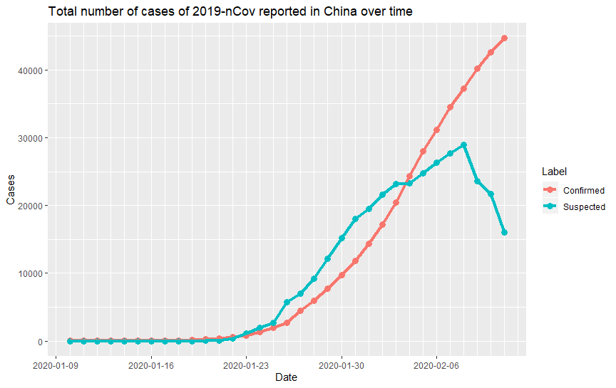
It can be clearly seen that over the 1.5 weeks since the 23rd January, the number of confirmed cases grew exponentially. As of 11th Feburary, the total number of cases is 44653. This large number of infection cases over such a short amount of time definitely place the 2019-nCov in the Epidemic status. It does look like though that the rate of increase is slowing down over the last few days. This trend is clearly shown in the suspected case data, where the number of suspected case started to decrease since 8th February. A reduction of suspected case is of course good news, as this should mean that the confirmed case would be slowing down soon, may be with a couple of days of delay.
To confirm this suspicion, we can plot the actual new number of cases over time:
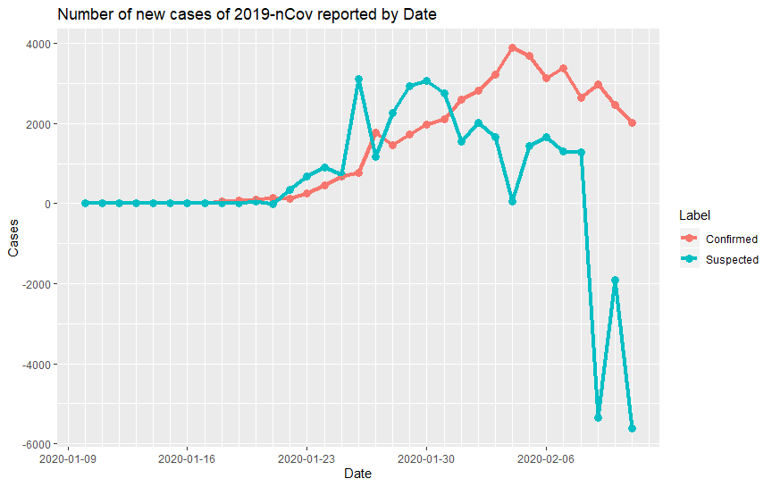
As suspected, the number of new suspected cases is dropping since its peak on around 30th January, with the new confirmed cases peak delayed by about 5 days. The number of new confirmed cases has been dropping since the 5th February, which is good news. However, some experts have warned that it may still be too early to celebrate as there is a chance that the virus mutates and become even more infectious.
One thing that was obvious to me as soon as I plotted this is how the graph looks different to that reported widely in the media, mainly sourced from the reputable website DingXiangYuen (DXY), a medical media website. The discrepency comes from the fact that the data reported at the NHC website also contained the daily new cases reported, which is where DXY draws their plot from. However, for the suspected cases, quoting just the new reported cases each day does not take into account of suspected cases that either have become a confirmed case, or is written off as a false alarm. Hence the true increase in the suspected case of the day should be the total number of suspected case today minus the total number of suspected case the day before. This is the data shown in the plot above.
How Dangerous is it?
The fact that it has already infected more people than the similar and notorious SARS 17 years ago gives the general impression that the 2019-nCov is really dangerous. Indeed, that is the general sense that you get in most media report on the outbreak. Is there sensationalism going on? Let’s look at the data. The following plot shows the number of severe cases, recoveries and deaths over the course of the outbreak:
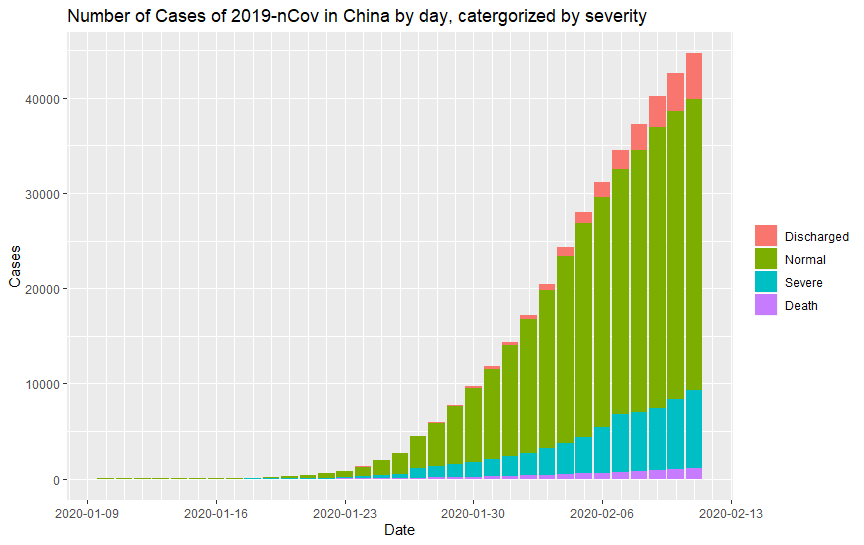
It can be seen that the number of deaths only contributes to a small number of total cases. However, a significant number of cases is reported as severe, which I would believe to be considered life threatening. The number of discharged case is increasing with time as well. An alternative view of the data which shows each category as a percentage is shown in the stacked bar graph below:
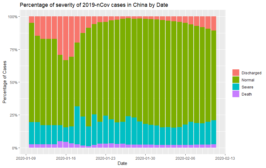
Some interesting trends can be seen from the graph above. Firstly, It can be seen that the recovery rate is quite high prior to 16th January. This correspond to the period when the number of reported case is still small, i.e before it become an epidemic. So in fact, rate before that date is probably not accurate. As time passes, the number of cases dramatically increase, and it is expected that the corresponding rate would settle to an equilibrium that is the true characteristics of the virus. 27th January is noted as the point at which the discharge rate started to become higher again, which interestingly correspond to the severe rate starting to drop. Unfortunately, while the recovery rate keep increasing, the severe rate drop wasn’t long lasting. A recent spike in severe cases has put the severe case rate (including deaths) to close to 20%.
To view the percentages and their evolution more clearly, I have generated a pie chart animation which shows the percentage of each category of cases over time:

Based on the latest results over the last few days, the death rate seems to have converged to around 2%. This is less than the 9.5% death rate for SARS and significantly less than the 34.4% death rate for MERS, another infectious disease caused by a type of coronavirus. For reference, seasonal influenza (the flu) has a death rate of 0.1%. So while the 2019-nCov outbreak so far looks much less dangerous than SARS, it is still more dangerous than the flu. It should be noted that with quite a significant proportion of severe cases, the death rate could rise in the future – this very much depends on how many of the severe cases eventually lead to deaths or recovery.
Is Quarantine Working?
One of the most dramatic responses that followed the outbreak is the complete quarantine of the city of Wuhan. Being a city with 10 million people, confining all residence within the city and banning all travels in and out of the city is no easy feat, and some criticises that this is an unnecessary move that will not work. To access whether the quarantining as worked, we look into the geospatial data provided by JHU. The following animation shows the evolution of the number of confirmed cases for all provinces of Mainland China (excluding HK and Taiwan).

The most obvious observation is the total domination of the number of cases in Hubei compared to other provinces in China. Wuhan is, of course, the state capital of Hubei. Hence the data is hinting that the quarantining is in fact working, as from such an explosive growth in the number of cases we would expect that the virus would spread quickly to other provinces, especially during the time of Chinese New Year when massive number of people commute across the country. Clearly the quarantining is at least slowing the spread of the virus to other parts of China.
To get a clearer picture of the rest of the country, here is the same data, but with Hubei data removed:
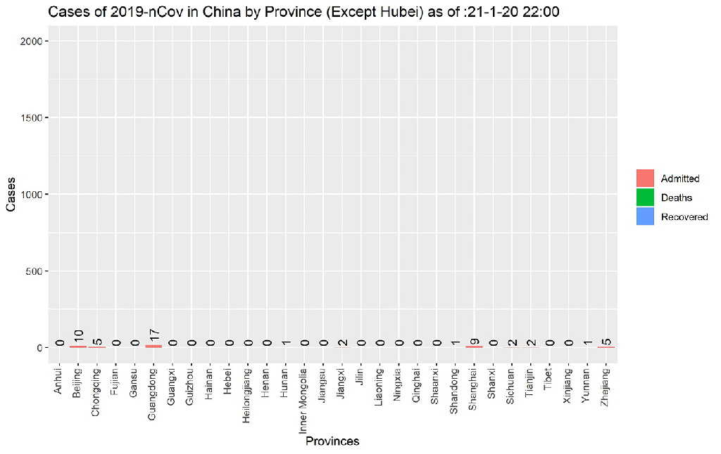
The top most infected provinces outside of Hubei are Zhejiang, Guangdong, Henan, Hunan and Anhui. It is noted that Henan, Hunan and Anhui border with Hubei, while Guangdong is the most populated province in China. Even then, the total number of cases of these five provinces is approximately 10% of all cases, again testifying that the virus is largely confined within Hubei, most likely due to the quarantining.
Another way to view this is to look at the number of new cases over time. The following two plots shows the number of new cases over time for Hubei, and for the five most infected provinces outside of Hubei (Note that the data is a bit noisy due to the frequent and irregular updates in this dataset. I have therefore applied a 3 point moving average to allow the trend to be observed more easily):
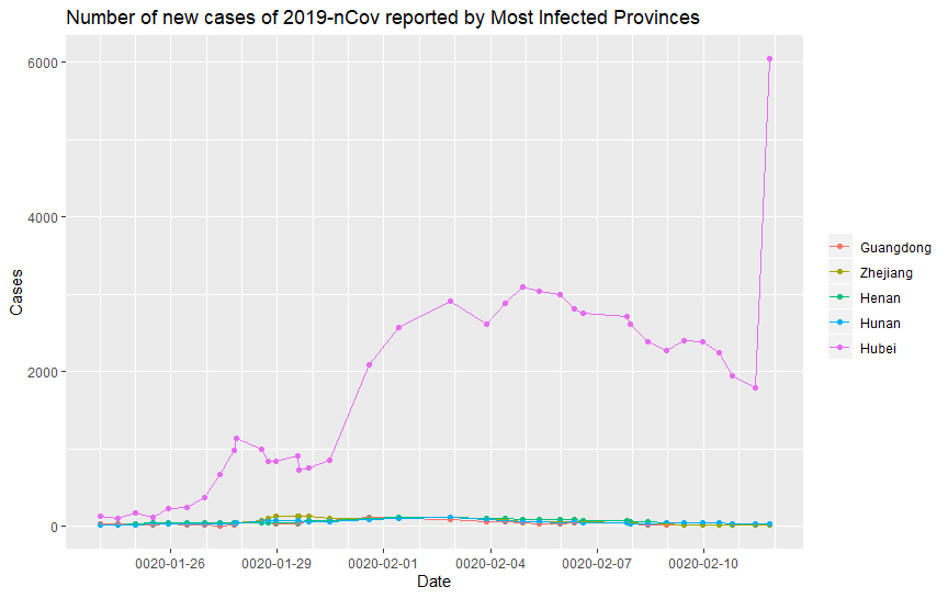
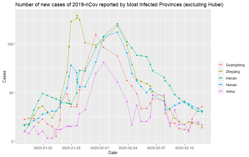
It can be seen that while the number of new cases in Hubei is still rising, the number of new cases for the other five provinces has already peaked and is decreasing, indicating that the outbreak is under control. In fact, the same is true for rest of the country. This clearly indicates that by quarantining Hubei, as well as placing other quarantine rules such as extending the Chinese Year Holiday by 14 days to avoid commute and transmission in the workplace, China has successfully keep the 2019-nCov outbreak under control for the rest of the country. It should also be noted that while the number of new cases in Hubei was dropping from 5th February, it suddenly saw a huge spike on the 13th February. The spike is caused by the decision on the 13th February to change to clinical diagnosis to combat the shortage of virus test kit. This naturally see a huge spike in new cases, and indicates that the infection in Hubei may be even more wide spread than initially thought (Note that this spike in cases is not seen in the other dataset due to the JHS dataset updates twice daily while the NHC data only updates at the end of the day.)
So unfortunately, while helpful for the rest of the country, the quarantining has serious implications for Hubei. In particular, the following graph shows the death rate for the most infected provinces, including Hubei, as time progresses.
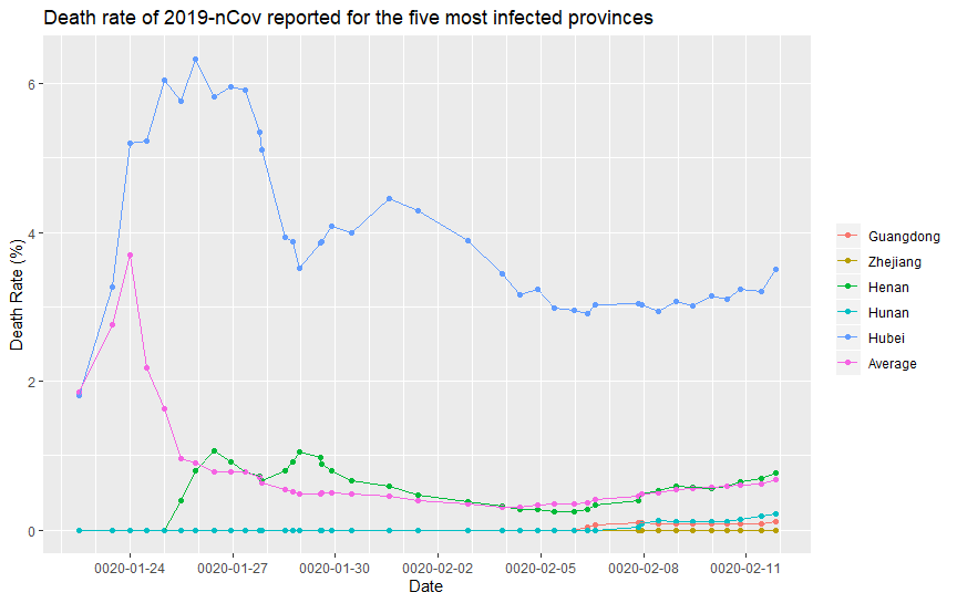
Note that the initial death rates is probably inaccurate due to the small number of sample size. Here we will only consider the death rate observed beyond the 30th January, after the number of cases significantly increased. Apart from the worrying upward trend that can be seen since the 6th February, a clear observation is that the death rate in Hubei is clearly significantly higher than the rest of the country: over 3% death rate in Hubei vs a <1% death rate in the rest of the country. Why is that the case? As an non-expert, I could only think of two possible reasons. The first is that the virus has evolved, and the higher death rate is the reminisce of the earlier, deadlier strands that are less capable in transmission, while the majority of the other cases, including those that get spread to the other provinces, are more infectious, but less deadly strand. Without data, this first case is hard to prove or argue for. The second possibility is that the large number of patients, combined with the quarantining has resulted in a severe shortage in medical resources that significantly decrease the survivability of severe cases. This second possibility is unfortunately very likely, as the shortage of masks, protective gear, and even hospital beds are well reported. Hopefully with the outbreak under control in the rest of the country, the other provinces can provide material and support that Hubei desperately need.
Note that there has been report or rumours that suggests that the number of deaths are significantly higher than officially reported, to a point where dead bodies are lying in the street as they cannot find a hospital bed or that a lot of the deaths are not reported as they are not diagnosed. Based on the statistics seen in the other provinces, I would think that it is unlikely that the real death rate is significantly higher, as the other provinces would not have the resource problem that Hubei is facing, and therefore would not have these shortage issues that masks the number of deaths. If the larger number of deaths than reported is true, then the only possibility is that the number of cases in Hubei is significantly higher than reported, with a lot of cases not being diagnosed. Eitherway, in the data perspective, this highlight a key point that all data scientists or analysts should keep in mind: the analysis can only be as good as the data. If the data is bad or inaccurate, then the conclusions from the data would be flawed.
Is the 2019-nCov a Pandemic?
By definition, a pandemic is an epidemic that occurs in multiple countries. So is 2019-nCov a pandemic? Face masks and disinfectants quickly sold out in many countries since the virus become world news at the end of January. Are we safe outside of China? Let’s have a look at the data. The animation below shows the evolution of the number of confirmed cases outside of Mainland China since the end of January:
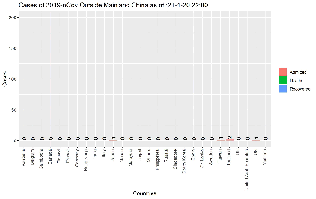
The animation shows that in general, the increase in number of cases outside of China is slow. The only two places that shows a sudden jump in cases recently is Japan, and “Other”. Actually, both refers to the outbreak that occur on the Diamond Princess Cruise that is currently docked in Japan. Hence, the initial data are recorded as “Japan”, and then it was changed to “Others”. As expected, the infection rate in a closed environment like a cruise ship is going to be extremely high, and so the number of cases will probably keep climbing within the ship. For the rest of the world though, it does not look like the virus has sustained any other outbreaks. It is also worth noting that (as of 13th February 2020) the cases outside of Mainland China only accounts for 0.86% of the total number of cases. So for now, it seems that the virus is mostly contained within China, through the various quarantining measures such as flights bans and travel restrictions. The death rate outside of China is currently 0.38%, slightly lower than the death rate observed in China outside of Hubei.
The following time series plot shows the number of new cases by date. Note that the total number of cases outside of China is used as the number of cases and new cases in individual countries remains small.
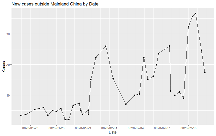
The number of new cases around the world is still on an increasing trend (probably slightly skewed by the large number of new cases onboard of Diamond Princess). However, the rate of increase is still significantly slower than what we have seen in China. At the current stage, the 2019-nCov is far from being a Pandemic, which is good news.
What should I do now?
Base on the data above, unless you are in Hubei or been to Hubei recently, you should not panic. Especially if you are outside of China. You are more likely to get hit by a car than to contract the virus at this stage. Don’t stockpile masks or food like the nuclear winter is coming. Do wash your hands often, cover up when you cough, and all other common sense personal hygiene.
If you are in China or Hubei, stay safe. No data will be able to tell you how to not get 2019-nCov, so try to avoid going to crowded places, and don’t go to the hospital unless you absolutely have to. Wash your hands often, don’t touch your face with your hands. Let’s all hope that this epidemic will go away soon.
